Hey Bloggers! Want to create a blog that grabs attention and keeps visitors coming back? It starts with a killer design!
We’ve scoured the web to find the most captivating blog designs out there, showcasing the perfect blend of style and function.
Dive into our resources! Whether you’re starting or refreshing, these examples are your guide to a standout blog.
Get ready to shine! With these design inspirations and tips, you’re on your way to a more engaging, shareable, and influential blog.
Why Your Blog Design Matters
Have you ever wondered why some blogs get all the love and clicks, while others seem to just sit there? A lot of it has to do with design! It’s not just about looking good – it’s about creating a great user experience.
So, before we jump into the good stuff and explore some killer website blog design, let’s chat about why nailing your blog’s look is super important. It’s not just about being pretty – a top-notch design can boost engagement, build trust, and make sure your content resonates with the right crowd!
User Engagement and Trust – Let’s be real, first impressions matter! A sleek blog design tells your visitors that you’re serious and committed. It’s like saying, “Hey, if my blog looks this good, imagine how great my content is!”
Influencing Reading Experience – It’s all in the details – the layout, fonts, colors, and multimedia all play a part in how people interact with your content. Nail the design, and you’ll have visitors sticking around and diving deep into your posts!
Niche-Specific Design Attracts Target Audience – Imagine if a tech blog looked like a foodie blog – weird, right? When your design vibes with what your audience expects, it’s like an instant connection!
Jump here:
- Best Website Blog Design Examples for Every Niche
- Fashion and Beauty
- Food and Culinary
- Parenting and Family
- Travel and Adventure
- Tech, Gadget and Gaming
- Customizing Your Blog Page Design
- Conclusion
- Blog Website Design FAQs
Best Website Blog Design Examples for Every Niche
Fashion and Beauty
In the dynamic world of fashion and beauty, where the stakes are high with a market cap of 3 trillion dollars, having a well-thought-out website blog design is essential. Fashion sites are digital shop windows, and first impressions are all about eye-catching, high-res imagery. But there’s more to it than just visual appeal. A successful site needs to be as functional as it is fabulous, blending aesthetics with user experience, something a savvy web design agency like Cyphon Digital understands and implements.
Wendy’s Lookbook – Visual Symphony of Style
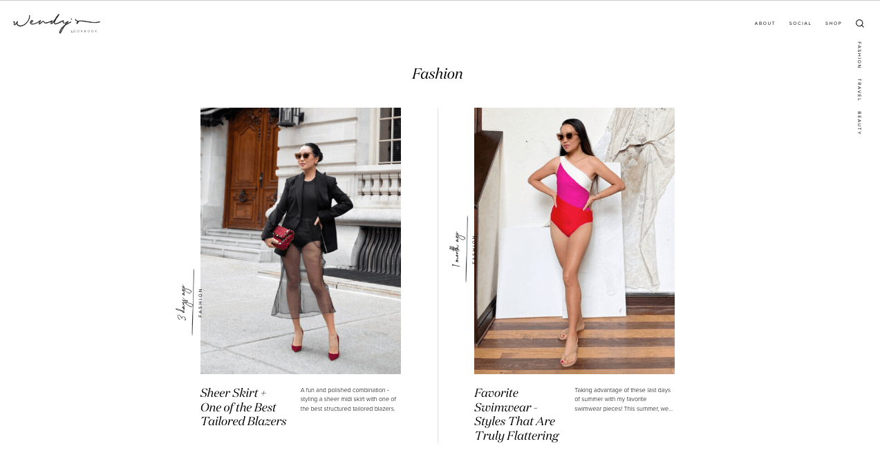
Image source: https://www.wendyslookbook.com/
Wendy’s Lookbook isn’t just about fashion; it’s about creating a visual symphony that resonates with style aficionados. The homepage is a canvas of creativity, where high-quality images and typography dance together to create an immersive experience. The layout is far from mundane; it’s a well-curated gallery, where each element has its place, and every detail is a brushstroke of style. The navigation is seamless, and the footer houses all the essential links, crafted with the same attention to detail. It’s not just a blog; it’s a showcase of fashion, designed to impress and inspire.
Jadore Fashion – Sophisticated Harmony of White Space

Image source: https://www.jadore-fashion.com/
Jadore Fashion invites you into a world where sophistication meets design harmony. The homepage is an elegant parade of fashion, lifestyle, and motherhood, utilizing sliders to seamlessly highlight multiple posts. Its website blog design is a testament to the power of white space, allowing each element to breathe and enhancing content readability. Each post is a visual treat, with smooth sliders displaying products and an Instagram feed that’s nothing short of fabulous. The design elements coalesce to create a sophisticated and harmonious user experience, making every visit a stylish journey.
Kate Lavie – Minimalist Elegance & Pictorial Brilliance
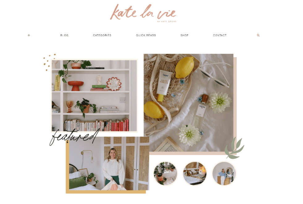
Image source: http://www.katelavie.com/
Fashion and Beauty blogs, like Kate Lavie’s, exemplify the pinnacle of aesthetics in the world of blogging. Notice that smart use of white space that makes the entire look and feel uncluttered and easy to the eye.
The blog’s homepage features high-resolution images that encapsulate her brand identity, exuding both elegance and the latest in vogue. But what sets Amelia apart in the saturated blogger landscape?

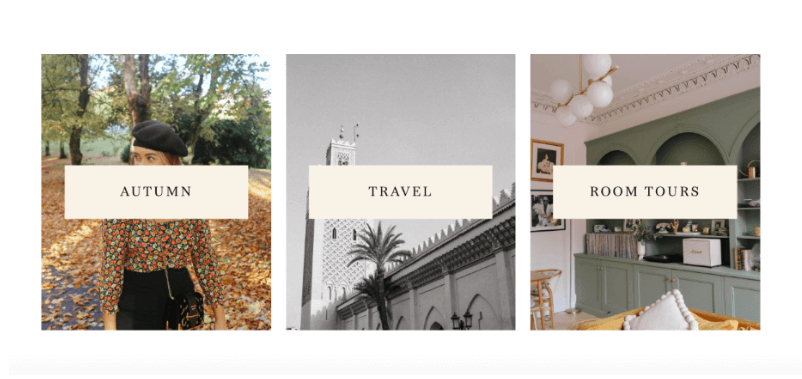
Her blog layout is a masterclass in how to create a beautiful website blog design. It is leaned towards a minimalist, clean layout. This not only made content easily digestible but also let the images stand out, which is crucial for a beauty and fashion-centric site.
The color palette and typography choices were in line with the aesthetics of a modern beauty and fashion blog—chic, understated, yet distinct.
Kate La Vie has been known for its impeccable attention to detail in photography.
The images on the site were typically high-resolution, capturing both the nuances of beauty products and the aesthetic of fashion pieces.
As a personal blog, katelavie.com infused individuality in its content and design.
Food and Culinary
At the core of such successful blogs is a collection of kitchen-tested, fail-proof recipes. Their blog content is complemented by an easily digestible writing style, which acts like the subtle seasoning that completes the dish.
On the aesthetics front, captivating photography takes center stage on the blog homepage design.
However, it’s crucial to maintain white space and avoid a barrage of images; focus on a few that truly capture the essence.
For beginners wanting to enhance their website blog design, investing in a pho’s backbone, almost like a blog template but with a more personal touch.
Combine that with an effective navigation menu, a swift search bar, and a snappy website design load time (because “avocado toast” waits for no one) — and you’re golden, especially on smartphones.
Serious Eats – Culinary Canvas of Delight
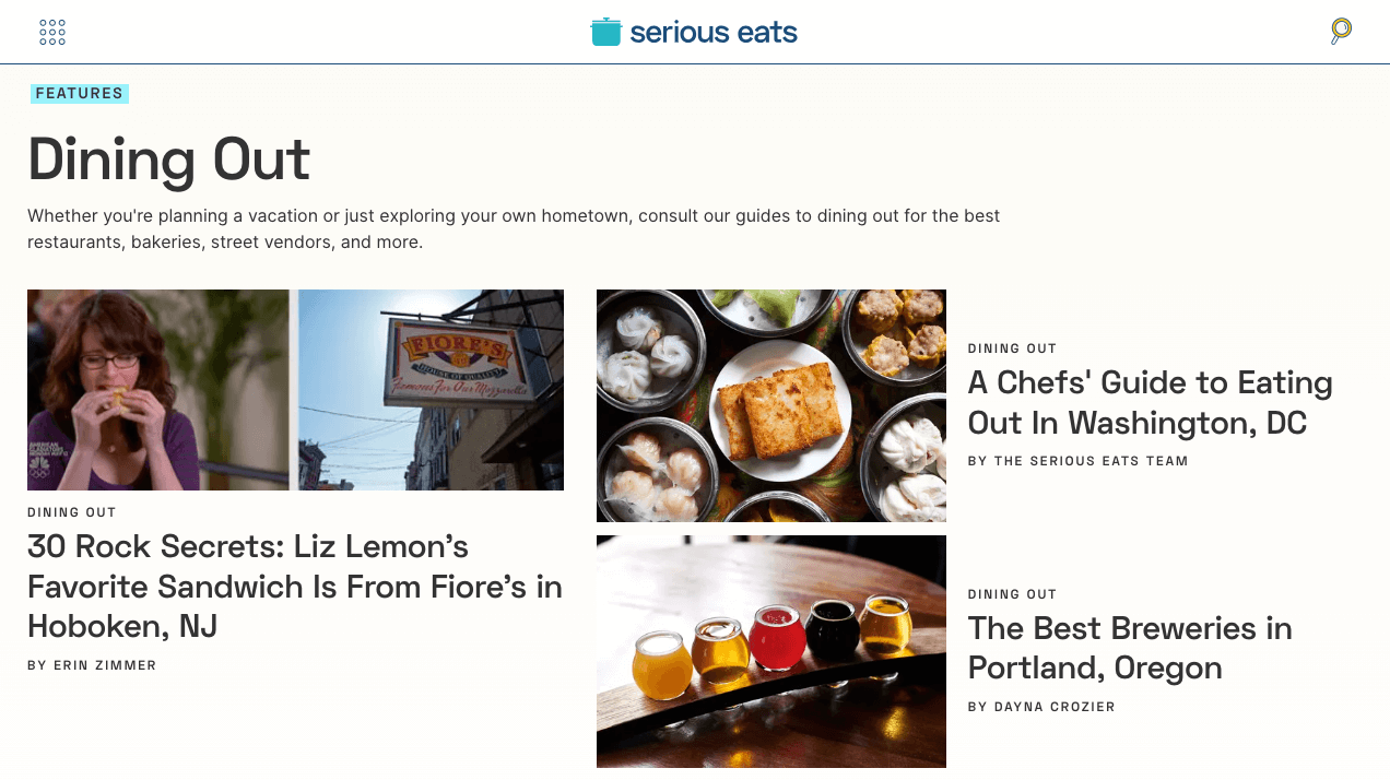
Image source: https://www.seriouseats.com/
Serious Eats goes beyond being a food blog; it’s a culinary canvas showcasing a delightful blend of recipes, food science, and essential eating guides. The homepage is meticulously designed, featuring a hero header that presents articles in a magazine-like fashion, ensuring an engaging user journey. The advanced search feature, neatly organized elements, and enticing thumbnails make every visit a gastronomic adventure.
Asia Street Food – Vibrant Tapestry of Flavors
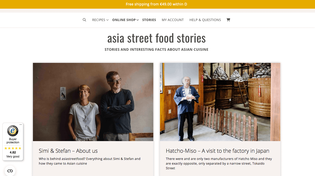
Image source: https://asiastreetfood.com/
Asia Street Food welcomes its audience into a vibrant tapestry where diverse Asian cuisines take center stage. The website blog design is an eclectic mix of clear, colorful imagery and intriguing food stories. The design incorporates interactive features like parallax effects and social links, offering a visually rich and dynamic experience for those seeking culinary inspiration.
Slender Kitchen – Stylish Repository of Nutritional Delights
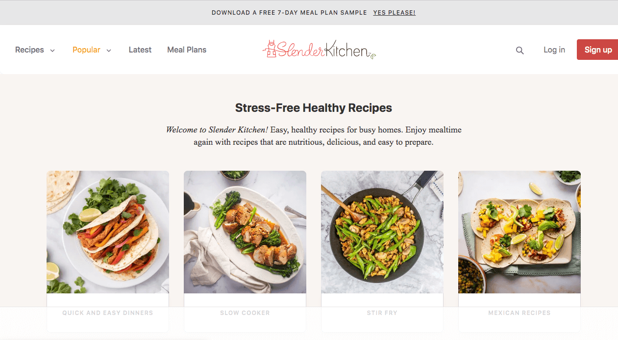
Image source: https://www.slenderkitchen.com/
Slender Kitchen serves as a stylish repository, bringing together delicious recipes and meal plans with a flair for presentation. The homepage blends attractive visuals with sleek typography, featuring a sticky top bar and a compelling call-to-action. The inclusion of featured magazines’ logos adds a layer of credibility, making it a go-to platform for health-conscious food enthusiasts.
Stay at Home Chef – Minimalistic Elegance with a Culinary Focus
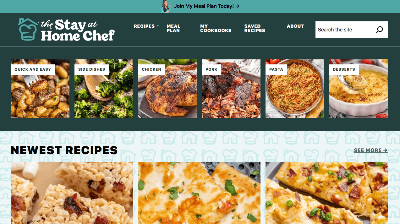
Image source: https://thestayathomechef.com/
Stay at Home Chef, spearheaded by Rachel Farnsworth, is a harmonious blend of minimalist design and culinary brilliance. The homepage stands out with its modern website design, clutter-free layout, highlighting visually appealing thumbnails of blog posts. Easy accessibility to social media pages and strategically placed banner ads contribute to a user-friendly experience, making every visit an exploration of restaurant-quality recipes.
Two Peas and Their Pod – Mobile-First Approach to Culinary Treasures
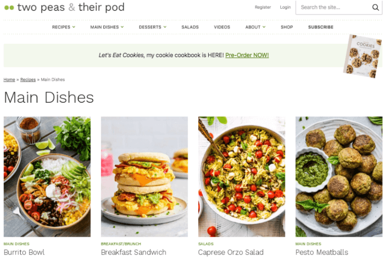
Image source: https://www.twopeasandtheirpod.com/
Two Peas & Their Pod, curated by Maria and Josh Litchy, is a beacon of exemplary website blog design and culinary diversity. The site delicately balances family-friendly, quick, and healthy recipes with the occasional indulgent treat. The clean, user-centric design, coupled with a mobile-first approach, mirrors contemporary web design trends, making it a delightful hub for cooking, baking, and hosting enthusiasts.
Parenting and Family
Let’s delve into the enchanting world of Parenting and Family blog designs, featuring three distinct examples that are sure to ignite your imagination. Whether you’re a parent, a relative, or simply someone who relishes family-focused content, prepare to be inspired!
Scary Mommy – Playful & Vibrant Design

Image source: https://www.scarymommy.com/
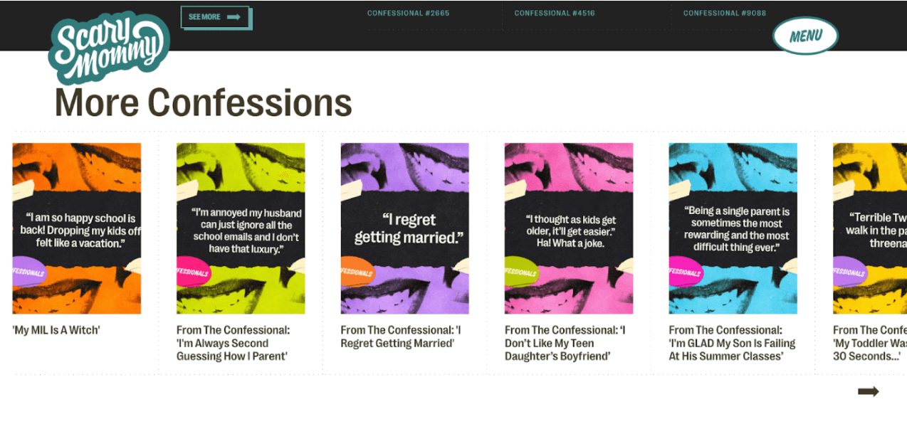
Blossoming from its roots as a personal diary laden with humor, Scary Mommy now stands tall as a pivotal parenting landing page, extending its reach to encompass everyone, from fresh parents to veterans with grown children. The essence of this successful blog isn’t confined to advice; it spills into territories of laughter and shared experiences.
Breaking the mold of typical website blog designs, Scary Mommy brings to the fore an unexpected blend of warmth coupled with modern, comedic undertones.
The website design of its Hero Section mesmerizes, exuding an eye-catching charm while being peppered with humor.

One cannot overlook the ingenious “Wheel of Feels,” an interactive feature that keeps the blog content in perpetual rejuvenation, fostering user engagement.
On the flip side, its too long of a homepage might pose a challenge for some, with the plethora of content potentially inducing scroll fatigue.
At the heart of it all, for a parenting blog page to succeed, it must intertwine unique content with authentic audience engagement. Scary Mommy’s strategy, marrying humor with genuine advice, epitomizes the essence of catering to its niche audience.
With so many blogger platforms, pinpointing and cherishing your distinct voice remains the ultimate mantra.
Modern Day Moguls – Harmonious Layouts & Warm Tones

Image source: https://moderndaymoguls.com/
Modern Day Moguls showcases visual harmony and warmth through its well-organized layouts design ideas, and captivating imagery. The blog covers offers an immersive, Instagram-like experience, with each image and title sparking curiosity. The warm tones extend a sense of comfort and relatability, while the strategic design promotes engagement and community. It’s more than aesthetics; it’s about making every visitor feel valued.
Go Fatherhood – Simple & Masculine Design
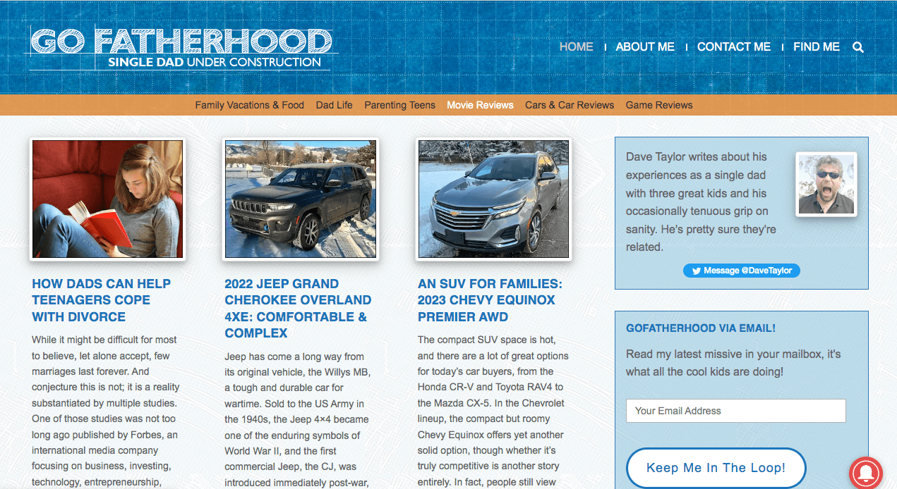
Image source: https://gofatherhood.com/
Breaking the mold, Go Fatherhood sits different with a masculine, blue-dominated design reflecting trust and stability. The layout is a model of simplicity, with well-arranged posts and essential sections. It speaks to a male audience’s preference for clarity and authenticity, providing a space for exploring fatherhood without clutter. Go Fatherhood is more than a blog; it’s a sanctuary for dads navigating parenthood.
These examples highlight the diversity in design in the Parenting and Family niche, emphasizing the importance of audience understanding in creating a successful blog. Time to leverage these insights for a resonant design!
Travel and Adventure
In the realm of travel and adventure, a blog’s ability to captivate relies heavily on a blend of mesmerizing visuals, evocative storytelling, and seamless user experience. Here’s what stands out:
A travel blog‘s essentials are multi-faceted. The photography, a pivotal element of website design, should be exceptional. The website blog design should naturally accentuate these visuals, employing a color scheme that complements and elevates the content.
While images ensnare the audience’s attention, it’s the tales they unfurl that reel readers in. Each photo should be grounded in compelling stories, sculpted to resonate with the blog’s ethos.
With mobile users increasingly dominating web and social media traffic, adopting a mobile-first approach using a WordPress theme or tailored blog design becomes indispensable. This shift is not just about aesthetics but also about fostering a thriving community.
Active engagement in the comments section and a robust blog page fortified with social sharing buttons can amplify content’s reach across various platforms.
Intertwining purposeful outbound links, whether they’re affiliate connections or ties to pertinent content, further enriches the reader’s journey.
Sidetracked – A Blend of Visual and Narrative Artistry

Image source: https://www.sidetracked.com/
Sidetracked is a travel magazine website where every pixel tells a story, marrying stunning photography with intimate essays and insightful travel guides. The design philosophy? Think of flipping through your favorite magazine, with each article a masterclass in layout design, balancing visuals and content to enrich your journey. Sidetracked pride ourselves on emphasizing both imagery and text, crafting a multi-dimensional experience that lets the story shine, without the clutter of design intricacies.
Blonde Abroad – Tailoring Vivacious Journeys for Female Explorers
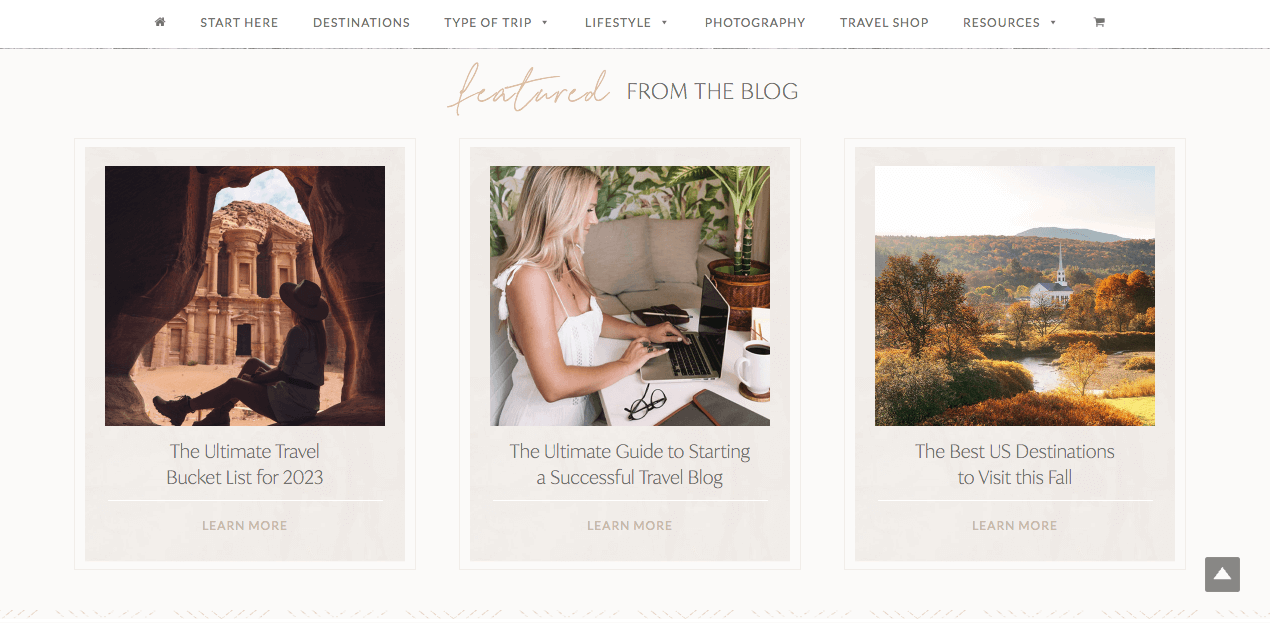
Image source: https://www.theblondeabroad.com/
Meet Blonde Abroad, a vibrant beacon of travel blog design, specifically curated for the female adventurer. This blog is not just about showcasing global escapades; it’s your go-to for specialized tips and a myriad of experiences. The homepage is a visual feast, adorned with custom graphics, dynamic maps, and integrated social pages. Navigating through its treasure trove of content, from destination guides to travel styles and resources, is a breeze. But what sets this blog apart is its voice – every journey comes alive with enchanting tales and a distinct personality.
Along Dusty Roads – Where Minimalism Meets Visual Storytelling
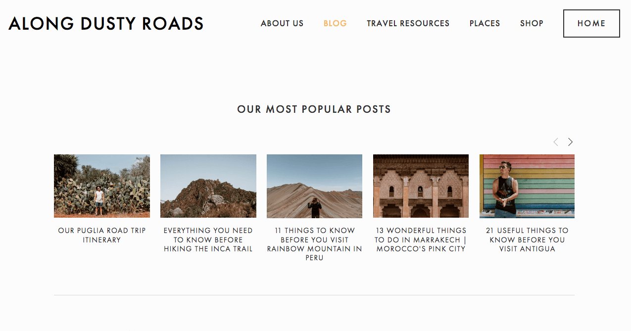
Image source: https://www.alongdustyroads.com/
Step into Along Dusty Roads, where we break the mold with our minimalist design and let our images do the talking. Its narrative is a visual journey around the world, brought to life by a layout that’s a celebration of white space and elegant typography. Along Dusty Roads believes in the power of simplicity, showcasing a design that’s as impactful as it is uncomplicated. Every element is meticulously placed, allowing the images and the tales they tell to resonate, proving that there’s no one-size-fits-all in crafting a unique travel blog.
Dan Flying Solo – Crafting Visually Stimulating Experiences with Content Variety
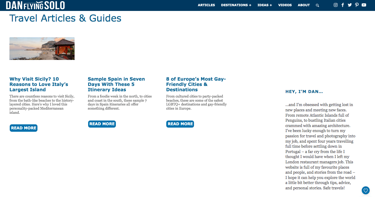
Image source: https://www.danflyingsolo.com/
Dan Flying Solo is your hub for personal travel inspiration with a unique organizational twist. Ditching the usual categories, it presents a variety of content – articles, videos, and photos, all at your fingertips. Dan’s design choices, from prominent social media buttons to page-wide images overlaid with text, are reminiscent of a Netflix video page, enhancing the visual appeal and user experience.
Petite Passport – Designing Thematic Journeys to Destinations
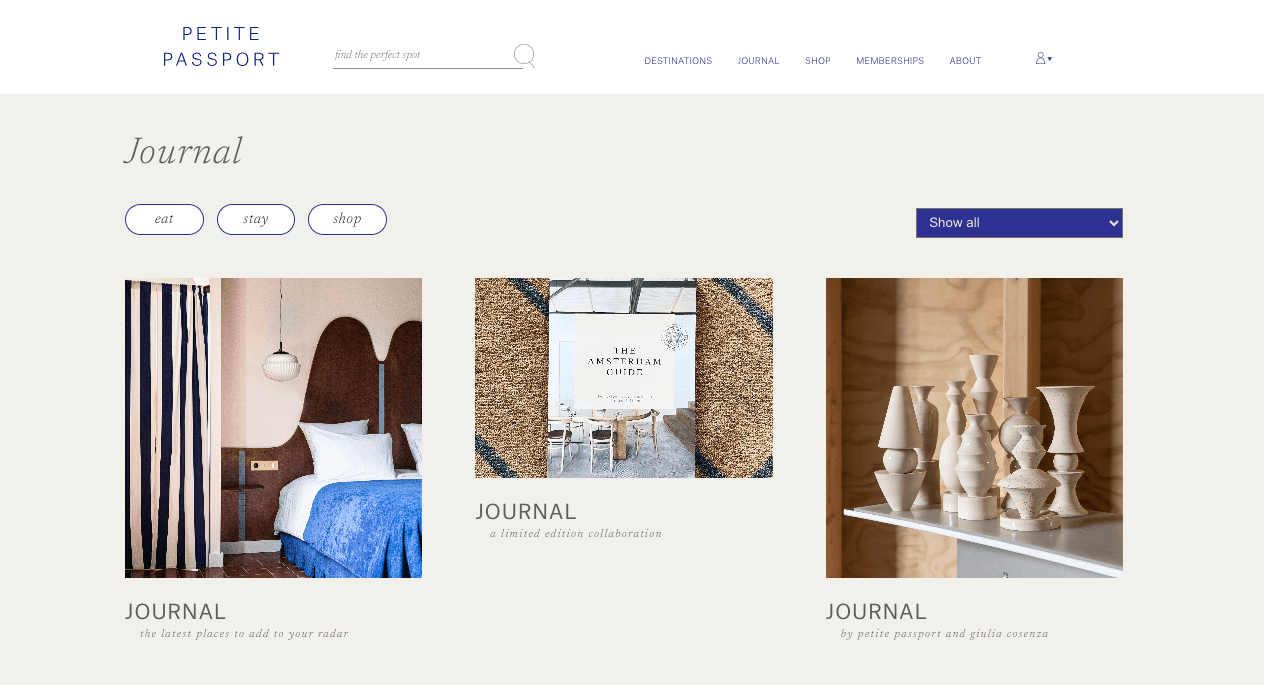
Image source: https://www.petitepassport.com/
Explore with Petite Passport, a travel blog with a design-centric lens, focusing on insightful reviews rather than personal adventures. Its modern, refined style features a clean, boxed frame, set against a contrasting gray background. Petite Passport embraced the “passport” theme, adorned with stamp-like graphics, bringing a unique flair to its design. For those looking to craft their travel blog, this blog serves as a reminder to integrate thematic elements that truly embody the essence of your journey.
Tech, Gadget and Gaming
Dive into the dynamic world of Tech, Gadget, and Gaming Blogs, where innovation meets creativity, and every design tells a story. Whether you’re a tech enthusiast, a gaming aficionado, or just curious about the latest digital trends, these website blog designs will captivate you with their distinctive creativity.
Destructoid – Dive into the Dark Side!

Image source: https://www.destructoid.com/
So, let’s kick off with Destructoid. Created by the quirky cartoonist Yanier Gonzales in 2006, this site immediately pulls you in with its cool dark theme – a real winner among the tech and gaming crowds.
The hero section? Totally engaging, spotlighting one blog up top and four others underneath, giving you a sneak peek with titles over the images.
And as you scroll down, you uncover a treasure trove of content in this accordion-style layout. Yeah, there are quite a few ads, but the site’s simplicity and thematic vibe make it a top spot for game reviews and features.
The Verge – Making Bold Moves!
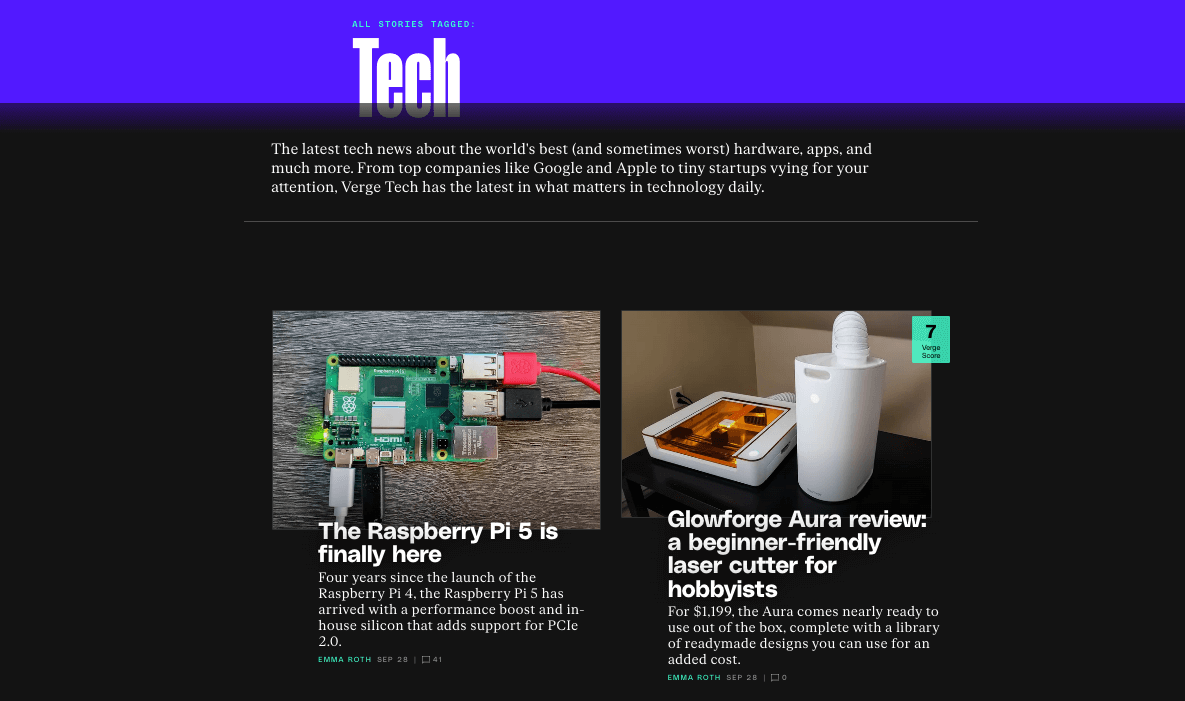
Image source: https://www.theverge.com/
Next up, The Verge! This is not just a tech blog; it’s a journey into science, art, and culture. And talk about making a statement – the gigantic hero image takes up 75% of your screen, putting the spotlight squarely on the featured content.
The bold logo? Front and center, reinforcing the blog’s strong identity.
And the navigation menu, those sleek slashes, and the choice of fonts, including that standout logo font – it’s all about making a visual impact while feeding your curiosity.
TechSpot – Simple yet Sophisticated!
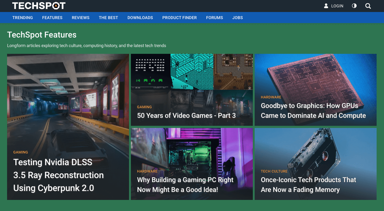
Image source: https://www.techspot.com/
Now, onto TechSpot. This one’s a haven for IT pros and PC gamers, and it nails the balance between simplicity and style.
The hero section shows rectangular tiles laid out asymmetrically with clickable blogs, guiding you smoothly through the site. Dive a bit deeper, and the white background offers a fresh contrast, making the reading experience super pleasant.
Here, it’s all about the tech, giving you the nitty-gritty without any info overload. It just goes to show, simplicity and sophistication do mix well in design!
Wired – Sleek, User-friendly, Interactive!

Image source: https://www.wired.com/
So, diving into Wired, you’re greeted with this super clean and organized top nav bar – a real timesaver for finding your favorite tech topics. And whether you’re a desktop aficionado or more of a mobile guru, Wired’s got you covered with its spot-on responsive design.
Visuals? They’re bold and high-quality, giving you a snapshot of what’s in store before you even start reading. And the typography – modern, easy-to-read, with just the right pop of color and plenty of whitespaces – makes sure you’re not overwhelmed.
Now, Wired is famous for its in-depth, quality articles, and they’ve nailed making sure images and videos add to the story, not distract. We’ve all been on sites where it’s more about the ads than the content, right? Well, while Wired does have ads – they’ve got to keep the lights on somehow – they’ve struck a balance to keep the user experience smooth.
Searching for a specific topic? Easy. Want to share an article or join the conversation? Just a click away. Wired really does tick all the boxes when it comes to a user-friendly design with a cool, professional vibe.
Customizing Your Blog Page Design
With all the examples above, you’ll probably inspired to design or redesign your blog, here are some tips:
- Embrace Authenticity: Ensure design elements like logos, color palettes, and fonts consistently reflect your brand. This fosters instant recognition.
- Understand Your Audience: Tailor your design to resonate with your readers, considering their age, preferences, and habits.
- Stay Trend-Aware: Regularly update your design knowledge. Incorporate trends that align with your brand and audience.
- Optimize for Mobile: A significant portion of readers may access your blog via mobile devices. Ensure you have a responsive and mobile-friendly website design.
- Interactive Elements: Consider adding interactive features such as quizzes or polls to engage and retain readers.
- Enhance Readability: Use easy-to-read fonts and maintain ample white space. Prioritize content layout for effortless reading.
- Integrate Social Sharing: Place social media buttons prominently. This promotes content sharing and increases visibility.
- Prioritize SEO: While design is vital, ensure your blog’s structure and content are optimized for search engines to boost organic reach.
- Regularly Test & Iterate: Continuously gather feedback and make incremental improvements. What works today may evolve tomorrow.
- Incorporate Multimedia: Use relevant images, infographics, or videos. They can break up text and enrich the reader’s experience.
Remember, your blog’s design should not only reflect your brand but also cater to the evolving needs and preferences of your readers. Keeping it fresh, user-friendly, and engaging is the key to retaining and growing your audience.
Conclusion
Your website blog design can either make or break the reader’s experience. Beyond just aesthetics, it’s about building trust, fostering engagement, and ensuring your content shines in its best light.
Blog Website Design FAQs
Q: How do I create a blog web design?
A: To create a blog web design, start by researching design inspiration from successful blogs. Consider using platforms like WordPress, which offer various blog templates tailored for beginners. Prioritize user experience and ensure your blog design is eye-catching, integrating elements like typography, white space, and a color scheme that matches your brand identity.
Q: How do you structure a blog website?
Structure a blog website by starting with a captivating homepage. Ensure there’s a clear navigation menu, which includes categories or sections like tutorials, case studies, and perhaps a podcast if relevant. Your blog layout should also feature sharing buttons for social media, a search function, and a sidebar for related posts or advertisements.
Q: What are some good website blog design tips?
A: When designing a blog:
- Use eye-catching typography and fonts.
- Keep the design clean with ample white space.
- Incorporate social sharing buttons for platforms relevant to your audience.
- Optimize the blog for SEO to rank better on search engines.
- Implement a responsive design for mobile users.
- Consider the user experience: easy navigation menu, fast loading times, and clear call-to-action points.
- Look for design inspiration from the best blog designs in your niche, be it a lifestyle blog, travel blog, or ecommerce site.
Q: How often should I redesign my blog?
A: Ideally, every 2-3 years to stay updated with trends, but it also depends on how your audience interacts with your content.
Q: Do mobile-responsive designs matter?
A: Absolutely! With the majority of users accessing content via mobile, having a mobile-responsive design is crucial.
Q: Can I design my blog myself?
A: Yes, with platforms offering customizable templates. However, for a unique and professional touch, consider hiring a designer.
