In a rapidly evolving digital landscape, keeping up with the latest website design trends is paramount. Just as fashion evolves, so does the look and feel of the digital realm.
Modern web design isn’t solely about aesthetics; it directly impacts user experience, brand perception, and even search engine rankings.
Let’s dive into the web design inspiration of 2023 and see how top brands are setting the pace.
Jump Here
Modern Web Design Elements
- Parallax Scrolling
- Dynamic Cursors
- Interactivity and Microinteractions
- Dark Mode
- Smart Video
- Interactive 3D Content
- Use of White Space
Modern Website Examples for 2023
Looking Into 2023 Modern Design Trends
But, what makes a web design “modern”?
Modern website design is a harmonious blend of aesthetics and functionality. Prioritizing user experience, it encapsulates visually appealing elements but also takes into account loading times, mobile responsiveness, and user-friendly interfaces.
With millions of new websites launching annually, your web page needs a modern web design to stand out. Current design is about staying relevant, ensuring visitors navigate your site with ease, and fostering a positive user experience.
A high-quality modern website design keeps users engaged, reduces bounce rates, and ensures a smoother journey. Furthermore, search engines, like Google, favor websites that offer an excellent user experience, making web design a crucial component of SEO.
Modern Website Design Elements With Examples
1. Parallax Scrolling
At its core, parallax scrolling is a visual technique where the background content (usually an image or graphic) moves at a different speed than the foreground content when scrolling. This differential in movement creates a captivating 3D effect, adding depth and dimension to a web page.
Originating from the visual effects of old side-scrolling video games, parallax scrolling has now firmly cemented its place in modern website design. The technique’s ability to produce an illusion of depth on a two-dimensional screen has always been its standout feature.
However, while parallax scrolling can offer several advantages, it’s essential to use it judiciously. Overdoing it can lead to a confusing user experience. Also, if not implemented correctly, it can impact the site’s speed and SEO performance.
It’s also crucial to ensure that the website remains mobile-friendly, as parallax effects might not always translate well to smaller screens.
Example: Supernatural
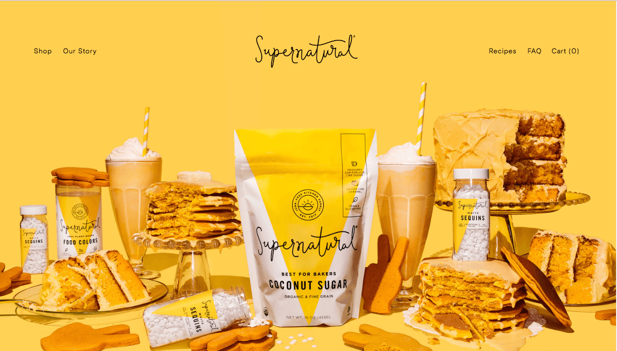
Image source: https://www.supernaturalkitchen.com/
Supernatural showcases a minimalist, responsive design accentuated by a prominent hero image with a captivating parallax effect. The minimal texts allow the visually appealing image to command the viewer’s attention.
A 100% transparent header eliminates potential distractions, while the addition of another parallax section adds dynamism. Notably, the integration of their Instagram feed serves as a smart strategy for adding rich, updated content to the website.
2. Dynamic Cursors
As the digital frontier continues to evolve, so do its components. The cursor, a staple of on-screen navigation, is no longer confined to its traditional arrow symbol. Customized and interactive cursors bring an element of surprise, creating moments of delight and intrigue for users, turning mundane movements into visually arresting experiences.
Example: Advanced Team
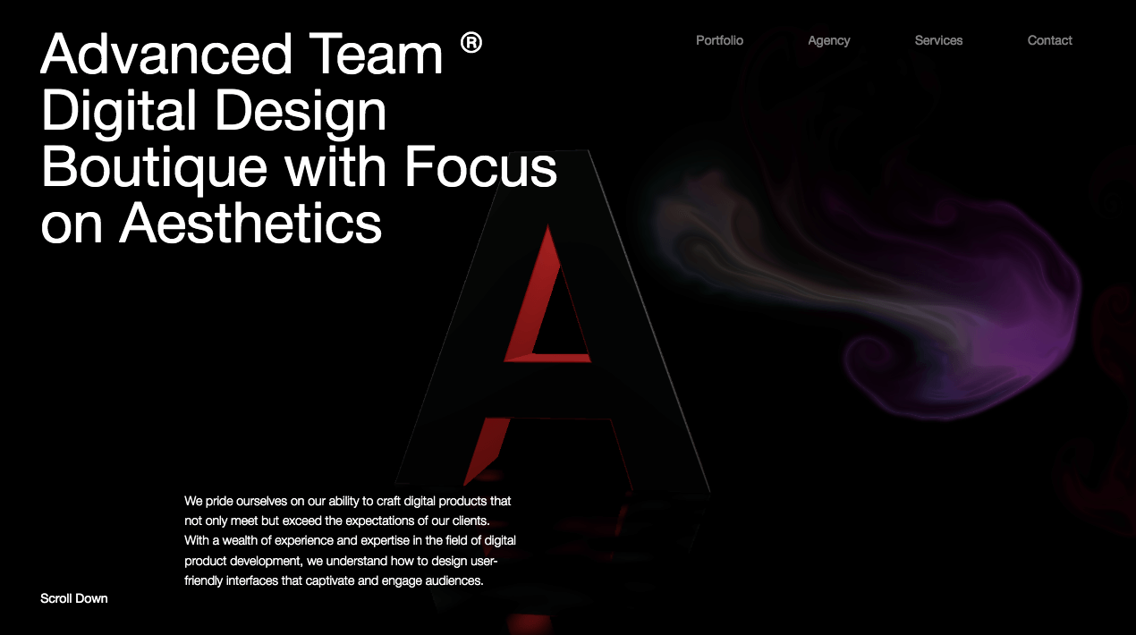
Image source: https://advanced.team/
Advanced Team’s modern website design employs a unique cursor effect reminiscent of a wake in rainbow-colored water. This distinct feature helps users trace their scroll path and infuses a splash of color into the primarily black and white design. The contrast of the swirling rainbow cursor against the stark black background stands out, offering users a visually engaging experience.
3. Interactivity and Microinteractions
Interactivity in modern website design involves various methods and features that allow users to engage actively with content, rather than being passive viewers. Within this broader realm, micro-interactions are subtle design details that achieve specific tasks or offer feedback to users. Think of them as the tiny nudges, animations, or response mechanisms that make users feel more connected and engaged with the content.
For instance, a button changing color when you hover over it or a small animation letting you know your form has been submitted are all examples of micro-interactions. They should be strategically incorporated into web design, ensuring that they serve a function that enhances the user experience rather than overwhelming or distracting users.
Example: Camille Mormal
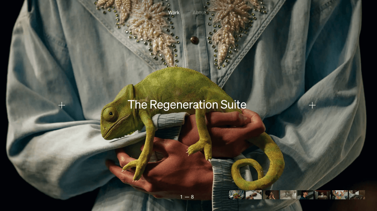
Image source: https://camillemormal.com/
Camille Mormal’s website is a testament to her prowess as an interactive designer. With a plethora of innovative micro-interactions, some notable features include the horizontal project scrolling facilitated by unique plus symbols and the film strip-inspired navigational menu. Her use of these elements not only showcases her originality but also emphasizes usability and user engagement.
4. Dark Mode
Black backgrounds are popping up everywhere. As dark mode web design grows in popularity—with operating systems, browsers, and apps—so does its prevalence in modern web design.
Though it feels fresh, dark mode websites and its use in design is nothing new. If you ever used a computer in the ’80s with a monochrome screen. Most of the earliest home computers displayed green or white text on simple black backgrounds.
Also called black mode, dark theme, or night mode, dark mode web design is a term used to describe any layout with a light-on-dark color scheme that many users prefer using in low-light environments. In its most basic iteration, think bold white text on a jet black background.
Example: Masterclass
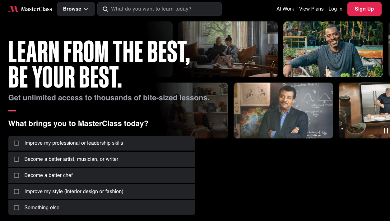
Image source: https://www.masterclass.com/
Masterclass, a premium online learning platform, showcases the potential of dark mode in modern website design.
This dark mode orientation aligns with the platform’s premium, high-quality feel. Vibrant colors from thumbnail images or icons juxtaposed against the black backdrop gain more prominence, ensuring that the content remains the focal point.
This strategy is particularly effective for Masterclass, where the content—whether it’s filmmaking, writing, or culinary arts—is often rich, colorful, and demands attention.
The white and bright typography against this dark background not only ensures readability but also reduces potential eye strain for users, especially those who access content in low-light settings. Interactive elements like the navigation menu and CTA buttons pop out in this design, guiding the user’s journey with ease.
In embracing the dark mode trend, Masterclass not only nods to past design sensibilities but also encapsulates a forward-thinking approach, ensuring a user-centric experience that aligns with the brand’s luxurious and expert-driven ethos.
5. Smart Video
Video content on a website is akin to the elegant façade of a property. Just as curb appeal can influence someone’s decision to explore a home further, a well-executed video can entice visitors to delve deeper into a website.
Incorporating video on your website homepage isn’t merely about aesthetics; it’s about crafting a compelling visual introduction to your brand.
In an age where video content dominates the digital landscape—consider the staggering metrics from platforms like YouTube—it’s undeniable that video is the medium of choice for vast swaths of internet users.
Beyond just engagement, smart video integration can expedite the sales process, equipping your team with enriched conversations and sharper insights.
Example: Purple Mattress
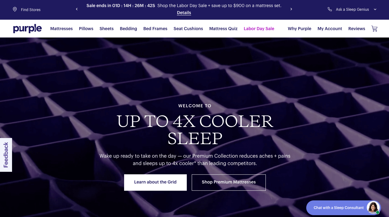
Image source: https://purple.com/
Purple Mattress stands as a testament to the power of smart interactivity. Not only have they effectively utilized video on their site, but they’ve also integrated it as their hero image and display photos. This not only captures attention but also communicates product benefits more evocatively. By ensuring adaptive video content, they guarantee uninterrupted playback, irrespective of a user’s device or internet connection quality. This meticulous attention to user experience, ensuring the message is conveyed flawlessly, accentuates the brand’s dedication to quality at every interaction.
6. Interactive 3D Content
3D visuals in modern website design are more than just sophisticated graphics. When users can interact with these elements, the entire browsing experience transforms. Such interactive 3D content offers unparalleled depth and immersion, ensuring not just a visual treat but an engaging journey that captures and sustains user attention.
Example: Admire Amaze by De Bijenkorf

Image source: https://admireamaze.debijenkorf.nl/
De Bijenkorf’s ecommerce platform, Admire Amaze, offers a splendid testament to the power of interactive 3D content. Right from the outset, users are greeted by a luminous bee guiding them through a rich, intricate forest, finally leading to the treasures—De Bijenkorf’s curated products.
Powering this magical experience is WebGL, a potent Javascript graphics library dedicated to rendering 3D visuals on the web. But the journey doesn’t stop at visuals. The ambient sounds—frogs croaking, water gurgling, and insects humming—paint a vivid auditory picture, further amplifying the woodland ambiance.
It’s evident that De Bijenkorf’s approach transcends traditional e-commerce conventions, offering users an immersive experience that’s both memorable and surreal.
7. Use of White Space
White space, often termed ‘negative space’, isn’t just an absence of content. It’s a powerful design element in itself, facilitating focus, enhancing comprehension, and accentuating key components on a webpage.
When combined with custom graphics or blended photos, white space lends a breath of fresh air, allowing these visuals to truly stand out and resonate with the viewer. In essence, white space is the canvas that amplifies a brand’s unique visual identity.
Example: Support Shepherd

Image source: https://www.supportshepherd.com/
Support Shepherd’s web design embodies the art of white space. By masterfully showing generous spans of white space with impactful visuals and content, the website effortlessly guides visitors’ eyes to where they matter most.
This strategic use of white space avoids visual clutter, making the user experience more intuitive and the brand message more impactful. In a digital landscape often dominated by information overload, Support Shepherd’s minimalist approach is a refreshing reminder of the elegance of simplicity.
Recurring Modern Design Trends Among Brands
Modern website designs have seen the rise and adoption of several trends that have grown in prominence across top brands. The reason? They aren’t merely aesthetic choices; they stem from a deep understanding of contemporary user behavior and preferences.
While design elements like white space, dark mode, parallax scrolling, video integration, and micro-interactions are consistently embraced, it’s essential to understand why they are more than just fleeting fads.
Modernity in design doesn’t just pertain to visual appeal but to utility, user-friendliness, and the enhancement of user experience. For instance, while dark mode or parallax scrolling gives websites a fresh appeal, they also ensure visual comfort and interactive user experience, respectively.
The merging of form and function is the driving force behind these trends, ensuring users are not only engaged but also have a seamless experience.
While all of these sounds amazing here’s a few tips on incorporating modern website design elements to your website:
- Research and Resonate –Dive deep into each trend to understand its core essence. For instance, while integrating dark mode, think about how it complements your brand colors and mood. Does it resonate with what your brand stands for?
- Prioritize User Experience – Always prioritize the user’s experience. A trend should not just be about aesthetics but about making the user’s journey smoother. For instance, if micro-interactions can guide a user or make a process more intuitive, they’re worth integrating.
- Blend Trends with Brand Voice – Make sure the trends you adopt harmonize with your website’s branding. For instance, a minimalistic design with ample white space may not suit brands with a vibrant and bustling image.
- Seek Feedback – Involve your community or a segment of your audience. Run A/B tests to gauge how your audience responds to these trends.
- Quality Over Quantity – Don’t feel compelled to incorporate every trend. Choose those that align with your brand and can enhance the user’s experience.
- Continuous Learning – Stay in tune with the evolving world of web design. Regular workshops or webinars can keep you updated.
- Consult with Professionals – If you’re unsure about a trend, consult with us, at Cyphon Digital. We can provide you with the insights that will work best for your brand.
In Summary
Web design is a dynamic field, with the junction of aesthetics and functionality at its core. Top brands consistently set benchmarks not just by following trends, but by weaving them seamlessly into their unique brand narratives.
As you chart your own design path, remember that authenticity and understanding your user’s needs are paramount. Embrace innovation, but ensure it rings true to what your brand stands for.
Modern Website Design FAQs
- What is the difference between responsive and adaptive design?
In modern web design, responsive design ensures a web page fluidly adjusts its layout based on different device sizes, from mobile devices to desktops. Adaptive design, however, tailors to specific device sizes, often employing distinct templates.
- What is an example of a modern website design?
Apple’s website serves as an excellent example of modern website design. It combines minimalist aesthetics, smooth scrolling features, dynamic animations, and an efficient color palette. Their homepage embraces white space, intuitive typography, and eye-catching call-to-action elements.
- Is there a name for a website that is designed to be accessed on a mobile device?
Yes, it’s often termed as “mobile-optimized” or “mobile-friendly” web page. Modern web design emphasizes this given the prevalence of mobile devices.
- What are some of the newest design trends in web design?
Dark mode is on the rise, with many modern website design examples integrating it. Parallax scrolling, gradient backgrounds, custom illustrations, and bold typography are all pivotal design elements. Templates with integrated social media widgets, like those found on WordPress, also enhance user experience.
- What are some of the most common design trends in modern website design?
Some hallmarks of modern website design include a minimalist approach, with plenty of white space. Dynamic animations, captivating color schemes, and prominent CTA buttons enhance user interaction. Landing pages often showcase hero sections with bold headers, guiding the cursor through a well-thought-out user journey.
- What is the difference between a static website and a dynamic website?
A static web page remains unchanged unless manually updated. In contrast, a dynamic page can adjust its content and functionality based on user interactions or back-end changes. Ecommerce websites are typically dynamic, offering tailored user experiences based on browsing history and user preferences.
Remember, regardless of design trends, the best website designs prioritize the user’s needs and preferences, ensuring an engaging, intuitive, and user-friendly experience.