Imagine walking into a physical store, only to find it cluttered, confusing, and lacking in design elements. Just like in an ecommerce site, if the website layout isn’t captivating or user-friendly, you’d likely walk out, right?
In our digital era, a website’s homepage design is the storefront window, playing a pivotal role in capturing website visitors’ attention and determining if a visitor stays or swiftly clicks away.
Studies indicate that, often influenced within a brief 50 milliseconds (0.05 seconds!), users make up their minds about a website. This first impression, largely formed based on aesthetics alone, decides if they’ll stay or exit.
In this insightful post, we’re uncovering a series of 5 website homepage design examples that don’t just steal attention but have efficiently transformed casual browsers into loyal customers. These best website homepage designs have perfectly straddled the delicate equilibrium of eye-catching aesthetics, top-tier user experience, and pinpoint clear messaging.
If you’re an aspiring designer, a business professional focused on brand awareness, or just someone keen to learn more about web design services, take a closer look to discover key elements that set a homepage apart in today’s competitive digital landscape.
By the end of this blog, you’ll have insights into the best website homepage design examples that can help enhance your online presence, spark creativity , and make you appreciate the nuances of web design.
Dive in to better understand the process behind creating top-notch homepages and pinpoint features that you can adapt, adjust, or admire.
Jump here:
- Homepage as a Brand’s Forefront
- Homepage Example 1: Noah DeMuldre
- Homepage Example 2: Animal Music Studios
- Homepage Example 3: The Spice Suite
- Homepage Example 4: Apple TV
- Homepage Example 5: Airbnb
- Industry Hindsight
- In Summary
- Website Homepage Design Examples FAQs
Homepage as a Brand’s Forefront
For many, a website’s homepage is the inaugural interaction they have with a brand. In this fleeting window of time, the page design, arrangement, and tagline ought to succinctly convey a firm’s value proposition and philosophy.
First Impressions Matter
Before users digest any text, their judgments are already being molded by the visual panorama, the intelligent use of white space, and the overarching aura of the homepage. Highlighting its significance, a study by Stanford disclosed that a staggering 75% of users gauge a firm’s trustworthiness by its exceptional web layout alone.
Influencing Engagement & Navigation
Beyond mere visuals, the homepage design is instrumental in steering users to pivotal website sections, flaunting flagship products or services, and nudging them towards specified actions like clicking on a call-to-action button. Merging smart design stratagems with interactive and intuitive navigation bar structures can drastically spike user immersion.
Optimization for mobile devices and SEO is also critical, ensuring that the homepage resonates with its target audience and ranks high on search engines, thereby maximizing its reach and impact.
The art of web design is more than just flashy animations or bold colors; it’s about creating an attention-grabbing experience that resonates with the viewer, encourages exploration, and ultimately converts casual visitors into committed customers or followers.
Whether you’re building from web design templates or crafting a custom design, always prioritize the user’s journey, keeping website design examples in mind to inspire and guide your creative process.
Homepage Example 1: Noah DeMuldre
Noah DeMuldre’s personal site, a prime example of best homepage designs, doubles as a digital portfolio. It emphasizes his prowess in graphic design, 3D modeling, and motion design, and stands as a beacon for best website homepage design examples.

Image source: https://www.noahdemeuldre.com/
What makes it stand out:
Dynamic Hero Section: As soon as one lands on the homepage, they are met with a rotating 3D model. This animation, a testament to Noah’s 3D design skills, is not just an interactive element, but it’s designed to seize the visitor’s attention, spurring curiosity.
Portfolio Thumbnails: Each of Noah’s works gets its spotlight through a thumbnail, a strategic web design choice that offers visitors a preview while ensuring seamless navigation. The grid layout, adhering to modern design elements, ensures a clutter-free user experience.
Versatility in Display: Noah’s website homepage design example showcases his versatility, flaunting works from motion graphics to static 3D designs, thereby catering to a vast target audience.
Clear Navigation: Prioritizing user experience, the top navigation bar is user-friendly and concise, leading visitors seamlessly to his works, about section, or contact page.
Areas for Improvement:
Call to Action (CTA): As seen with many website homepage design examples, a clearer CTA can guide users post their portfolio exploration. This could be in the form of a CTA button directing them to get in touch or delve deeper into a specific project.
Testimonials or Client Feedback: Including testimonials or feedback can enhance the site’s social proof, showcasing Noah’s professionalism and expertise.
Homepage Example 2: Animal Music Studios
Animal Music Studios stands out as a pioneering entity in the field of music and sound production. Their website homepage design example is a digital reflection of their auditory prowess, encapsulating projects that span from vibrant advertising campaigns to evocative film scores.
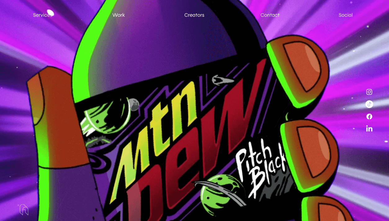
Image source: https://www.animalmusicstudios.com/
What makes it stand out:
- Auditory Engagement: As an attention-grabbing element, the immediate auditory experience upon entering the site captivates website visitors. Visitors are submerged in sound, ensuring they quickly grasp the core of what Animal Music Studios brings to the table.
- Stellar Visual Design: Employing a design trend, the monochromatic color scheme contrasts beautifully with colorful representations of sound. This is more than just eye-catching; it amplifies the brand’s message about the vibrant nature of sound, optimizing the first impression.
- Interactive Elements: The dynamic sound bars aren’t just typical design elements; they add interactivity. Such animations ensure that visitors actively engage with the site, improving overall user experience.
- Clear and Unique Navigation: The side navigation bar, an essential part of the website layout, is both effective and distinctive. It doesn’t obstruct the primary visual space but is easily accessible, ensuring a seamless and user-friendly experience.
- Portfolio Showcase: With high-quality visuals, their work is presented such that it’s easy for users to understand the breadth of projects Animal Music Studios has been involved in. Each project is well-defined, ensuring smooth browsing.
Areas for Improvement:
- Project Context: While the visuals are striking, adding brief descriptions could provide the necessary context, addressing any visitor pain points about understanding the nature of the work.
- Defined Call-to-Action (CTA): A more pronounced CTA button, maybe in the form of “Hear More” or “Get in Touch,” can better guide visitors. This optimization can prove crucial in retaining the visitors’ attention and guiding them through desired actions.
Homepage Example 3: The Spice Suite
The Spice Suite’s website homepage design is an enchanting blend of commerce and community. Primarily offering a diverse range of spices, it also serves as an ecommerce site and hub for culinary enthusiasts. Events are hosted, promoting a sense of community and fostering a close-knit bond among its members.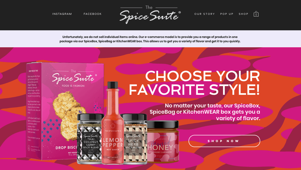
Image source: https://www.thespicesuite.com/
What makes it stand out:
- Vibrant Imagery: The website is a visual treat. High-resolution images of spices and culinary creations ensure that this ecommerce site captures the visitors’ attention. This imagery not only showcases their products but also exudes the joy and passion embedded in everything they offer.
- Community Spotlight: From the homepage itself, the Spice Suite’s emphasis on community becomes evident. Whether it’s highlighting upcoming events or showcasing testimonials from community members, it’s clear that this isn’t just an ecommerce site—it’s a thriving community.
- Informative Product Descriptions: The website design examples ensure that each spice or product is visually showcased and paired with an informative description. This approach guarantees that customers understand exactly what they’re getting and can discover new flavors seamlessly.
- Seamless Navigation: An effective website layout is showcased with a clean top navigation bar. It ensures users can easily move between shopping sections, exploring the spice club, or delving into the brand’s story.
- Personal Touch: Their unique value proposition shines through the inclusion of the brand’s backstory and the journey of its founder. This adds a personal touch, ensuring a deeper connection with visitors.
Areas for Improvement:
- Clearer Call-to-Action (CTA): Although the design elements are impeccable, introducing a more clear CTA button, like “Shop Now” or “Join Our Community,” could enhance user experience and guide them efficiently.
Homepage Example 4: Apple TV
Apple TV is a streaming service offered by Apple Inc., offering an extensive library of original shows, movies, and documentaries. The platform provides high-quality content with a blend of genres to cater to diverse audience preferences.
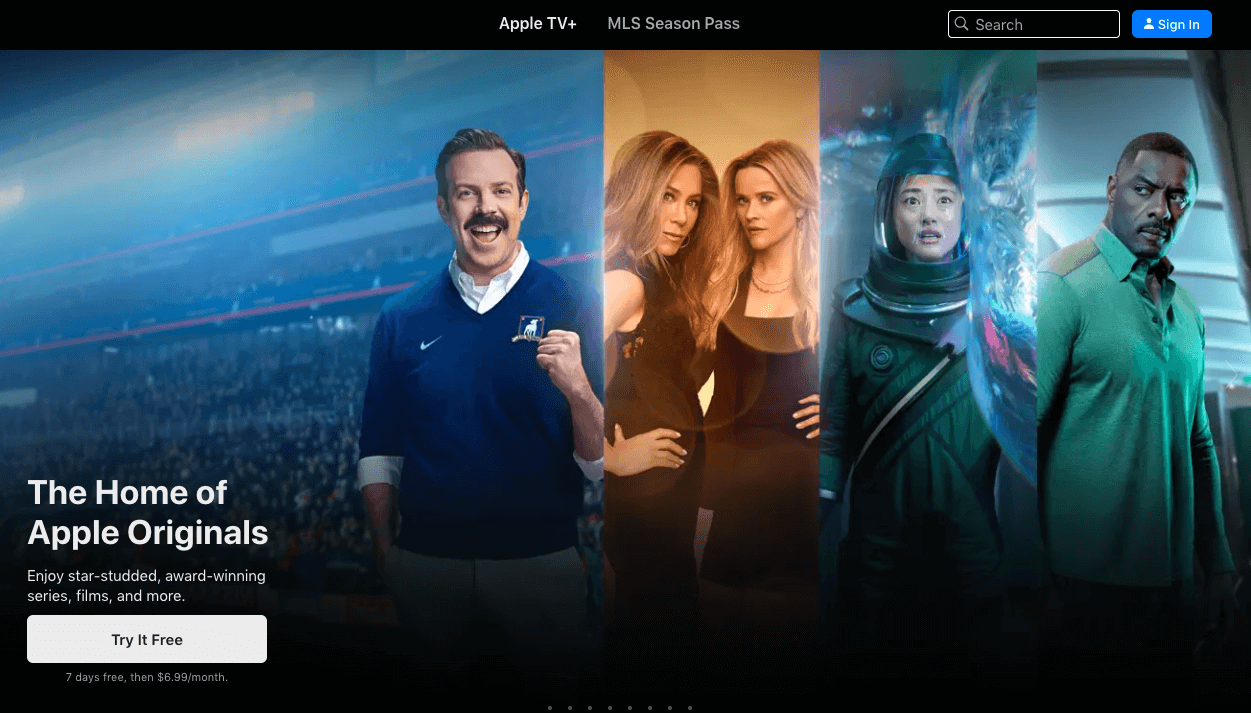
Image source: https://tv.apple.com/
What makes it stand out:
- Minimalist Design: Apple has always been a flagbearer of simple design. The website layout of Apple TV is no exception. With a heavy emphasis on visuals and a restrained color palette, the design aligns seamlessly with Apple’s broader brand identity.
- Dynamic Hero Section: Upon entry, website visitors are greeted with a high-quality trailer of a featured show or movie, which auto-plays. This not only is attention-grabbing but provides an immediate taste of the content’s quality.
- Clear Call-to-Action (CTA): The CTA buttons, such as “Watch now” or “Start Free Trial,” are evident and strategically placed, guiding the user’s journey and encouraging conversions.
- Typography and Imagery: The typography is consistent, clear, and complements the vibrant imagery of show posters. Such visuals act as effective homepage features to attract and retain attention.
- Interactive Navigation: The navigation experience is smooth, with a clear navigation bar at the top and sections dedicated to individual shows and movies that users can scroll through. Each show or movie tile acts as an interactive portal to its dedicated page.
- Use of White Space: Apple’s consistent use of white space around textual elements ensures the design doesn’t feel cluttered, even with numerous content tiles.
- Testimonials and Reviews: For select shows, ratings and reviews from critics provide social proof of the content’s quality.
Areas for Improvement:
- More Distinct Categories: While the website homepage design example is sleek, some users might appreciate a more evident categorization of content – drama, comedy, documentaries – for quicker navigation.
- Personalized Recommendations: Integrating a system where users can get personalized recommendations based on viewing history can enhance user experience.
- Footer Information: A more detailed footer with quick links, FAQs, or other pertinent information might be beneficial for users looking for additional platform details or support.
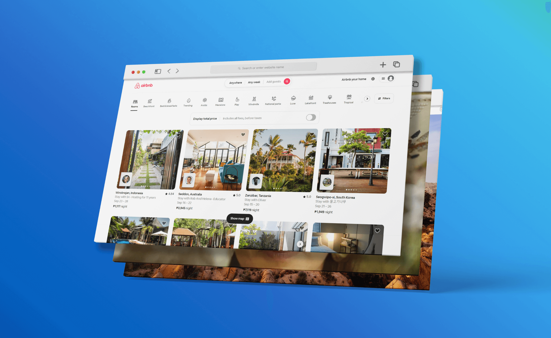
Homepage Example 5: Airbnb
Airbnb is a pioneering platform in the sharing economy, connecting travelers with hosts offering unique accommodations across the world. It has redefined the travel experience for millions, emphasizing local, authentic, and affordable stays.
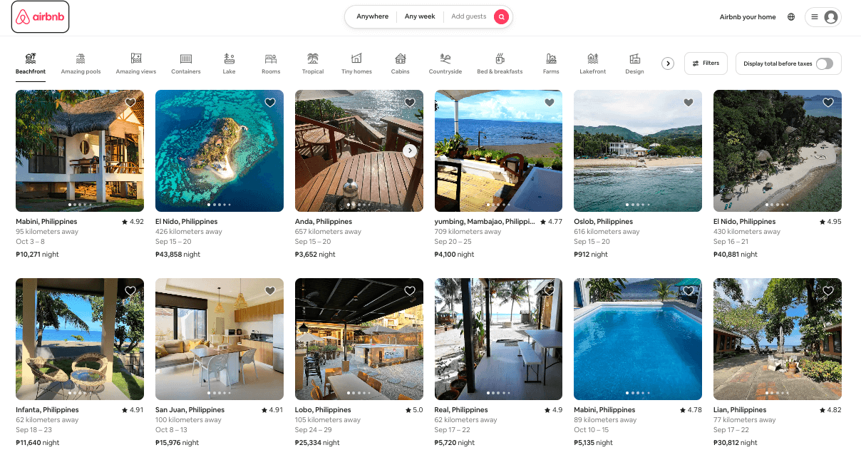
Image source: https://airbnb.com
What makes it stand out:
- Vibrant Imagery: Airbnb‘s homepage is replete with high-quality images of diverse accommodations, from cozy city apartments to treehouses in secluded woods. These visuals not only showcase the range of listings but also inspire wanderlust.
- Search-Centric Design: One of the most dominant features on the homepage is the search bar, reflecting Airbnb‘s user-centric approach. This feature encourages visitors to immediately start their booking journey.
- Clear Call-to-Action (CTA): Airbnb employs clear CTAs, such as “Start your search” or “Become a host.” These guide users effectively, whether they’re looking to book a stay or list their property.
- Engaging User Stories: The platform highlights reviews and stories from its community, which offers social proof and emphasizes the unique experiences Airbnb offers.
- Interactive Navigation: The navigation bar is intuitive, categorizing stays, experiences, and online experiences. Each section on the homepage, be it “Top-rated stays” or “Online Experiences,” guides users deeper into the site.
- Use of White Space: Airbnb’s design maintains a balanced use of white space, ensuring that despite the range of information and visuals, the design remains clean and uncluttered.
- Localized Recommendations: Based on user location or search history, Airbnb often provides localized recommendations, enhancing the relevancy of content for the user.
Areas for Improvement:
- Personalized Experience: While Airbnb does offer some level of personalization, enhancing this by curating homepage listings or experiences based on user behavior could further drive engagement.
- Enhanced Filter Options: While Airbnb offers a plethora of filters for users, making some of the more popular ones (like “pet-friendly” or “pool”) immediately accessible on the homepage could enhance user experience.
- Footer Clarity: The footer contains a lot of information. Streamlining this or categorizing it more clearly can make it easier for users to find essential links or details.
Industry Hindsight
Website design, much like any other creative field, has witnessed significant evolution. From the cluttered and gif-heavy pages of the early internet to today’s sleek, responsive, and user-centric designs, the journey has been transformative.
Modern design trends are heavily influenced by user behavior, technological advancements, and branding needs, ensuring that form always complements function.
The emergence of platforms like Airbnb shifted the design paradigm with their website homepage design example, featuring simple layouts but with attention-grabbing visuals. The success of such platforms underscores the importance of prioritizing the user experience.
Today, with the proliferation of ecommerce sites and diverse online platforms, design elements like bright colors, bold colors, intuitive dropdown menus, and carousels have gained prominence. Homepage features have evolved to accommodate diverse needs, from conversion rates optimization to brand storytelling.
Additionally, the integration of headers and navigation bars plays a pivotal role in guiding users. The fonts used, the use of white space, and even the strategic placement of CTA buttons and dropdown menus influence user interactions. Taking screenshots of different website design examples from industry leaders can provide valuable insights into current trends and inspire innovative approaches.
In Summary
An effective website homepage is a combination of aesthetic appeal, user-centric design, and clear messaging. It’s the digital face of a brand and plays a crucial role in shaping perceptions, driving engagement, and guiding users toward desired actions.
By observing and drawing inspiration from standout designs, businesses can better position themselves for online success. Incorporating elements like call-to-action buttons, effective pricing strategies, and an optimal website builder can significantly improve a brand’s online presence and performance.
It’s also essential to continually assess and recalibrate designs based on changing user preferences and industry advancements.
If you need further guidance on optimizing your website design, book a consultation with Cyphon Digital. Our team is here to provide expertise and tailored recommendations for your unique needs.
Website Homepage Design Examples FAQs
Q: Why is homepage design crucial for a business?
A: The homepage is often the first point of interaction between a brand and a potential customer. A well-designed homepage can attract, engage, and convert visitors, enhancing brand awareness and addressing customer pain points.
Q: How often should I update my website’s design?
A: While there’s no hard and fast rule, it’s recommended to evaluate and, if necessary, update your website design every 2-3 years to stay relevant and user-friendly.
Q: What are some key elements of a successful homepage?
A: Clear CTAs, intuitive navigation, responsive design, high-quality images or visuals, concise, compelling copy, and essential homepage features are some of the key elements.
Remember, the design realm is ever-evolving. Stay updated, be inspired, and continually optimize to craft a great website homepage design example that resonates with your target audience.
