Having an exceptional website layout is more than just appearance. The best website layouts also boost credibility, generate positive user experiences, and drive conversions and sales for your ecommerce brand.
Those are the type of results that Cyphon Digital web design and marketing experts have driven for our clients since 2001.
To help you develop a website layout with results-driven design elements, we put together this list of the 10 best website layouts and what you can steal from them to enhance your own.
Keep reading to learn about the top website layout design principles, and get inspired by the best website layouts and what makes them so effective.
Quick Guide Section Here
- Top Website Layout Design Principles in 2023
- 10 Stunning Best Website Layout Examples
- How to Design a Stunning Website Layout in 2023
Top Website Layout Design Principles in 2023
To ensure your website creates a pleasant user experience, and encourages clicks and conversions, it’s important to follow the most recommended and essential website layout ideas and design principles.
Visual Hierarchy
Maintaining visual hierarchy means arranging elements for continuity, flow, and organization. It can also be used to ensure the most important aspects stand out and attract the eye.
You should strive for a website layout that organizes visual characteristics in a logical and strategic way that makes it easy for users to absorb the information and naturally progress toward the call to action.
White space
Having too many elements without a balance of white space can be stressful and cluttered. By using a balance of white space, images, and text content, you can cultivate an appearance that is easier on the eyes.
You can also use negative space to guide a user’s attention toward specific focal points or sections of the page layout.
Consistency
Consistency is important to ensure that all the elements of your website align to create a harmonious whole. This will provide a more positive user experience, improve navigation, and eliminate frustration.
Plus, by laying out the website in a consistent way, you make it easier to swap elements in and out for A/B testing or design changes.
Accessibility
People with disabilities spend a half-trillion dollars annually. That means that considering the readability of your typography, headline hierarchies, high-contrast color schemes, and simple keyboard navigation could impact your bottom line in addition to your reputation.
Also consider using text-to-voice widgets, translation toggles, alt text for images, and video captions to boost accessibility and usability.
Rule of Thirds
The rule of thirds is an old design principle that’s still relevant in 2023. Use this approach to break your web layout into a 3 x 3 grid and then place images, text, and other web design elements at each intersection.
Using this grid layout can improve the balance and symmetry of your website or landing page.
Scannable Design
Having a scannable design with subheadings, images, graphics, icons, and bullets makes it easy for visitors to find what they’re looking for. If they are interested in a specific subheading, then they can read the content beneath it.
Effective CTA
Any good website layout will have an effective call to action that’s strategically placed to encourage conversions.
Whether you have a landing page with a single CTA or a homepage with a full navigation menu, it’s smart to spread buttons throughout the page layout to make them easy to find. Plus, make sure you use actionable messaging with power words like “Get,” “Try,” “Free,” or “Buy.”
Branding
The best business websites have a layout design that aligns with their brand. Whether that means a minimalistic design with effective use of white space, a reliance on visual images and videos, or anything else will depend on your unique brand image and messaging.
10 Stunning Best Website Layout Examples
These websites have the best design layouts, including specific stunning elements, choices, and features that you might want to consider stealing for your own ecommerce website.
Basecamp
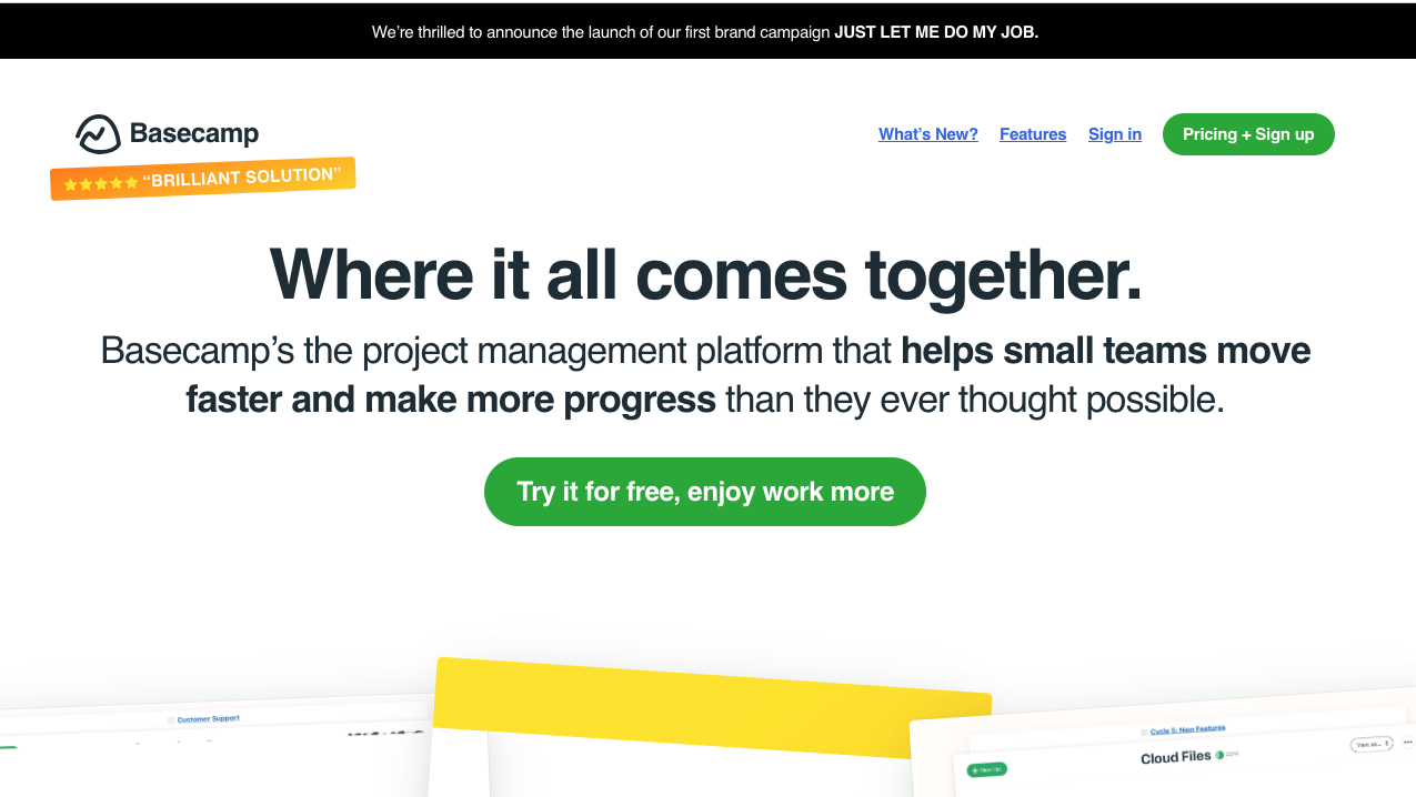
Image source: https://basecamp.com/
Basecamp uses a z-pattern design with their hero section that mimics the way the human eye reads starting from the top left and moving across before scanning through the centered CTA button and bottom left to right.
This common layout is user-friendly, organized, and directs attention to the CTA as a focal point.
Why the Layout is Stunning:
- Basecamp uses various techniques to attract the eye, including contrasting colors for CTA buttons, bold text, bullet points, underlines, and clear headers and subleaders.
- The zigzag design and simplified homepage layout make conversions the primary focus, but the design doesn’t impede navigation to other areas.
Nomadic Tribe
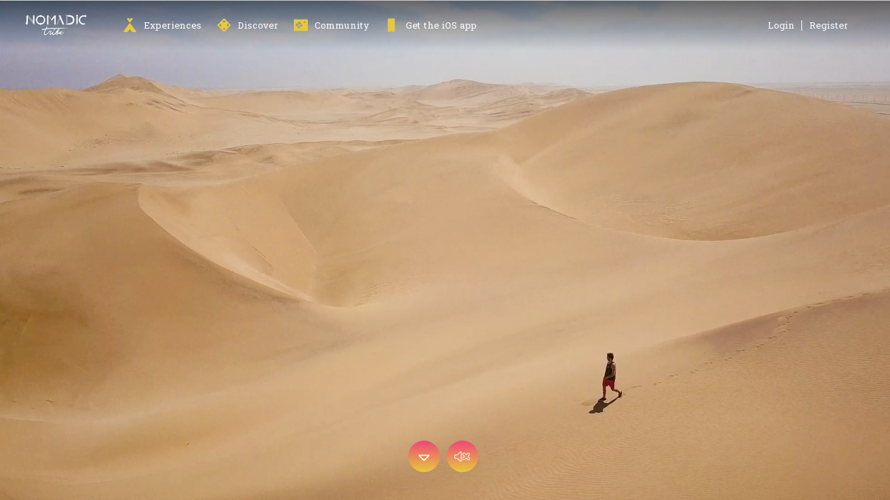
Image source: https://nomadictribe.com/
This stunning website starts with a screen-size video demonstrating the brand’s value and purpose.
Plus, the layout combines white space, high-quality images, on-brand messaging, and interactive features for an engaging and pleasant user experience.
Why the Layout is Stunning:
- High-quality videos and interactive elements promote engagement while telling a brand story that maintains a cohesive structure throughout each webpage.
- The homepage is logically designed with strategically placed CTA buttons throughout, organized use of white space, and a navigation bar for easy accessibility.
Apple
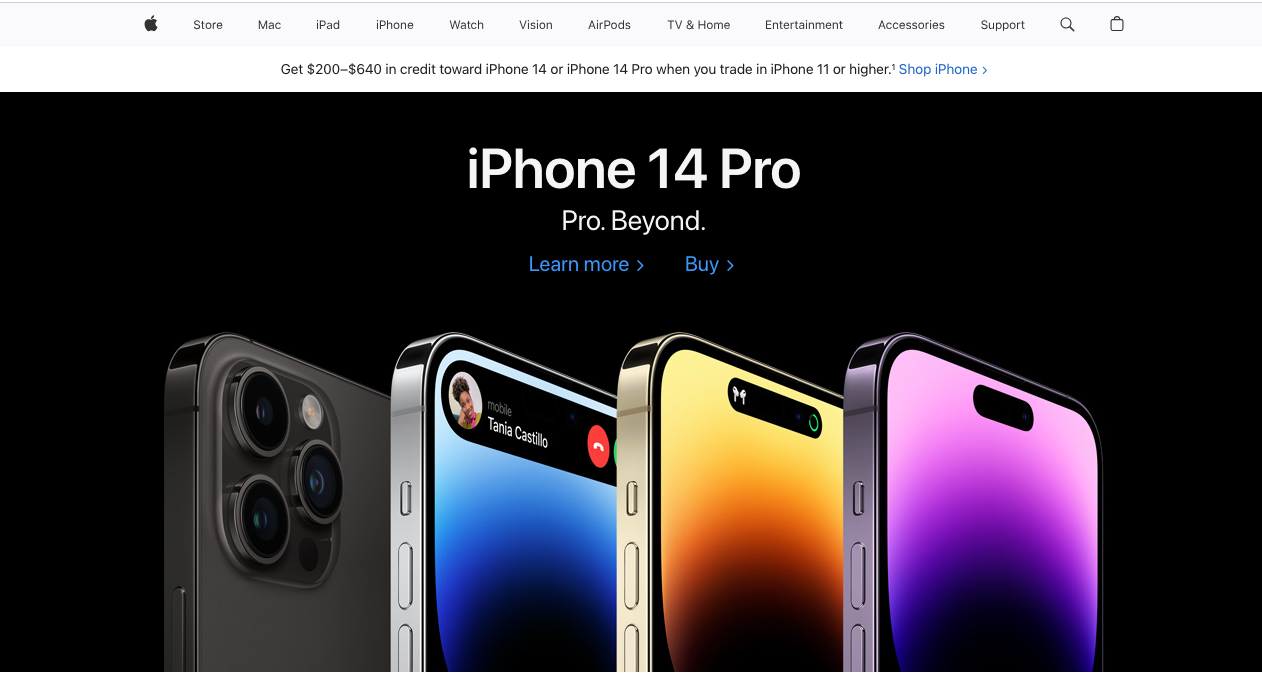
Image source: https://www.apple.com/
Apple’s homepage uses centered high-quality images that align with the intersections on the grid pattern created by the rule of thirds. Their product page designs use alternating images, headers, CTAs, and text in a single-column layout that keeps the eyes flowing down the page.
Why the Layout is Stunning:
- The minimalistic design combines exquisite high-quality images with concise, but effective copywriting that encourages simple navigation, promotes on-brand messaging, and keeps visitors scrolling and clicking.
- The attractive single-column layout is easy on the eyes, uncluttered, and consistent across pages. Whenever the layout deviates from the single column, it does so with balance by following the rule of thirds.
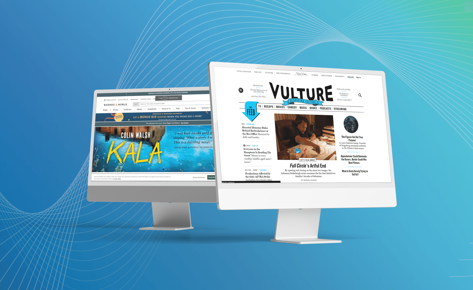
Vulture

Image source: https://www.vulture.com/
Vulture is a stunning example of a magazine layout often used for content-heavy news websites to create a stimulating and complex visual hierarchy without overwhelming the visitor.
They use a simple navigation menu as well as different text sizes, colors, and emphasis animations to improve the user experience and make it easy to find what you’re looking for.
Why the Layout is Stunning:
- The exceptional visual hierarchy includes the biggest and most recent stories at the top of the page (even including publication times for relevance) while directing the reader throughout the webpage using simple navigation, arrow graphics, and emphasis underlines for usability.
- The large, featured image on the homepage promotes an f-pattern layout that caters to both readers and scanners with short attention spans. It’s readable and clean while still offering lots of content as a news publication.
Barnes & Noble

Image source: https://www.barnesandnoble.com/
Barnes & Noble’s website isn’t stunning because it does anything revolutionary, but it’s a great example of how you can use a standard symmetrical grid pattern while boosting engagement with interactive elements.
The large images attract attention, copywriting stays concise and on-brand, and the content is vertical with horizontal slideshows for engagement and easy browsing, just like at a bookstore.
Why the Layout is Stunning:
- Demonstrates how you can stick with a simple grid layout without it being boring by interspersing interactive slideshows, large images, visual navigation, and a hierarchy that mimics physical bookstore browsing.
This is particularly a good option for portfolio websites or ecommerce sites with dozens of products to offer.
- Uses symmetry through every page of the website with a variety of different full-screen images as well as small and medium-sized visuals to break up the sections in a way that makes it easy to browse without feeling monotonous.
Underbelly

Image source: https://www.underbelly.is/
This attractive website not only uses exceptional visuals and videos on its homepage, but all pages are stunning and cleverly use asymmetry by alternating images and text, parallax scrolling animations, and purposeful interactive features.
Why the Layout is Stunning:
- Uses a fantastic parallax scrolling video on the homepage to showcase its services and capture the eye. You can even see the top portion of the video above the fold, which promotes curiosity to get the visitor to scroll down.
- By using an alternating zig-zag design and asymmetrical layout, the website is easier to read and never has too many images or text together. They also use images, interactive menus, and animations to break up the elements.
62 Management
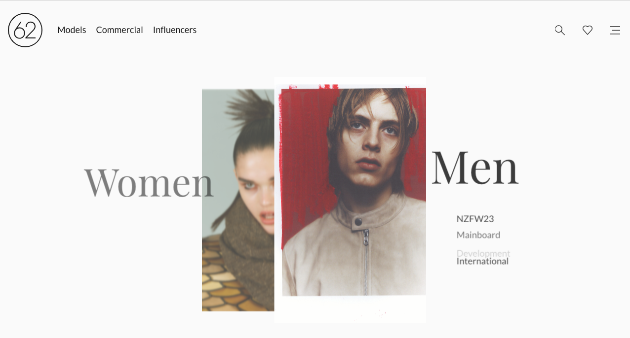
Image source: https://62management.com/
When you land on this website, you are greeted with a split-screen interactive splash page that allows visitors to choose whether they want male or female models.
After a page change, their card-based layout, use of white space, and easy-to-read typography are minimalistic and designed specifically to help potential clients find what they are looking for.
Why the Layout is Stunning:
- Exceptional use of a split-screen layout that acts as an interactive splash page. This is a great way to target the experience, including the layout, to different customer demographics.
For example, if you offer B2C and B2B services, you can use this to streamline leads.
- The card-based image layout is an easy and user-friendly way to showcase multiple products or services and the minimalistic design shows that 62 Management wants to eliminate clutter, minimize complexity, and simplify the experience for their visitors.
Tu Biomics
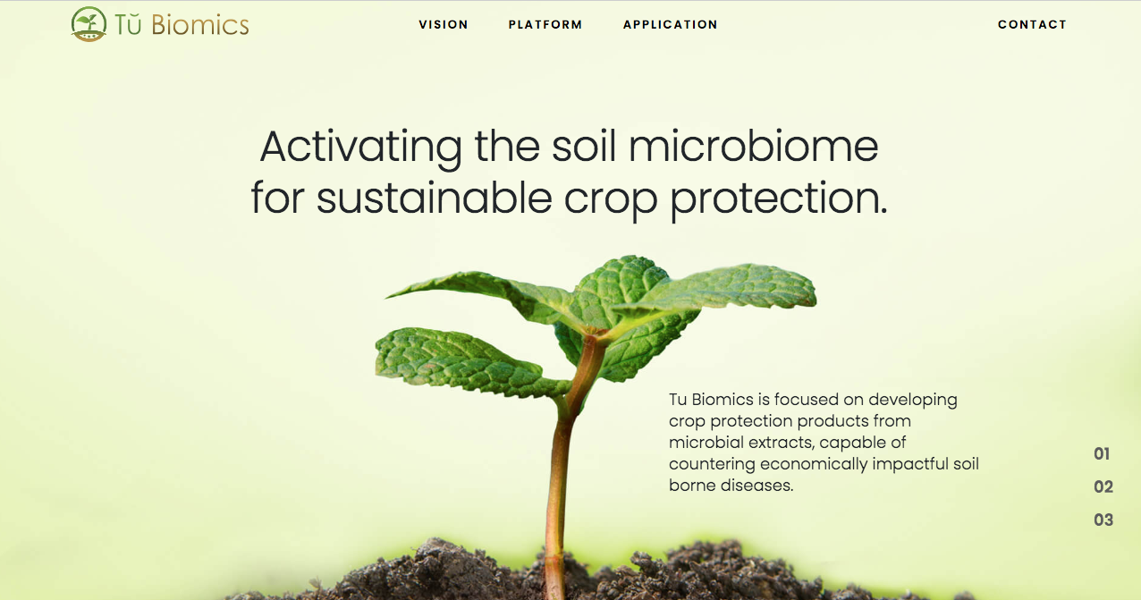
Image source: https://www.tubiomics.com/
This unique single-page website begins with a visual of a small plant with copywriting that tells guests exactly what they do and why. As you scroll, you enter the soil beneath the plant and continue through a visual hierarchy that promotes the brand story and vision.
Why the Layout is Stunning:
- Unique visual hierarchy that begins with their specific value proposition, matches the brand, and propels visitors along a journey from “Vision,” to “Platform,” and straight to the CTA application form.
- The two-column design with text on the left and visuals on the right makes for an organized appearance. Even if you click on “Read More,” the single-page design includes a pop-up to maintain the narrative-based hierarchy and two-column layout.
Hardgraft
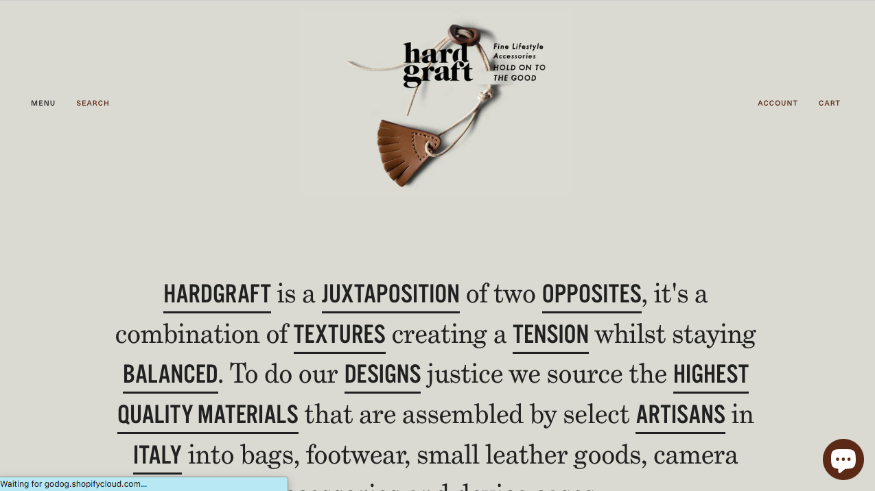
Image source: https://www.hardgraft.com/
This website has a great layout and begins with an exceptional value proposition that includes words like textured, tension, balanced, and juxtaposition.
These elements of their products are found throughout their website with a not-quite symmetrical layout, non-traditional background color, and a navigation menu that drops down on the edge of the screen.
Why the Layout is Stunning:
- The website is mostly symmetrical but offers enough juxtaposition to boost engagement without interfering with functionality.
- Lots of white space (that’s not really white, but a brand color) that ensures the eyes are attracted to other elements like high-quality images or Imaginative messaging.
George Nakashima Woodworkers
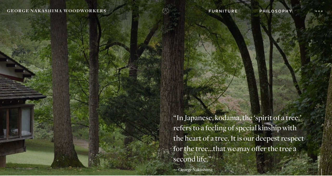
Image source: https://nakashimawoodworkers.com/
This website layout is fantastic with everything aligning toward their brand vision and speaking to their potential customers including the large changing images in the hero section, quotes that evoke their philosophy, and a sense of alternating balance.
It offers a stunning balance of high-quality photos, on-brand text, and simple navigation.
Why the Layout is Stunning:
- The changing images in the hero section show the progress of their vision. Plus, it’s clickable and takes you to their “Philosophy” page which further tells their brand story.
The entire website, in fact, offers a page-by-page narrative that the visitor can follow, interact with, and learn about.
- Interactive features don’t distract from the primary purpose: to tell visitors about their brand, what they offer, their unique vision, and how they can help visitors.
How to Design a Stunning Website Layout in 2023
Now that you’ve seen some of the best website layout examples, you can implement some of those same strategies to your webpage. Here are some tips to ensure your website is just as stunning as the examples above.
Focus on User Experience
Your website is designed for your visitors, so make sure the layout speaks to them. There are many ways to do this, including offering simple navigation sidebars that are clear and easy to find.
Ensure your layout, copywriting, and images target their pain points, needs, and goals. Also, don’t forget to make your website mobile-friendly for visitors who access it via mobile devices.
If possible, use the layout to move them through the lead or buyer’s journey like Tu Biomics does with one of the best website layouts. For example, by following a visual hierarchy, leads in the aware stage will just see the most important information.
Still, the most interested bottom-of-funnel leads will scroll further toward the primary call-to-action and most detailed information.
Maintain Consistency
Your website layout, as well as the color scheme, typography, and other elements, should remain consistent throughout each webpage.
Apple does a great job of this by using a column layout, high-quality images, and concise copywriting to maintain a distinct brand throughout its website as well as other avenues like social media.
This will create a more memorable experience for potential customers and can build credibility and trust. Plus, it makes website design easier because you won’t have to create completely different elements.
In fact, you can use Wix, WordPress, or another company to download a template that ensures consistency and requires little-to-no knowledge of CSS or HTML.
Include Most Important Info at the Top
As we mentioned before, following a visual hierarchy means placing the most important information at the top of the page. This can include your value proposition, offer, and CTA as well as other essential information about your product or service.
That way even if a visitor doesn’t scroll far, they see the most crucial information about your brand. You can also attract their attention to important elements by using bolding, bullets, sub headers, underlines, and animations.
Consider Readability
Make sure your visitors can easily read through your web pages. You can improve readability by using a clear font, plenty of headings and subheadings, a balance of white space and visual elements, and bullets or icons. You can also break up longer paragraphs of text.
Regarding website designs, F-shaped layouts like Vulture and z-shaped or zig-zag layouts like Basecamp or Underbelly are much easier to read.
That’s because they mimic the way we naturally read. Neilson even published a study in 2006 that demonstrated that most website visitors scan content in an f-shape.
Promote Simplicity
Including too many animations, videos, colors, asymmetrical layout choices, and other elements can overwhelm your visitors.
While it’s okay to use these elements, and doing so could help you create a stunning website, simplicity is also crucial for a user-friendly design that promotes credibility and trust.
Some simple layouts you might want to consider are grid-based, single-column, double-column, or zig-zag layouts. All of these are straightforward, and you still break up the symmetry with videos, CTAs, social proof, and other conversion-focused elements.
Conclusion
The most stunning and best website layout examples promote readability, simplicity, consistency, accessibility, and memorability with user-friendly design elements, scannable messaging, exceptional branding, and balanced features.
You can do the same thing by focusing on the user experience and ensuring a simple, easy-to-navigate, and conversion-focused layout that speaks to your customers.
Keep the most important info at the top for a clear visual hierarchy, and remember the rule of thirds to maintain balance. That way, you can create the most stunning website promoting credibility and growth for your brand.
Website Layout FAQs
What is a website layout?
A website layout is essentially a framework or template that provides the basic structure for a website. The right layout for your business will provide clear navigation, structure information for usability, and encourage a meaningful and strategic visual hierarchy.
What are the components of a website layout?
A website layout can include several components or elements, including a hero section, navigation bar or menu, header, CTA buttons, images, text content, footer, and hero section.
How can I create a stunning website layout?
There are a few options for creating a stunning website layout similar to the best website layouts above.
The first is to customize a unique web design on your own using code, but that’s not a preferable option for business owners or brands without an in-house design team.
Another option is to use a website builder like Squarespace, Wix, or WordPress. This simplifies the process but might be limited to specific layouts and not as customizable.
The last option is to use a web design agency like Cyphon Digital. We combine professional web development and design with marketing expertise to design the best website layout for your business.
We’ll ensure that it includes all the best elements for your target customers, includes the right type of content, tells your brand story, and, most importantly, generates revenue and drives conversions.
Click below to schedule a free consultation to tell us about your website goals and concerns!