In a world where 9 out of 10 people access the internet through their mobile devices, how confident are you that your website meets their needs?
With mobile users set to skyrocket even further, industry leaders have adopted a mobile-first approach, yielding higher engagement, satisfaction, and conversion rates. This isn’t just a trend; the numbers validate its potency.
Dive into this comprehensive guide, which focuses on mobile website design inspiration. We’ll take you on a journey through the essentials of mobile-first design, spotlighting leading mobile websites that are captivating audiences today.
By the end of this blog, you’ll be equipped with actionable insights and inspiration to launch your website into a user-friendly masterpiece, primed to capture and engage the modern mobile user.
Jump here:
- Mobile-First Design as a User-Centric Approach
- Mobile Website Design Inspiration
- Mobile Users are Dominant Consumers
- Key Takeaways
- Mobile Website Design FAQs
Mobile-First Design as a User-Centric Approach
Mobile-First Design is not about merely squeezing a desktop site into a mobile screen. It’s about starting the design process with mobile users in mind, acknowledging the constraints and unique features they present.
With smaller screens, touch interactions, and varying network conditions, a design tailored for mobile ensures that the user experience is seamless, comfortable, and prioritizes essential features and interactions.
Advantages
- User Engagement – Mobile-first design matches the rapid growth of mobile users, enabling businesses to reach a more extensive audience, enhancing customer satisfaction and retention.
- Efficiency & SEO Benefits – This approach champions minimalism, ensuring faster load times and reduced bandwidth consumption. Notably, search engines like Google prioritize mobile-optimized sites, boosting the online visibility of businesses that embrace mobile-first design.
Real-World Examples
Instagram – Started solely as a mobile app, it’s a testament to mobile-first design, with an interface optimized for ease of use on small screens.
Airbnb – Their mobile-first strategy ensures users can smoothly search, communicate, and book listings.
Spotify & Slack – Both platforms emphasize a mobile-first design, offering users intuitive, simplified, and effective interactions across varied screen sizes.
Mobile-first design isn’t a fleeting trend; it’s the future of digital interactions. Companies like Instagram, Airbnb, Spotify, and Slack stand as testaments to its efficacy. As the digital world becomes increasingly mobile-centric, adopting a mobile-first design is less about staying current and more about future-proofing your business.
Mobile Website Design Inspiration
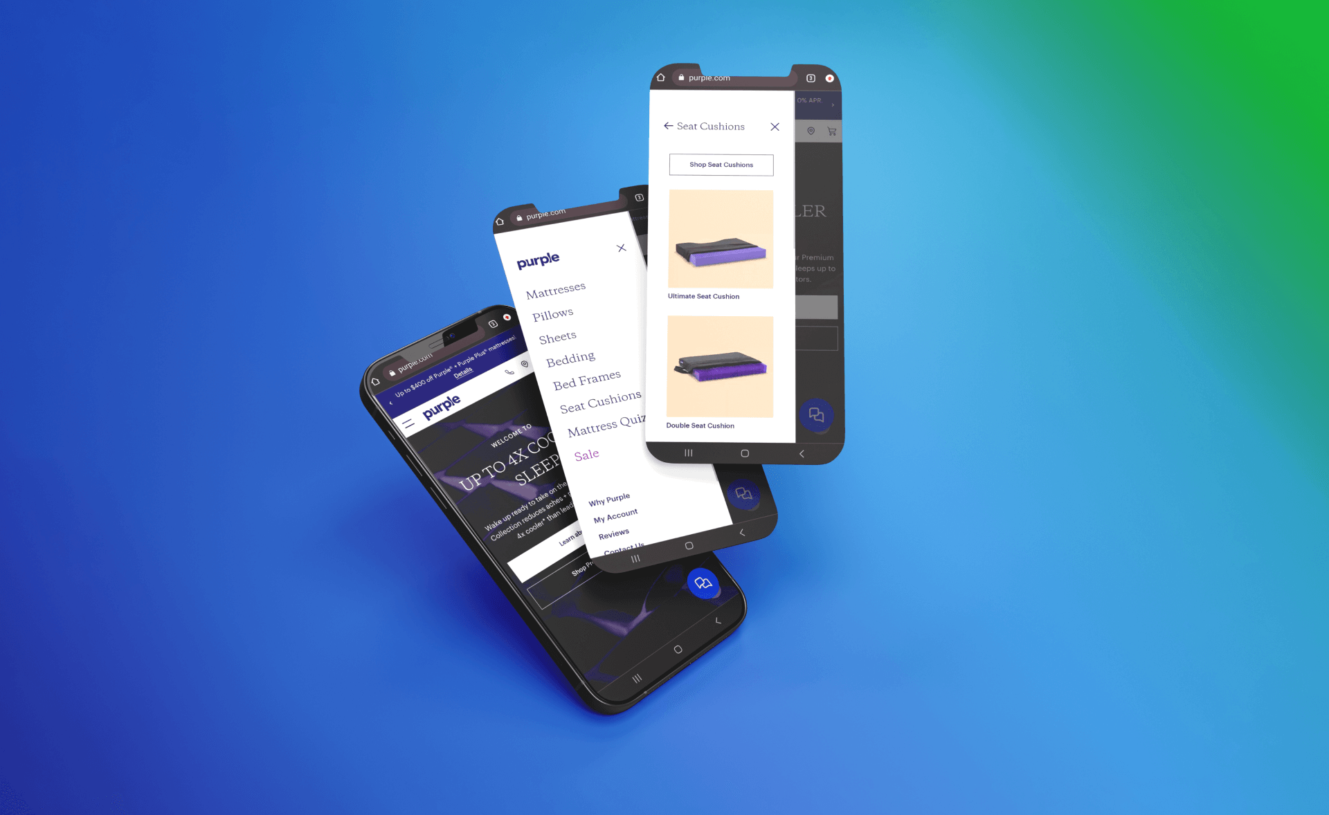
Purple
Purple revolutionizes the sleep and comfort industry with its state-of-the-art mattresses and cushions. Harnessing a mobile-friendly approach, its website offers an intuitive journey, seamlessly guiding users from product discovery to purchase. The essence of Purple’s innovation shines through every mobile page, promising not just a product but a transformative sleep experience.
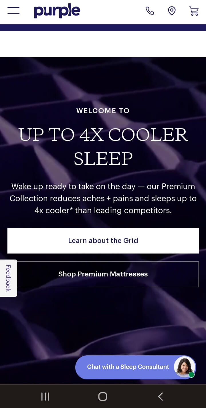
Image source: https://purple.com
Why We Love It:
- Streamlined Navigation: On Purple’s mobile website, everything feels intuitive. The hamburger menu, clear call-to-action buttons, and fluid scroll ensure users can find what they’re looking for without any friction, epitomizing best practices in mobile web design.
- Impactful ‘Hero’ Section: The ‘hero’ sections on product pages are not just visually pleasing but also informatively rich. They concisely provide essential details, ensuring mobile users grasp the unique selling points at a glance.
- Engaging Visual Experience: Purple employs a mix of original product photos and animations, tailored for mobile screen sizes. These visuals don’t just showcase products; they tell a story of comfort and innovation, enhancing user engagement.
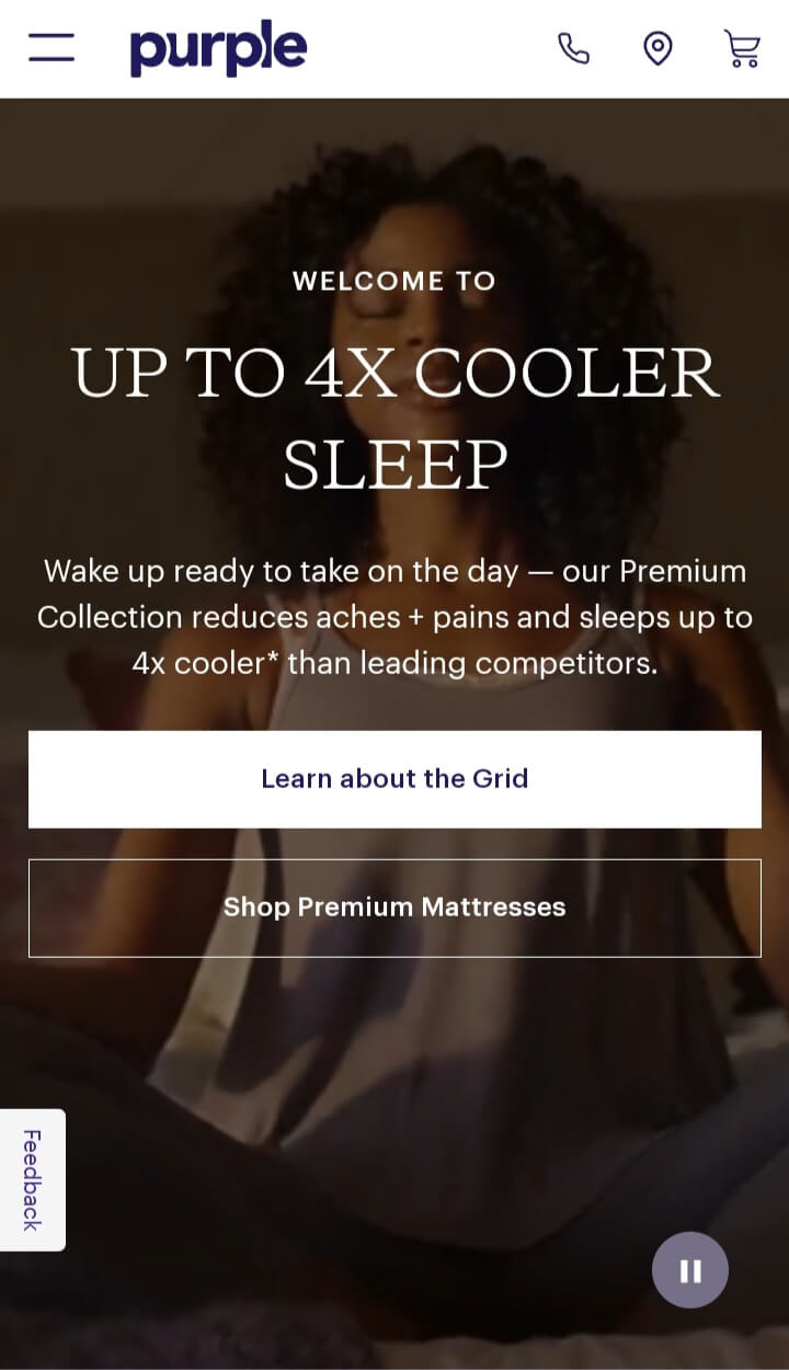
Image source: https://purple.com
- Optimized Product Interaction: Product customization and selection feel seamless on mobile. Whether adjusting mattress sizes or viewing cushion types, the design ensures users feel no limitations, showcasing the finesse of mobile-friendly ecommerce functionalities.
- Swift Load Times: Recognizing the impatience of mobile users, Purple’s mobile site is optimized for quick loading times, ensuring a smooth user experience devoid of frustrating lags, which is crucial for keeping potential customers engaged.
Domino’s
Domino’s mobile site is an exemplar of functional design. Prioritizing a user-friendly approach, it transforms the pizza ordering journey into an intuitive and efficient mobile experience.
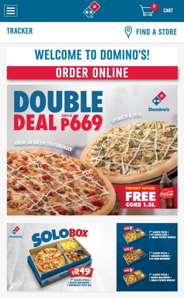
Image source: https://www.dominos.com/
Why We Love It:
- Clear User Pathway: Domino’s showcases exemplary web development, meticulously streamlining its ordering process. The progression from item selection, to customization, and order finalization minimizes roadblocks for mobile users.
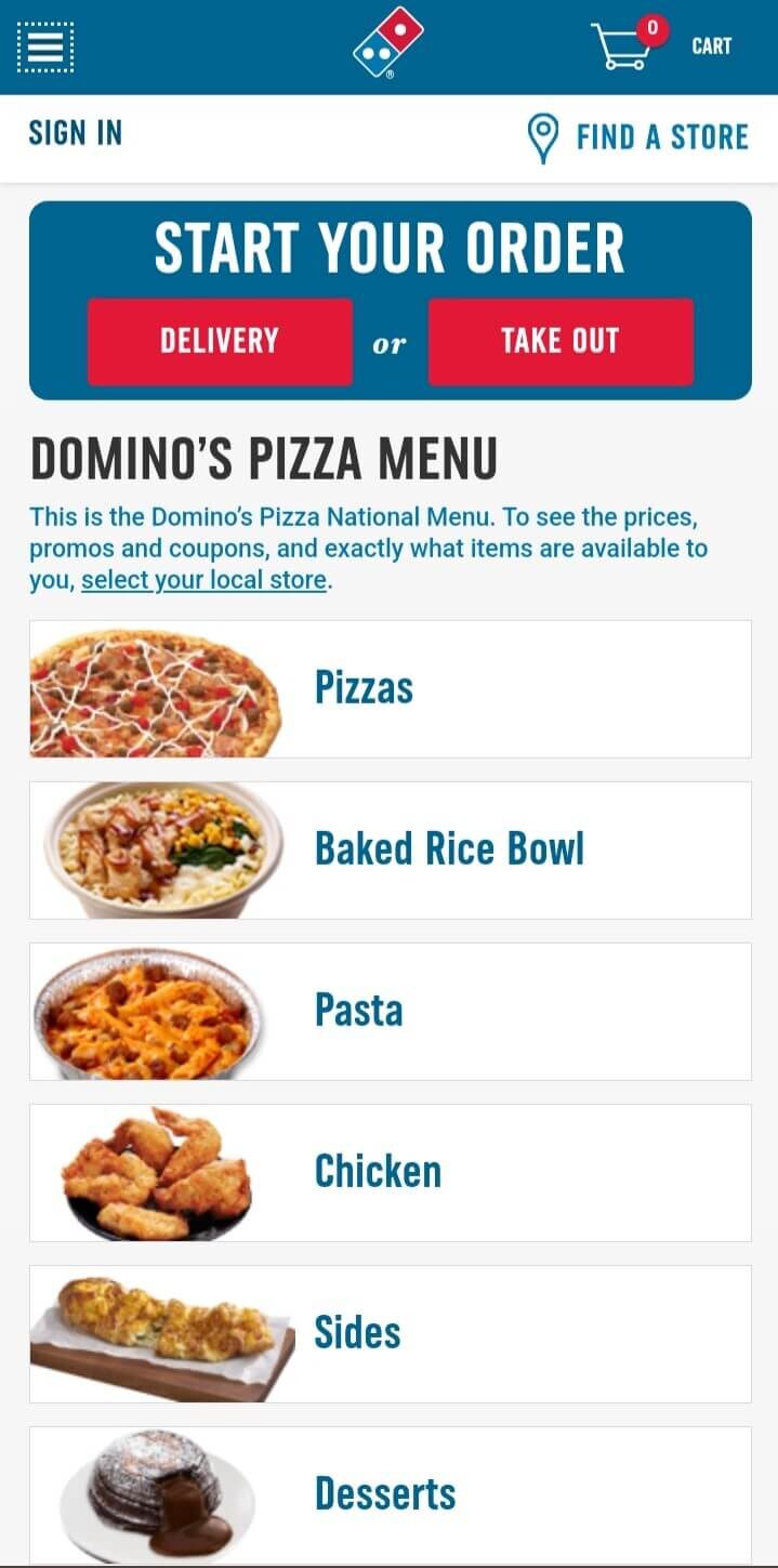
Image source: https://www.dominos.com/
- Innovative Features: ‘Dom’, the ordering bot, stands true Domino’s commitment to advanced digital engagement, evolving beyond traditional ecommerce functionalities.
- Adaptive Design: Domino’s responsive web design ensures complex pizza customization, from toppings to crusts, feels effortless, thereby enhancing the mobile experience.
- Prompt Accessibility: Quick-access features, whether it’s menu viewing or order tracking, underscore Domino’s dedication to efficient user service on smartphones.
Etsy
Etsy stands out as a premier online marketplace, predominantly featuring handcrafted and vintage items. With a responsive web design, its platform masterfully combines personalized browsing and targeted search, epitomizing best practices in mobile website design inspiration and serving as a haven for diverse buyer intentions on smartphones.
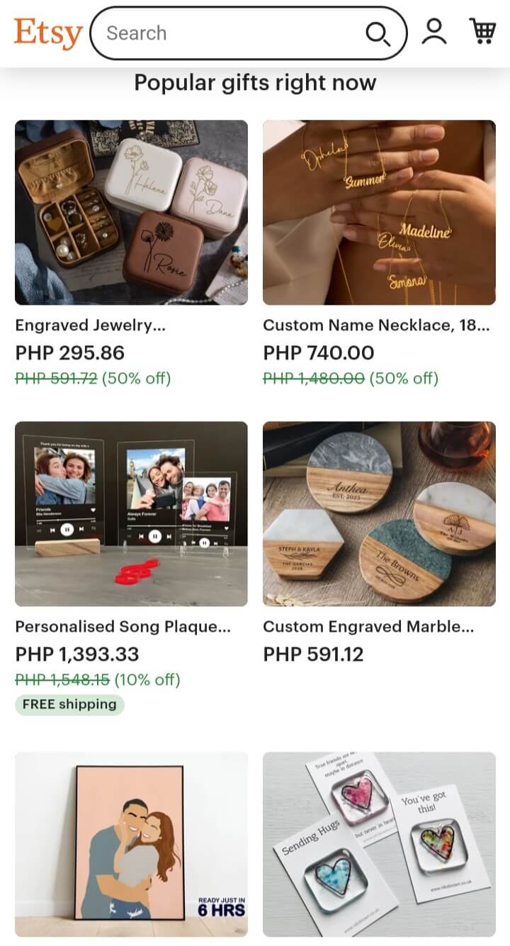
Image source: https://www.etsy.com/
Why We Love It:
- Tailored User Experience: Etsy’s mobile website design inspiration anticipates its user’s needs. The upfront search engine option caters to those with a clear target, while the scrollable trending items invite spontaneous browsing on mobile devices.
- Visual Engagement: Featuring trending items on a mobile screen in a visually dynamic collage format not only showcases popular products but also serves as design inspiration, encouraging further exploration. These generously sized images embrace a mobile-first approach.
- Community Emphasis: Etsy emphasizes its seller community with design elements. Direct links to shops spotlight the artisans behind the creations, fostering a unique connection between buyer and seller.
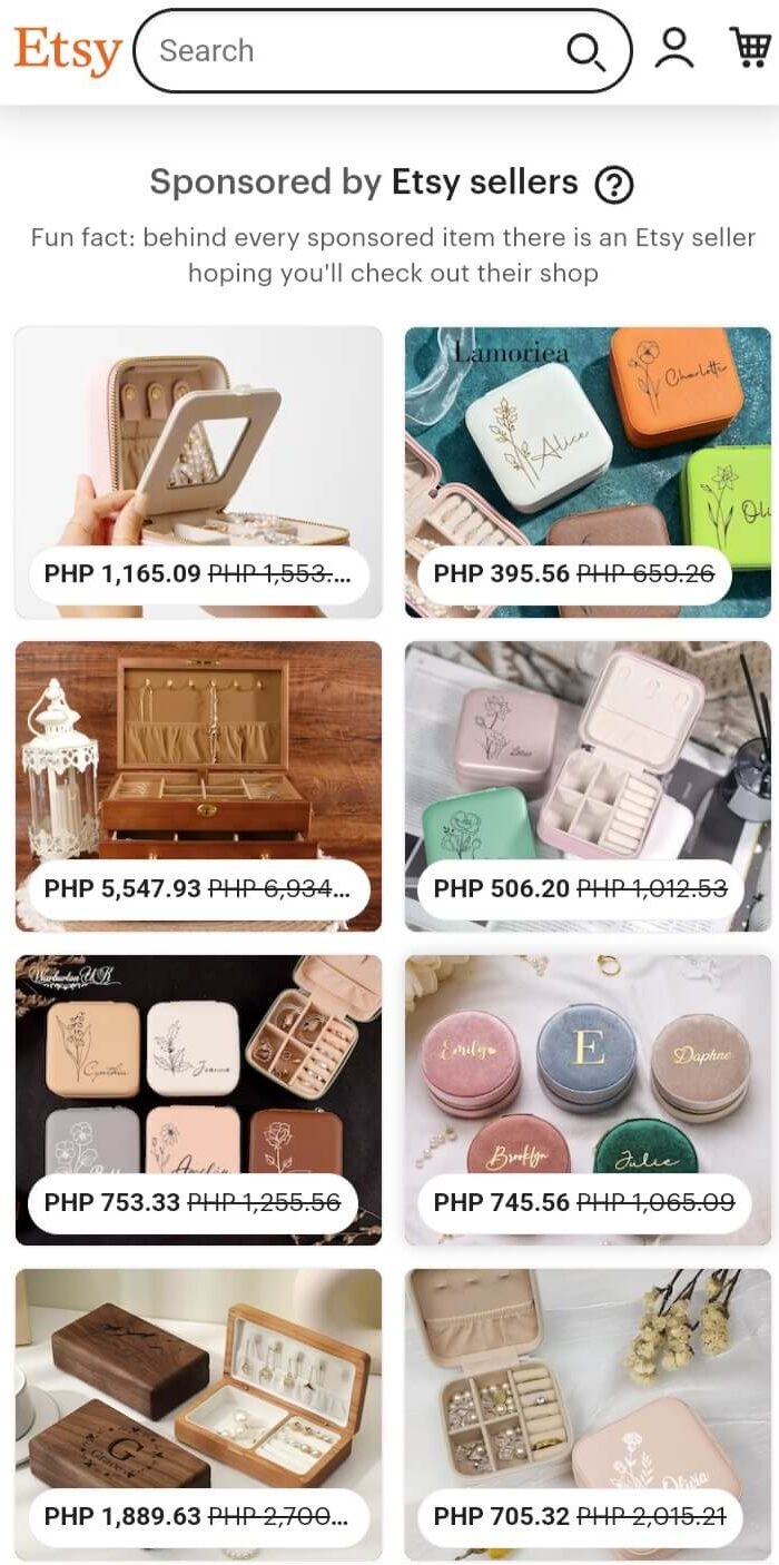
Image source: https://www.etsy.com/
- Customizable Shopping: The platform’s user-friendly interface allows narrowing down product categories or preferences, providing a bespoke ecommerce shopping experience and underlining user-centric ux design principles.
Manscaped
Manscaped firmly positions itself as a leader in men’s grooming, offering specialized tools and products for modern gentlemen. Boasting a responsive web design, its platform elegantly combines an intuitive layout with striking visuals, demonstrating mobile website design inspiration at its finest, and catering to the contemporary man’s grooming needs on the go.
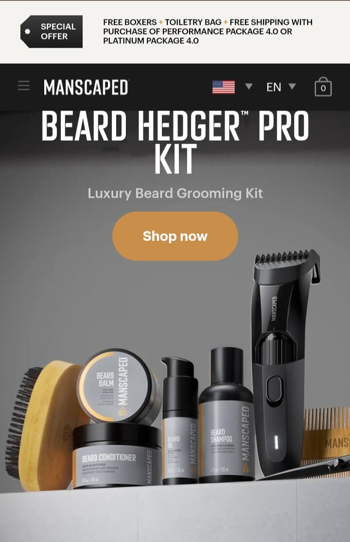
Image source: https://www.manscaped.com/
Why We Love It:
- Tailored User Experience: Manscaped’s mobile website design precisely addresses its target audience‘s desires. The easy-to-navigate menu ensures users quickly find their desired grooming tools, while the highlighted best-sellers section offers quick suggestions for those exploring the brand on mobile devices.
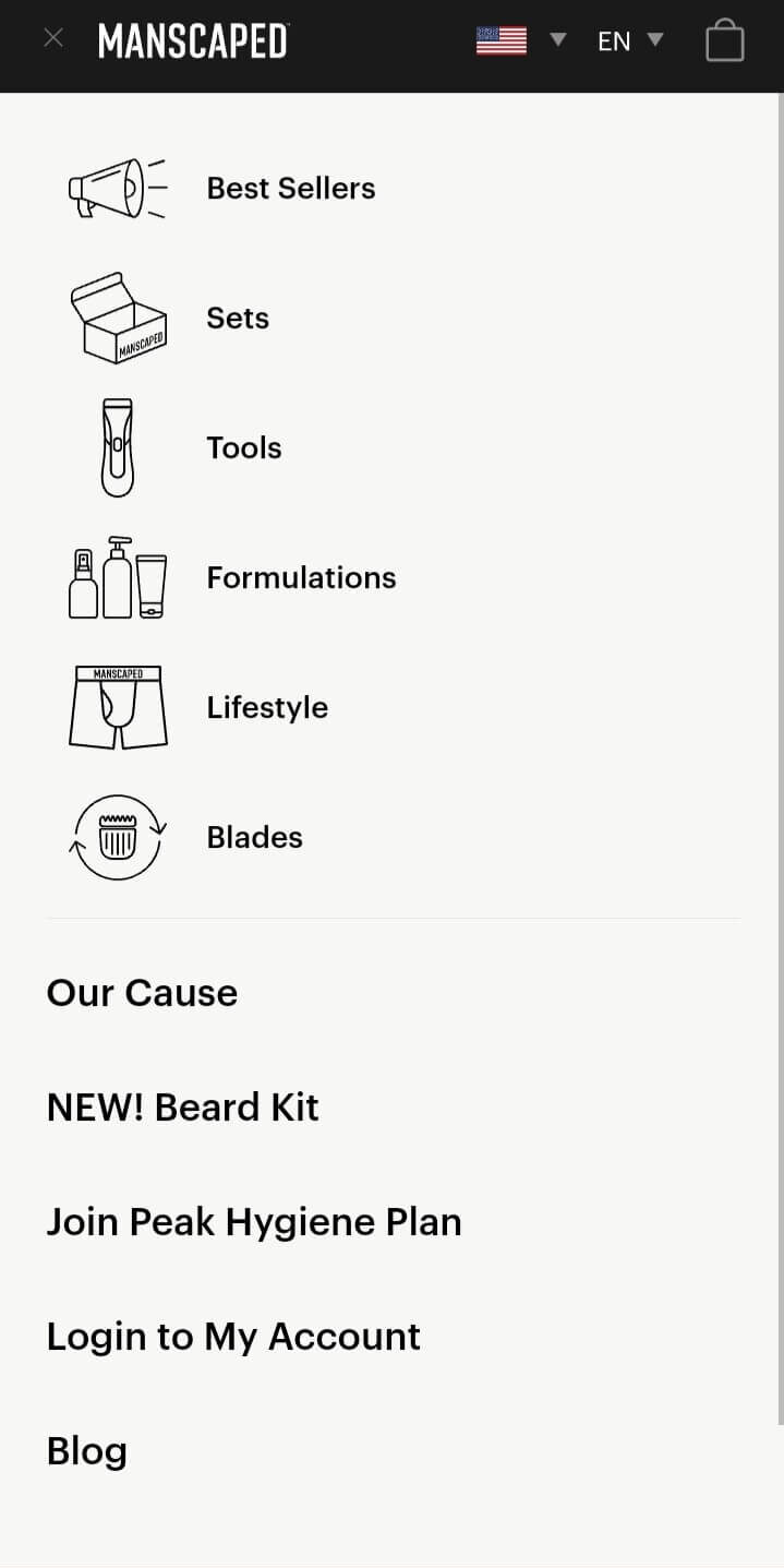
Image source: https://www.manscaped.com/
- Visual Engagement: With high-resolution product images presented on the mobile screen, Manscaped ensures users get a clear view of what they’re investing in. The consistent and bold brand color palette exudes masculinity and serves as a design inspiration for those looking to create a visually captivating mobile experience.
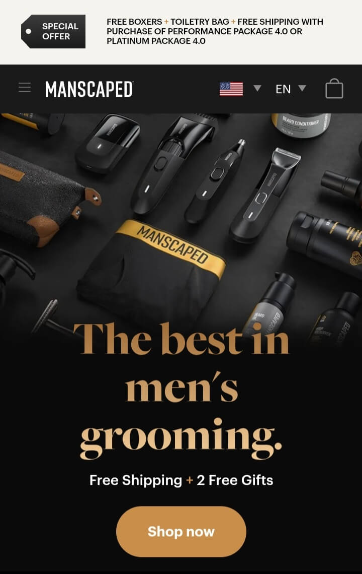
Image source: https://www.manscaped.com/
- Distinct Brand Voice: Manscaped is unapologetically bold about its brand voice. Their product descriptions, every word resonates with the brand’s confident and playful tone, establishing a memorable interaction with users.
- Effortless Shopping Experience: Manscaped’s mobile interface is streamlined to perfection. Users can easily filter products, read comprehensive reviews, and enjoy a seamless checkout process, showcasing the brand’s commitment to an optimized ecommerce experience and underlining their prowess in user-centric ux design.
Buzzfeed
Buzzfeed is a digital titan in contemporary content creation, mastering the art of blending entertainment with information. Its mobile site is an ode to efficiency, making viral content easily accessible.

Image source: https://www.buzzfeed.com/
Why We Love It:
- Content Hierarchy: The mobile website design prioritizes showcasing popular content on its homepage, leveraging best examples of content presentation.
- Flexible Navigation: Buzzfeed understands the varied motivations of its readers. The accessible navigation menu that classifies content signals this appreciation, optimizing mobile experience.
- Interactive Content Display: Buzzfeed’s web page seamlessly integrates interactive quizzes and polls, ensuring a consistent user experience devoid of disruptive transitions on small screens.
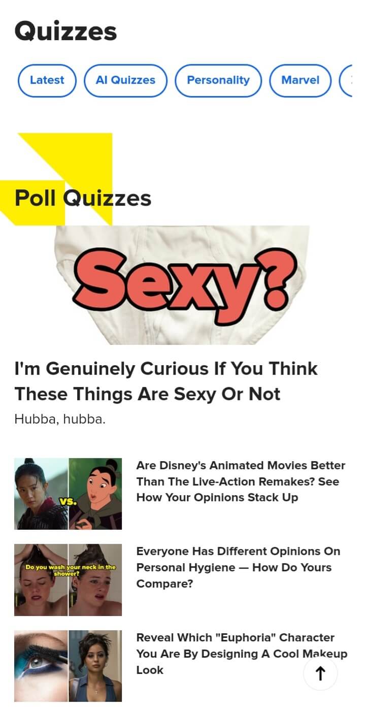
Image source: https://www.buzzfeed.com/
- Adaptive Content Presentation: Whether short-form quick reads or in-depth articles, Buzzfeed’s mobile website design inspiration is adept at showcasing varied content, addressing different reader preferences with finesse.
Walt Disney
Walt Disney’s mobile version platform artfully balances between corporate communication and brand essence. Despite its business orientation, it offers a visually delightful experience, embodying mobile-friendly website characteristics that enchant visitors.
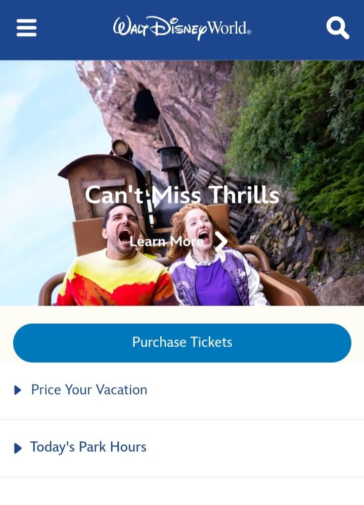
Image source: https://disneyworld.disney.go.com/
Why We Love It:
- Cohesive Branding: Through the use of vibrant imagery, a harmonious color palette, and engaging call-to-action (CTA) buttons, Walt Disney ensures brand consistency across the responsive website.
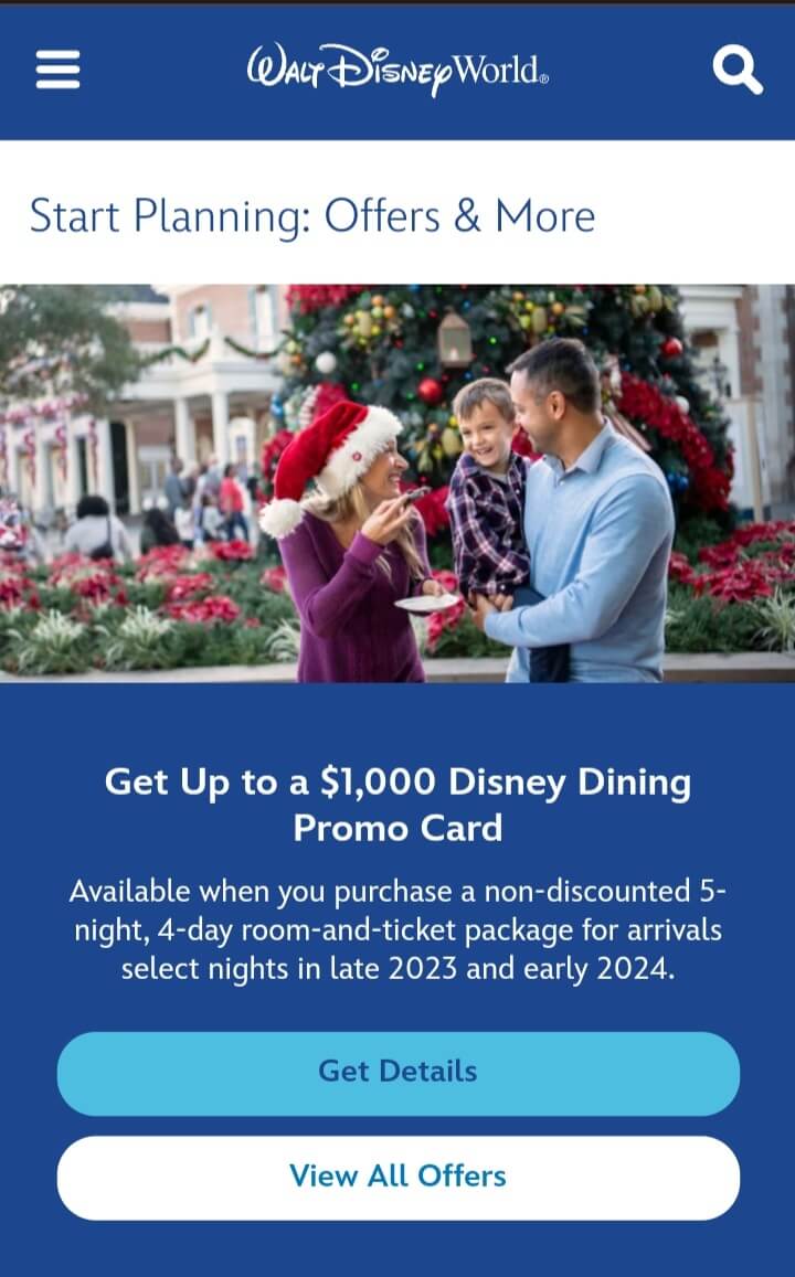
Image source: https://disneyworld.disney.go.com/
- Content Presentation: The card-style page design for articles, equipped with imagery, titles, and snippets, is more than just typography. It’s a digestible preview that promotes interaction and deeper engagement on various screen sizes.
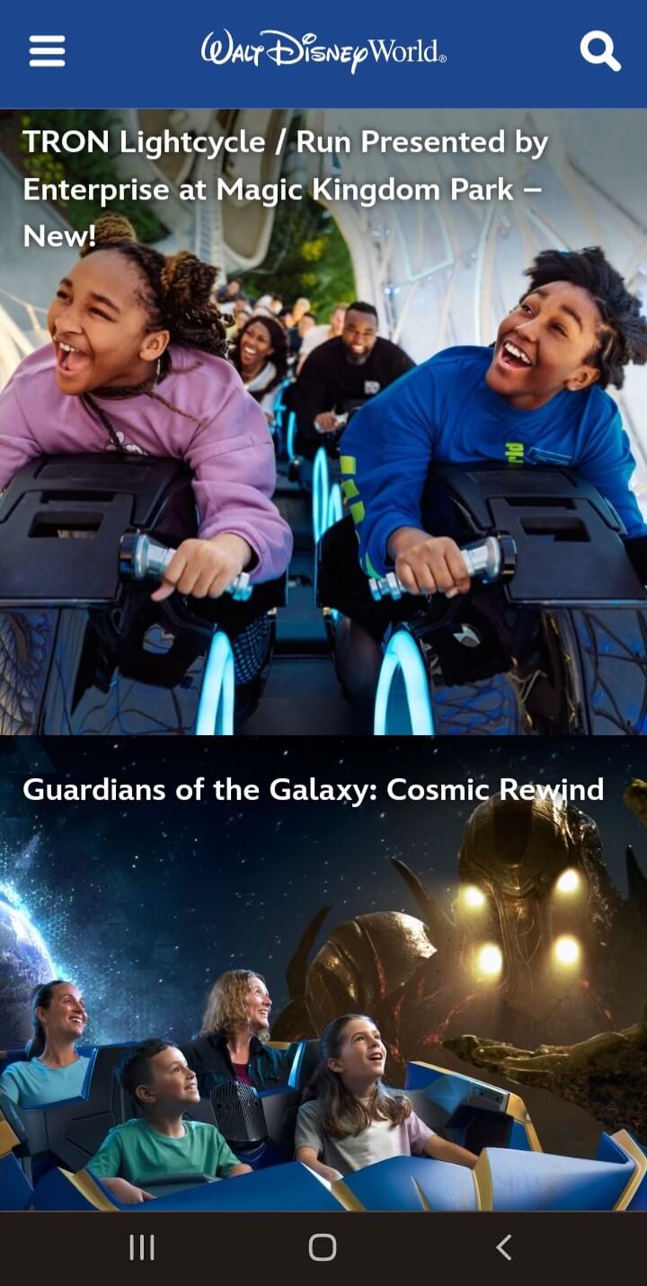
Image source: https://disneyworld.disney.go.com/
- Intuitive User Interface: Walt Disney’s interactive elements, such as menus and buttons, aren’t just eye-catching. They’re also ergonomically designed, making navigation an intuitive experience on mobile devices.
- Dynamic Storytelling: The platform masterfully showcases a tapestry of media formats from videos to articles, ensuring that diverse storytelling mechanisms keep the user engaged, truly showcasing the potentials of web development.
Booking.com
Booking.com’s mobile site serves as a direct portal to global travel experiences. It merges functionality with aesthetics, ensuring users can find accommodations without hassle.
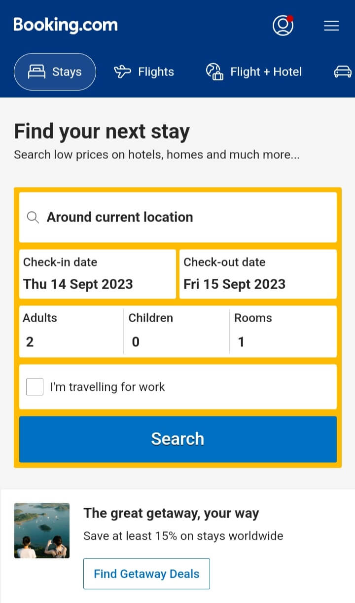
Image source: http://Booking.com
Why We Value It:
- Focused User Entry: The search function isn’t just a feature; it’s a direct invitation, enticing users to embark on their travel exploration swiftly.
- Informative Listings: Beyond just photos and ratings, the platform provides rich insights into each accommodation. The real-time notification about other users viewing the same property instills a sense of urgency and competitive interest.
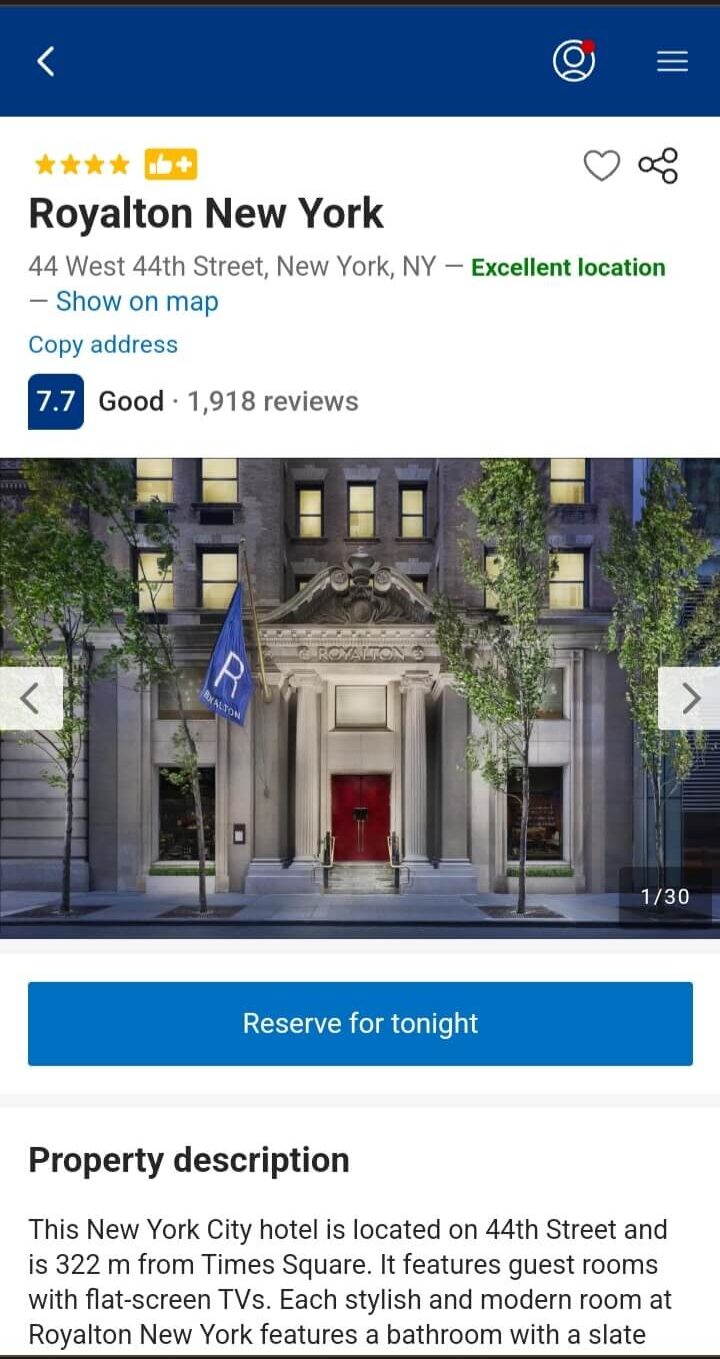
Image source: http://Booking.com
- Refined Search Mechanics: With filters and sort options, users can curate their search results, ensuring they find accommodations aligned with their preferences.
Image source: http://Booking.com
- User Trust Elements: The integration of genuine reviews and transparent pricing policies reinforces trust, encouraging users to finalize their bookings.
Adidas
Adidas’s mobile site brilliantly reflects its brand ethos. While it mirrors the desktop website, it’s fine-tuned for enhanced mobile interactions.
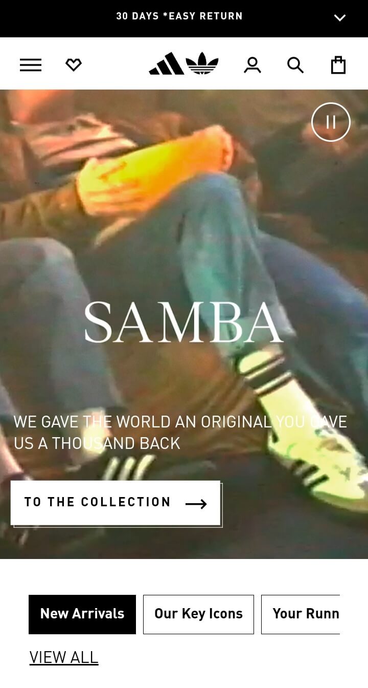
Image source: https://www.adidas.com
Why We Love It:
- Integrated Brand Experience: Every visual, CTA, and product showcase seamlessly extends the Adidas brand narrative, crafting a captivating digital brand ambiance.

Image source: https://www.adidas.com
- Efficient Product Exploration: Adidas prioritizes user experience, ensuring intuitive categorization and an optimized search function guide users swiftly to their desired items.
- Engaging Product Display: Beyond mere product visuals, the platform incorporates style guides, user critiques, and video content, enriching the user’s journey.
- Fluid Navigation: From accessing the shopping cart to viewing product details or checking out, Adidas’s mobile web design guarantees every touchpoint is smooth and user-centric.
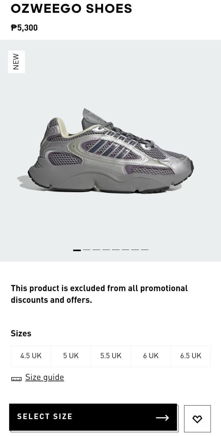
Image source: https://www.adidas.com
Mobile Users are Dominant Consumers
You won’t believe how mobile-obsessed our world has become. I mean, it’s been a crazy growth spree. In the past decade alone, mobile adoption just exploded. By 2022, we had like five billion people using the mobile internet. That’s over 60% of everyone online – wild, right?
Everywhere you look, from teens to even our grandparents, they’re glued to their screens. And it’s not just a few web pages here and there. In January 2023, mobiles were behind nearly 57% of all the web page views globally. So, whether it’s your niece showing off her new dress or your uncle looking up recipes, everyone’s doing it on their phones.
And shopping? Oh man, e-commerce is practically living on mobile now. 60% of all online shopping traffic is coming from our phones! No wonder every ad we see is optimized for mobile.
Then there’s the whole social media scene. Mobile’s completely changed the game. With 92% of mobile users being active on social, it’s like everyone and their grandma (literally) are scrolling through Facebook or watching cat videos on YouTube. And get this, places like Africa and southern Asia aren’t even at their peak social media game yet. There’s so much more room for them to grow.
Remember when smartphones just took off last decade? It’s now everywhere. Even folks in remote villages are getting in on the action. But, there’s a twist. Last year, for the first time in ages, people spent a little less on mobile apps. Maybe after binge-buying apps during lockdown, everyone’s chilling out a bit.
If there’s one thing to bet on, it’s mobile. It’s totally changed how we shop, chat, and even play. If you’re thinking of going into business or marketing, you’ve got to think mobile-first!
Key Takeaways
Mobile-first design isn’t just a trend; it’s the future of modern web design. By drawing inspiration from top-performing mobile websites and understanding the nuances of mobile user behaviors, businesses can create engaging, user-friendly mobile websites that drive success in the digital landscape.
If you’re looking to harness the potential of mobile web design for your business, book a consultation with Cyphon Digital today. Our experts are poised to guide your brand to mobile success.
Mobile Website Design FAQs
Why is mobile-first design important?
-
- Mobile-first design prioritizes mobile users, ensuring an optimal user experience tailored to mobile device constraints and advantages.
How do mobile designs impact SEO?
-
-
- Mobile-friendly websites rank better on search engines, as they provide a better user experience.
-
What are the key elements of a user-friendly mobile website?
-
- Clear navigation, responsive design, fast loading times, and engaging visuals are among the essentials.
What are the advantages and disadvantages of a mobile website?
- Advantages: Better user experience on mobile, faster loading times, improved SEO, and expanded audience reach.
- Disadvantages: Increased maintenance, higher costs, and potential content discrepancies with desktop sites.
What are some design principles that are most applicable to mobile website design?
-
- Adopt a responsive design, create touch-friendly navigation, optimize for speed, maintain clarity with simplicity, and prioritize content.
What does “mobile-friendly” mean?
- “Mobile-friendly” sites function effectively on mobile devices, ensuring readable text, touch-friendly elements, and eliminating the need for horizontal scrolling.
What are some of the latest trends for mobile website design inspiration?
- Trends include dark mode, micro-interactions, voice navigation, augmented reality integrations, and hamburger menus.
What is the difference between a mobile website and a responsive website?
- Mobile websites are tailor-made for mobile users, while responsive websites adjust their layout based on the device’s screen size and orientation.
What are some of the most popular mobile websites?
- Prominent mobile websites for design and user experience include Airbnb, Etsy, and Buzzfeed.