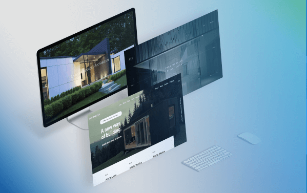
Does your firm’s online presence truly reflect the quality of your architectural designs? Think about the transformative effect of a website tailor-made for architects. It’s not just a portfolio; it’s a platform that elevates your work through strategic search engine optimization (SEO) and thoughtful user experience (UX) design.
We invite you to join us on a journey through the most captivating architectural web designs of 2024. This collection is a testament to precision and artistry, where every pixel is a stroke of genius and every function is fine-tuned for excellence.
Get ready to dive into a world of websites that are not only visually breathtaking but also functionally superior, redefining what it means to showcase architecture online.
Jump here:
- Amanda Martocchio
- Archi Site Mobius
- Humbert & Poyet
- Ark-Shelter
- Maman-Corp
- Measure
- Mafco Hous
- Zikza
- ABCD Architect
- Archi-Graphi
1. Amanda Martocchio
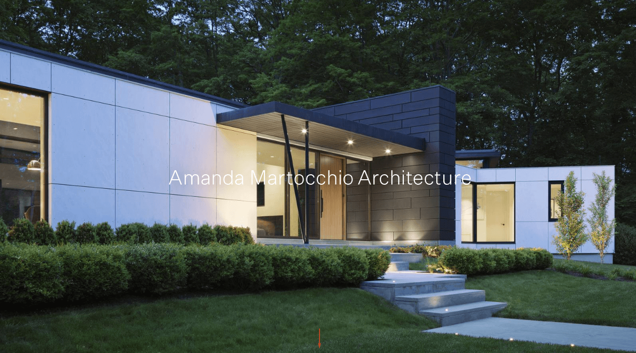
Image source: https://amandamartocchio.com/
Amanda Martocchio’s architecture web design offers a digital gateway into her diverse portfolio, focusing on both cultural and commercial architectural projects. This website exemplifies the best practices in architecture website design, blending a minimalist aesthetic with functional features.
As users engage in scrolling through the homepage, they embark on an interactive journey, narrated by high-quality images and a user-friendly interface, characteristic of top architecture firm websites.
What we love avout it: The fluid transition from panoramic shots to detailed views on the homepage enhances the user’s perception of space, akin to a virtual tour through Martocchio’s architectural achievements.
2. Archi Site Mobius
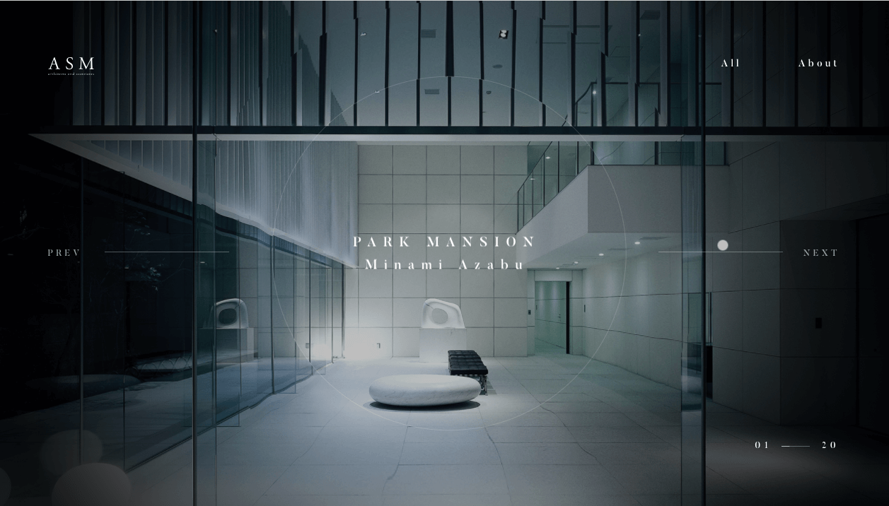
Image source: https://asmobius.co.jp/
ASM’s architecture web design offers a tranquil exploration of their space-creating philosophy, with GSAP animations providing smooth transitions between projects on their homepage.
Each project entices with a story of serenity through the virtual lens, showcasing the architecture firm‘s commitment to serene and thoughtful architectural design.
What we love about it: More than just visual flair, these animations act as a guide, leading users through a seamless interactive experience that mirrors ASM’s commitment to serene and thoughtful architectural design.
3. Humbert & Poyet
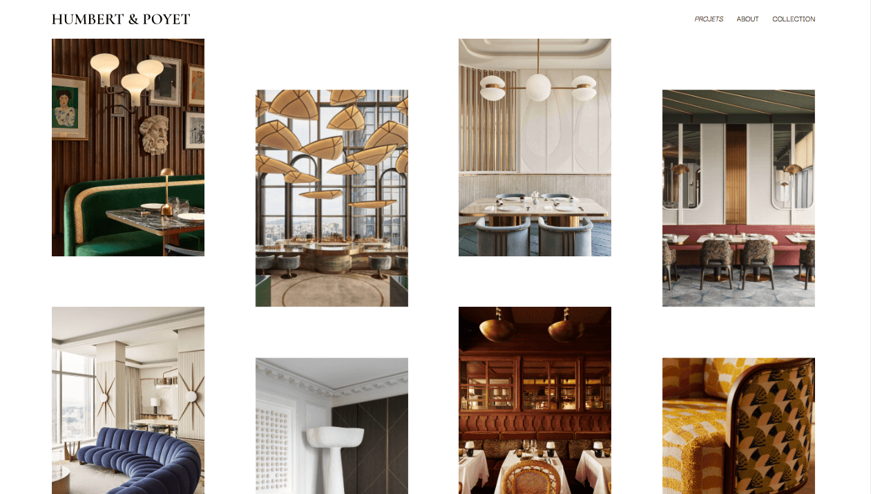
Image source: https://www.humbertpoyet.com/projets
The Humbert & Poyet website showcases a unique, clutter-free layout, epitomizing the best in architecture website design. As a leading architecture firm, they have crafted their homepage to present their architectural projects with minimal distractions, drawing potential clients and visitors directly into their portfolio with its intuitive user interface.
What we love about it: The user interface‘s simplicity and portfolio-centric design create a potent user experience that underscores the firm’s architectural mastery.
4. Ark-Shelter
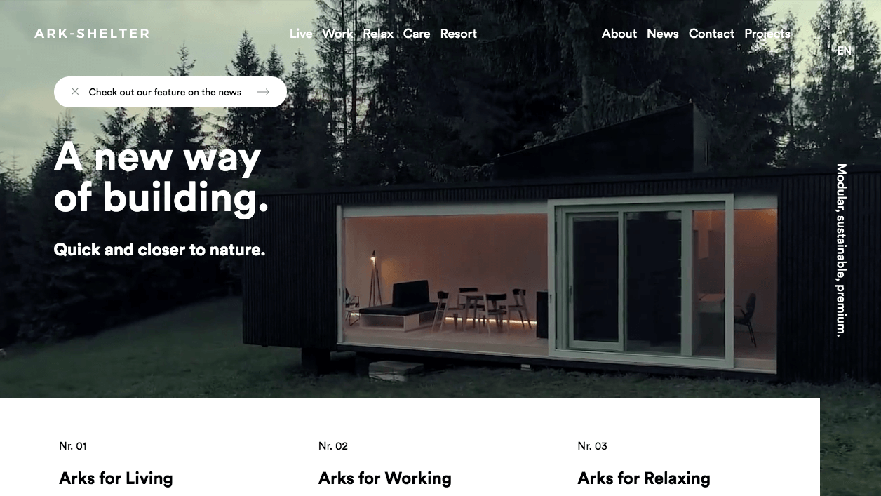
Image source: https://www.ark-shelter.com/en
Ark-Shelter’s architecture web design presents a website that epitomizes their mission—offering a sanctuary through innovative design.
The video background on the hero header sets a compelling narrative tone, while the minimalist design with thoughtful use of white space invites users to envision themselves in tranquil architectural spaces.
This approach effectively reflects the architecture studio‘s focus on interior design and functionality.
What we love about it: The immersive video and minimalist approach create a sense of peace and escape, mirroring the firm’s architectural intention and enhancing user engagement.
5. Maman-Corp
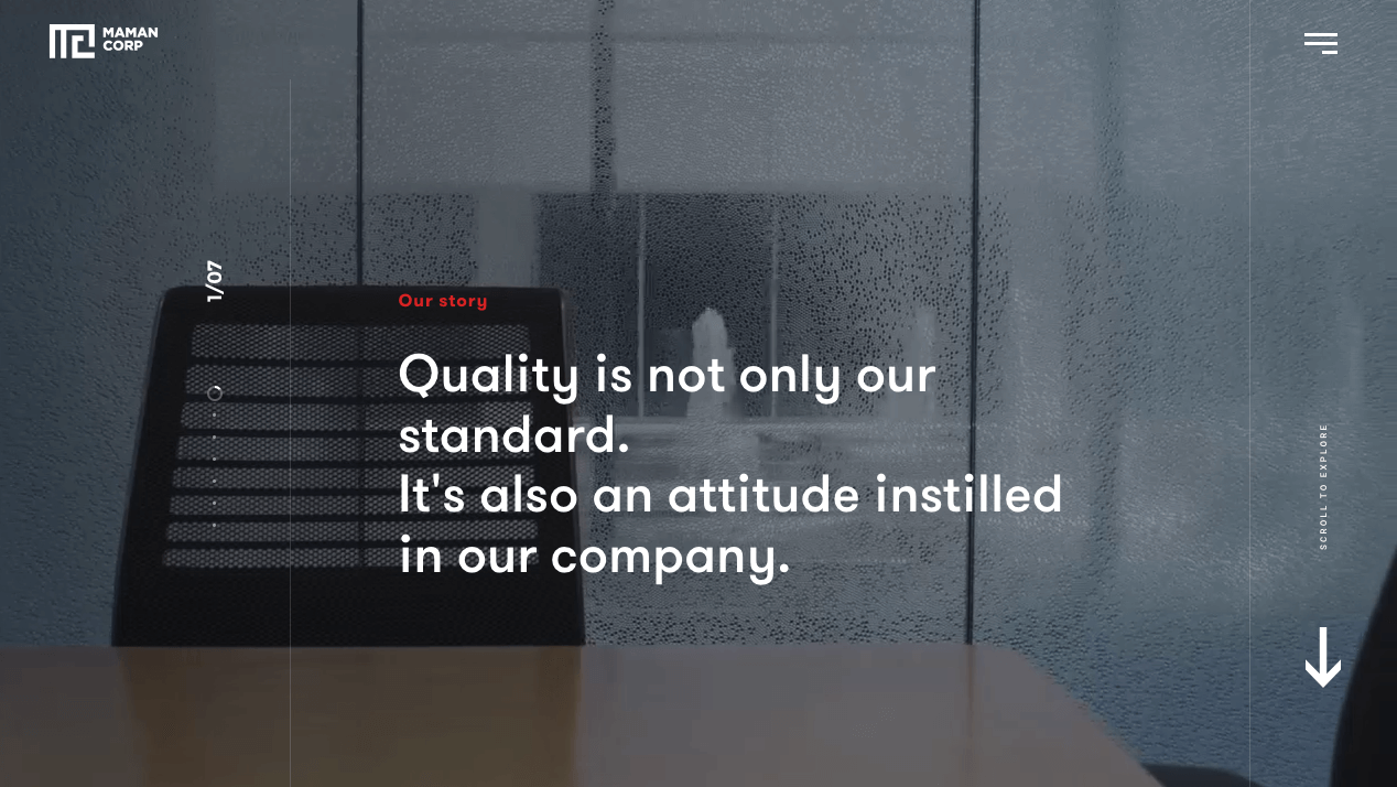
Image source: https://www.maman-corp.com/
Maman-Corp’s architecture firm website is a testament to their expertise in creating growth-oriented spaces. This digital showcase, crafted with a focus on web design functionality, utilizes GSAP animations and an effective use of white space.
The integration of video on the homepage adds a dynamic layer to the presentation of their architecture projects, enhancing the overall architecture website design.
What we love about it: The use of animation and video gives depth to the user experience, allowing a fuller understanding of the firm’s capacity to create innovative and thriving environments.
6. Measure
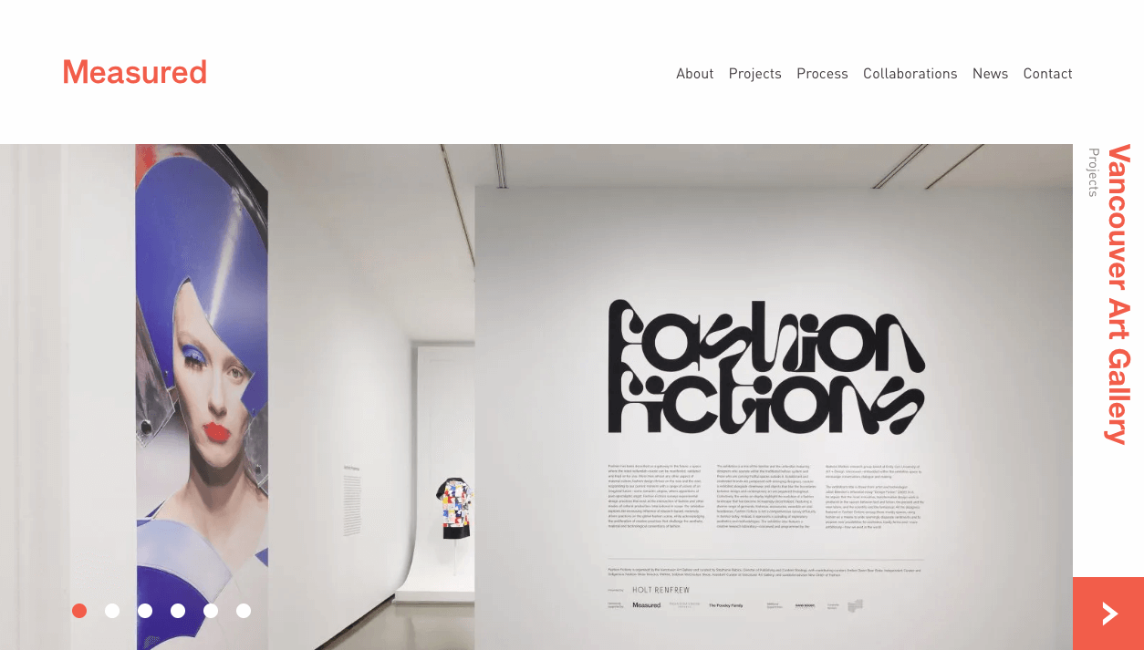
Image source: https://measured.ca/
Measured architecture studio‘s website stands as a beacon of modern design in the realm of architecture web design. Using asymmetry and crisp imagery, the site reflects their architectural philosophy with an emphasis on contemporary aesthetics.
The clean lines and well-planned layout underscore the studio’s projects, presenting them with style and substance on their homepage.
What we love about it: The layout and visual elements offer an intuitive navigation experience, embodying Measured’s commitment to precision and contemporary aesthetic in the digital realm.
7. Mafco Hous
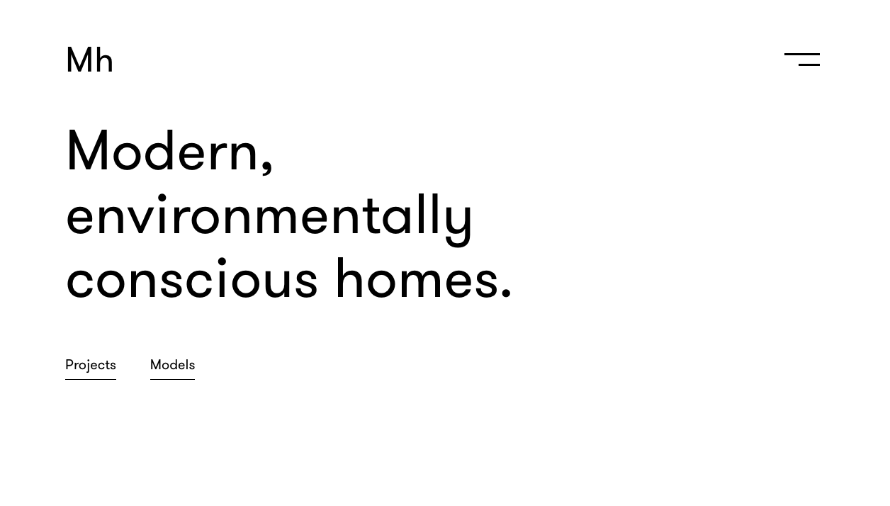
Image source: https://mafcohouse.com/
Mafco House’s architecture web design employs a balance of white space and visual hierarchy to present its modernist homes.
The careful arrangement of high-quality images and typography on this architecture firm website creates an elegant and sophisticated aesthetic that speaks to the firm’s dedication to design of real estate and interior design.
What we love about it: The site’s design elements come together to provide clear and focused content, delivering an online experience that reflects the firm’s dedication to modernist design principles.
8. Zikza
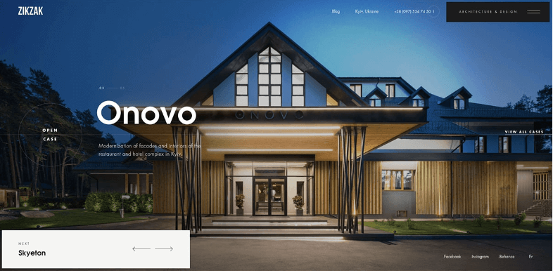
Image source: https://zikzakarchitects.com/
Zikzak’s architecture website is a canvas of perfect quality and creativity, offering an exceptional example of architecture web design. Its homepage features a masonry layout and a dynamic slider that showcases the firm’s innovative projects and approach in the realm of architecture firm website design.
What we love about it: The interactive layout and dynamic presentation of projects offer an engaging user experience that’s akin to an interactive gallery, showcasing Zikzak’s innovative architectural solutions.
9. ABCD Architect
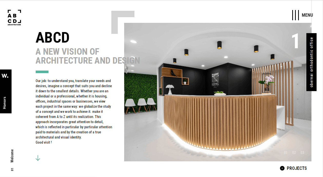
Image source: https://www.abcd-architecture.fr/
ABCD Architect’s architecture website design stands out with its interactive elements, such as sliders and hover effects. These features add a new dimension to their webpage, enhancing the display of their architectural and design services.
What we love about it: The interactive nature of their website design significantly boosts the user experience, showcasing ABCD Architect’s proficiency in merging modern web design principles with their architectural portfolio.
This approach not only engages users more deeply but also highlights the architecture firm‘s commitment to dynamic user engagement and modern functionality in their project presentation.
The use of high-quality images and thoughtful transitions on their homepage further strengthens their online presence, making it one of the best architecture websites in the field.
10. Archi-Graphi
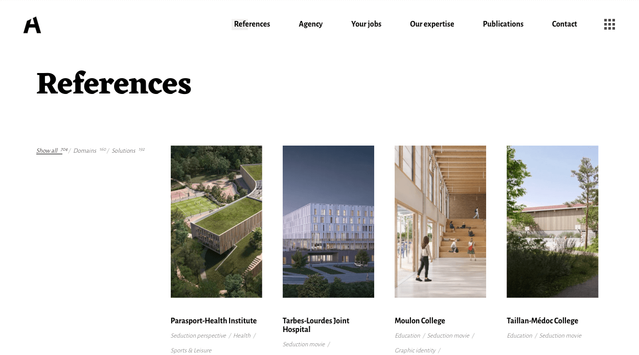
Image source: https://archi-graphi.fr/
Archi-Graphi, a distinguished architecture firm, demonstrates the perfect blend of aesthetics and functionality in their architecture website design.
They present a masonry layout on their homepage, allowing for diverse project views and highlighting the firm as one of the best architecture websites. This layout is supported by a unique navigation menu, tailored to meet both the needs of potential clients and the standards of modern web design.
What we love about it: The structured masonry layout of the Archi-Graphi website, while primarily functional, subtly echoes the firm’s architectural expertise. Its straightforward approach, resembling a comprehensive menu list on the homepage, offers a clear, user-friendly experience. This simplicity in design, prioritizing ease of navigation and information accessibility, reflects a different trend in architecture firm websites. The focus here is on creating a user interface that is uncluttered and direct, much like the firm’s approach to their architectural projects.
The emphasis on white space and clean typography in the website’s design underlines the firm’s commitment to clarity and precision, mirroring their reputation as a meticulous design studio and architecture business.
To Sum Up
These ten architectural websites push the boundaries of digital design, just as their architects push the boundaries of physical space. They remind us that a website can be more than a portfolio; it can be an extension of the firm’s philosophy, an interactive experience that begins the client’s journey before the first meeting.
Is your digital presence as impactful as your architectural work? It’s time to ensure that your website is not just a portfolio but a narrative of your vision and expertise.
Schedule a Free Consultation Call today and let us help you build a web presence that resonates with your brand’s ethos and engages your audience at a deeper level.
