There’s nothing like a standout online portfolio website to showcase your best work. Think about it: a sleek homepage with subtle animations, the perfect typography, and an interactive design that just pops. Oh, and don’t get me started on the importance of that white space!
Whether you’re a web developer, a graphic design freelancer, or just someone with an eye for design trends, your portfolio tells potential clients everything they need to know. And remember, it’s all about making a lasting impression, right down to your contact info and that snazzy contact form.
At Cyphon Digital, we’re all about that wow factor. We’ve dived deep into the web, curating a list of the top web design portfolio examples for 2023. These aren’t just any examples; they’re the crème de la crème, handpicked for those of you wanting to stand out, be it as a digital designer, a product guru, or someone building their own portfolio on platforms like WordPress or Behance.
Need some design inspo or templates? Looking to showcase some killer case studies? We got you covered. Dive in and let’s get those creative juices flowing!
Key Elements of a Striking Web Design Portfolio
8 Best Web Design Portfolio Examples
Tips on How to Create Your Own Web Design Portfolio
Key Elements of a Striking Web Design Portfolio
Your web design portfolio is more than just a collection of your design work; it’s a showcase of your identity as a designer. In this digital age, many individuals are eager to create their own portfolio. A well-curated portfolio website can significantly help in this endeavor. Here are the indispensable elements for a compelling portfolio:
- Personal Branding – In the vast digital world of web design, standing out is crucial. Your portfolio site should be an authentic reflection of your personal brand and unique style. Whether you’re a freelancer or part of a design agency, craft your digital persona in a way that it instantly communicates your ethos, setting you apart from the rest.
- High-quality Visuals – A pixelated image can mar your presentation, no matter how great your designs are. To avoid this, include screenshots of your best work in high resolution. Ensure every image showcased is of the finest quality, reflecting the design trends of your portfolio website examples. This is a non-verbal cue of your attention to detail and professionalism.
- Clear Navigation – The best web design portfolio examples can get overlooked if buried under complex menus or too many templates. Your homepage should prioritize a user-friendly interface, perhaps with a clear header and landing page, that guides visitors intuitively. A clear, straightforward path can elevate their browsing experience, spotlighting your design portfolio with ease.
- Compelling Case Studies – Showcase your design process, not just the end result. Whether it’s UI design, UX design, or graphic design, highlight specific challenges you’ve faced, the strategies you employed, and the innovative prototyping solutions you crafted. This depth, combined with interactive design, demonstrates your problem-solving abilities.
- Client Testimonials – Testimonials from satisfied clients can be powerful persuaders, especially if they come from LinkedIn or Behance. By integrating these, you underscore your credibility and offer a glimpse of the positive experience potential clients can expect.
- Contact Information – Your online portfolio’s ultimate goal is to spark interest and facilitate connection. Apart from a contact form, prominently display your contact page details, making it effortless for potential clients to reach out. Perhaps even offer pricing options or tutorials to entice collaborations.
A standout web design portfolio website is a harmonious blend of aesthetics, functionality, and storytelling. With the right color palette and typography, combined with minimalist white space and subtle animations, it’s not just about showcasing your design skills, but also about building trust, offering design inspiration, and forging connections.
8 Best Web Design Portfolio Examples
Refusi Studio
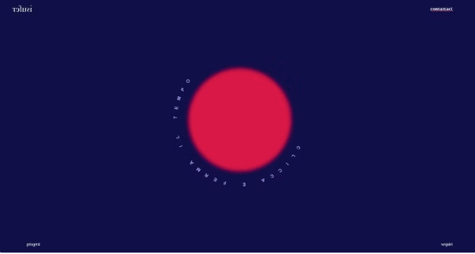
Image Source: Screenshot from https://refusistudio.it/
Refusi Studio, an Italian web design establishment, has curated a portfolio reflecting its core philosophy. With a strong focus on deliberate planning and quality, the studio veers away from the rush of the world, embracing a slower and more thoughtful workflow.
Why It Stands Out: The website exudes a compact yet charismatic design. While it maintains a capsule-like simplicity, it never appears primitive. An eye-catching feature is the dynamic components of the site. Various elements subtly move, but the motion is smooth, never hasty. It’s captivating, almost allowing visitors to feel as though they can pause time.
What Can You Learn From It: Refusi Studio’s website is more than just a digital presence; it’s a strategic tool. Its distinct design not only differentiates it from other websites but also acts as a magnet, drawing in the exact clientele the team cherishes. It’s a brilliant blend of form and function.
Alice Lee
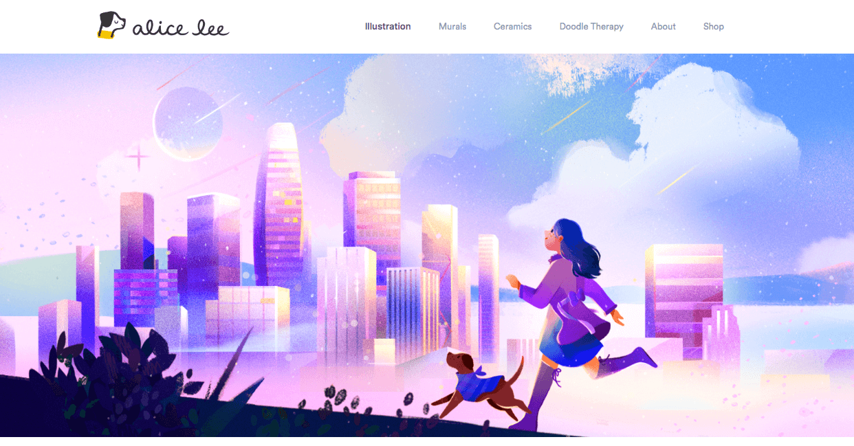
Image source: Screenshot from https://www.byalicelee.com/
Alice Lee’s website showcases talent as an illustrator and muralist. The interactive hero image, which responds to cursor movement, immediately captures attention. Presented against a minimalist white background, her vibrant illustrations take center stage. Each piece, when clicked, offers a deeper look into her creative journey with descriptions and drafts.
Why It Stands Out: Its minimalist design for illustration portfolios
What Can You Learn From It: Alice The site not only showcases her vivid illustrations but also emphasizes features unique to portfolio websites. Through its blend of interactivity and minimalism, visitors are granted a comprehensive view of her creative journey, demonstrating the power of thoughtful content presentation and structuring in portfolio design.Lee’s website masterfully blends interactivity with minimalist design, spotlighting her vibrant illustrations and providing a captivating glimpse into her creative journey.
Diplo Studio
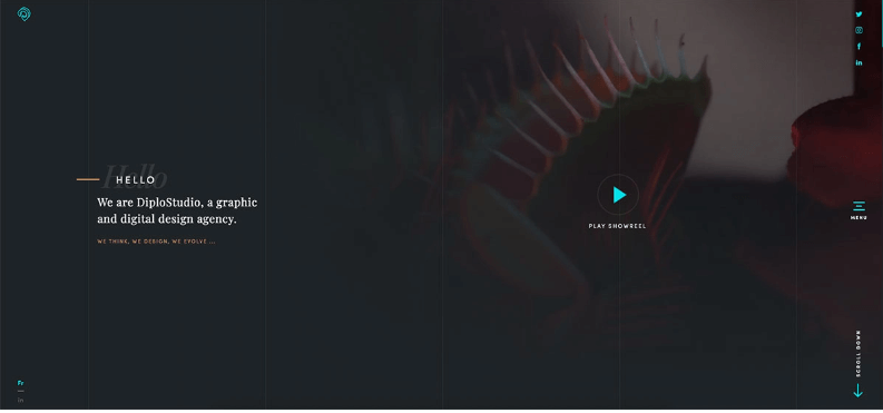
Image source: Screenshot from https://www.diplo.studio/
Diplo Studio presents a captivating portfolio website, combining striking visuals with modern features. The homepage instantly grabs attention with its brand-introducing showreel, a clear headline, and handy social links. Advanced GSAP animations further showcase their design expertise, while sections like their work, news, and live Instagram feed enhance user engagement.
Why It Stands Out: The seamless GSAP animations. They don’t just add movement; they tell a story, highlighting Diplo’s innovative edge.
What Can You Learn From It: Diplo’s website is more than a portfolio; it’s a blend of skill and modern digital artistry. It’s not just about showcasing work but creating an immersive user experience.
Ivette Felix Uy
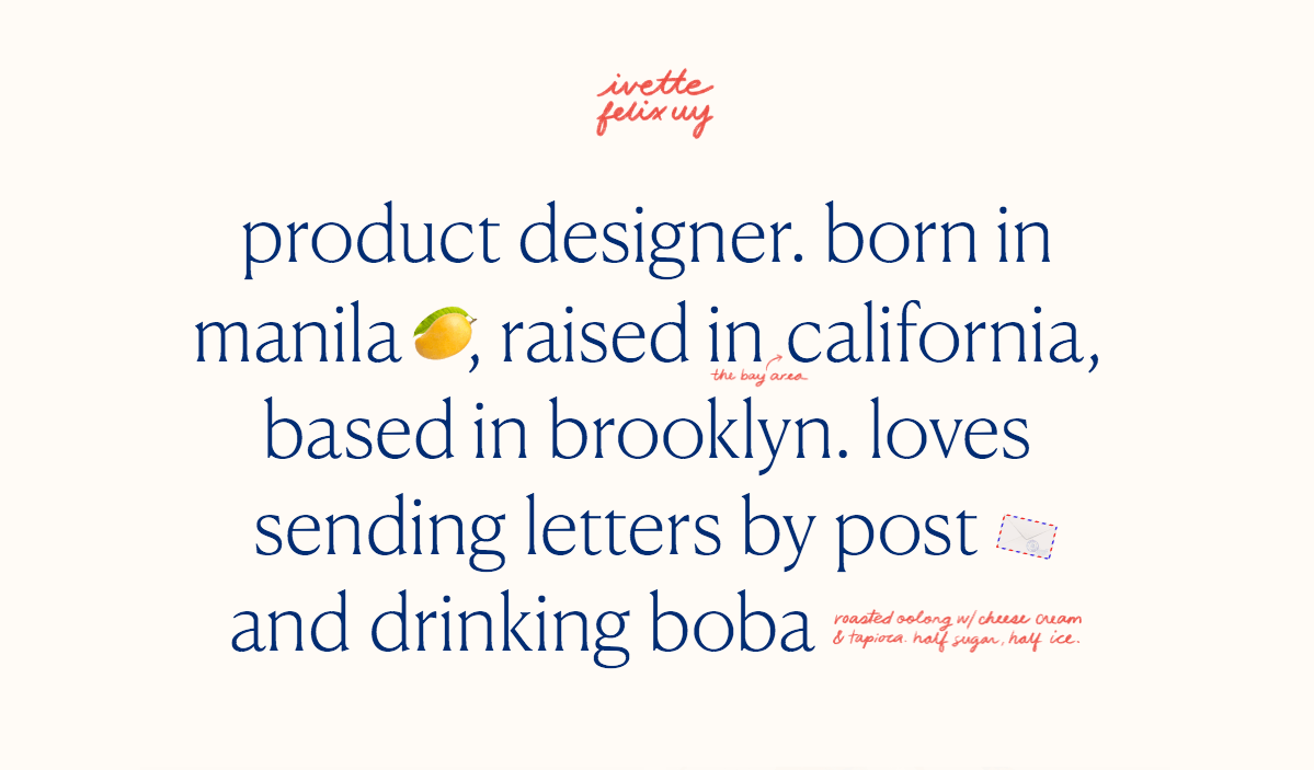
Image source: Screenshot from http://www.ivettefelixuy.com/
Ivette Felix Uy’s digital portfolio is a curated two-page showcase featuring six meticulously chosen projects that mirror her finesse in product design. Nestled in Brooklyn, Ivette demonstrates her specialized aptitude through an engaging layout, giving potential clients or employers an encapsulated view of her versatility in the realm of product design.
Why It Stands Out: More than just a visual display, Ivette’s portfolio offers a comprehensive exploration into each project. The in-depth case studies reveal her individual contributions, the interplay of team collaborations, and tangible success metrics, ensuring that viewers gain a holistic understanding of her prowess in the product design landscape.vette’s portfolio dives deep with detailed case studies, showcasing her role, team dynamics, and quantifiable success metrics for each project.
What Can You Learn From It: Ivette’s portfolio serves as an exemplary model of depth and detail. It meticulously lays out case studies, highlighting not just her individual contributions, but also the interplay of team dynamics. Unique to her portfolio is the emphasis on quantifiable success metrics for each project.
Ali Saeed
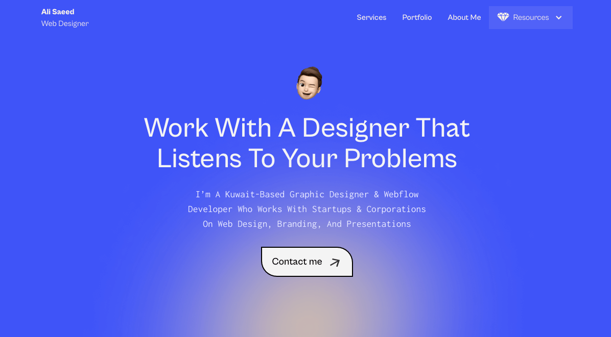
Image source: Screenshot from https://www.alisaeeed.com/
Ali Saeed is a seasoned graphic designer and Webflow developer hailing from Kuwait. Specializing in web design, branding, and presentations, Ali’s extensive expertise predominantly caters to startups and large corporations. His portfolio, a testament to his talent, features an inventive template that captures the essence of his design philosophy.
Why It Stands Out: Ali’s portfolio enchants with a unique “falling” animation for each work as visitors scroll.
What Can You Learn From It: This subtle animation isn’t just decorative—it’s a live showcase of Ali’s expertise in engaging design.
Eve Kayser
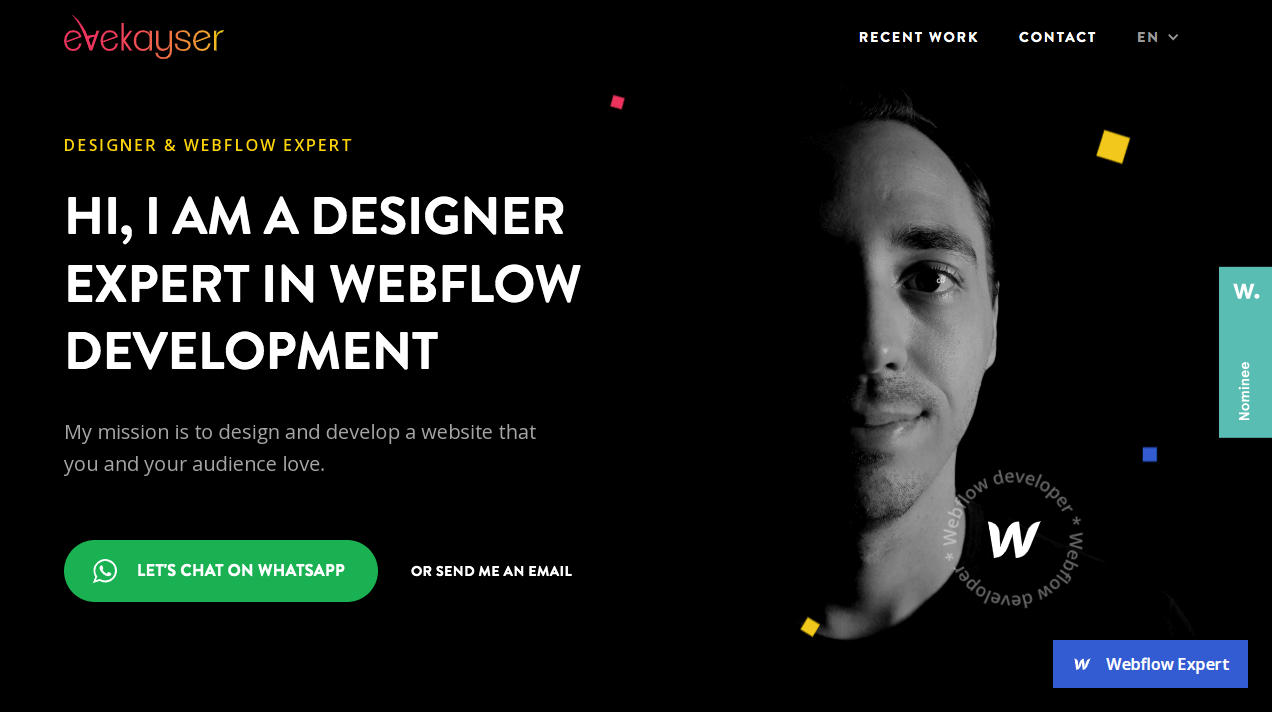
Image source: Screenshot from https://www.evekayser.com.br/
Eve Kayser’s portfolio is a masterful combination of modern design aesthetics and user-centric functionality. It beautifully marries the vibrant gradient effects on the logo with floating squares that augment the overall visual appeal. With critical information strategically placed above the fold, visitors can quickly grasp Eve’s expertise, get a snapshot of his experience, and find means to contact him. Additionally, the presence of an anchor link to the recent work amplifies the user experience by providing instant access to portfolio samples.
Why It Stands Out: Eve’s anchor link offers immediate access to his work, bypassing the usual scroll, valuing users’ time.
What Can You Learn From It: Eve’s design prioritizes the most vital information at the top of the page, ensuring immediate visibility for visitors. This placement allows viewers to rapidly understand Eve’s skill set, gain an overview of his background, and discover ways to reach out to him.
Colin Moy
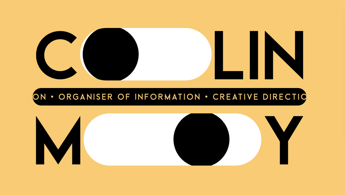
Image source: Screenshot from https://colin-moy.webflow.io/
Designer Colin Moy showcases his skills in an innovative portfolio website, utilizing his own design as a sample of his capabilities. With eye-catching visual tricks and interactive elements, he offers a firsthand experience of his creative prowess.
Why It Stands Out: Colin embeds a unique touch by incorporating eyes within his name. When interacted with, these eyes not only switch to dark mode but also launch a mesmerizing animation, underscoring his innovative approach and attention to detail.
What Can You Learn From It: By turning simple navigation into an engaging visual journey, Colin effectively retains and immerses visitors in his world of design.
Ast + Nebel
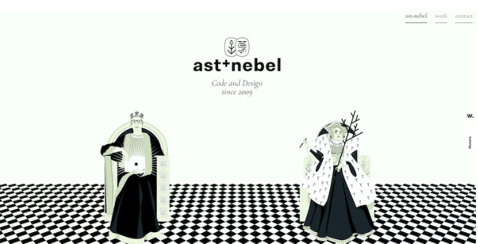
Image source: Screenshot for https://www.astundnebel.at/
Ast and Nebel, a dynamic duo from Austria, combine their talents to offer expertise in web design and development. Their portfolio is a beautiful fusion of their Viennese heritage with a touch of modern flair.
Why It Stands Out: Their design uniquely embraces their Viennese origins, channeling royal elegance without being overbearing. Instead of going the predictable route, they’ve reinvented the royal theme with playful chess motifs, adding an element of fun and cleverness. This blend of tradition and creativity sets them apart.
What Can You Learn From It: Their portfolio underscores the power of simplicity combined with thoughtfulness. Adopting an editorial style, it showcases their work in clean blocks with high-quality imagery and dynamic effects. Even without intricate interactive features, the portfolio is compelling. It teaches that a clear vision and authentic representation can make a significant impact, highlighting the duo’s unique perspective and capabilities in the web design realm.
Tips on How to Create Your Own Web Design Portfolio
Personal Touch
Your portfolio isn’t just a collection of your work; it’s a representation of who you are as a designer. Add a personal touch, whether it’s through an about me section, testimonials, or even a blog. Give visitors insight into your design process, inspirations, and what makes you unique in the sea of designers.
Showcase Versatility
Every project is a story. Displaying a diverse set of projects not only highlights the range of your capabilities but also tells potential clients that you can adapt to various styles and requirements. Make it a point to present different types of web designs, from corporate to creative, from minimalistic to vibrant.
Mobile Responsiveness
The rise in mobile browsing is undeniable. In today’s digital age, more users access websites through their phones and tablets than desktops. This makes it imperative for your web design portfolio to look and function seamlessly across all device sizes. Test your portfolio on different devices to ensure a consistent experience.
SEO Integration
A beautifully crafted portfolio is of little use if it doesn’t reach its intended audience. Ensure that your web design portfolio is SEO-friendly. This means using relevant keywords, optimizing images, and integrating meta descriptions. Remember, it’s not just blogs that benefit from SEO; your portfolio needs to rank on search engines for prospective clients to find you.
Keep it Updated
Web design is an ever-evolving field. New trends emerge, and old ones fade away. As a designer, you’re continually learning, evolving, and perfecting your craft. Your portfolio should reflect this journey. Regularly update it with new projects, and occasionally revisit older ones to ensure they still represent your best work. Also, consider adding a ‘work in progress’ section to show ongoing projects or experiments.
User-Friendly Navigation
While showcasing your design prowess, don’t forget the basics. Ensure that your portfolio is easy to navigate. Use clear headings, intuitive menus, and a straightforward layout. The easier it is for potential clients to browse through your work and get the information they need, the better the impression you’ll make.
Remember, your portfolio is often the first impression you make on potential clients. It should not only showcase your skills and versatility but also tell a story about who you are and how you approach design. Ensure it remains a true reflection of your growth and evolution in the field.
Conclusion
As web design is generally dynamic, staying static is not an option. Web design portfolios serve as much more than a mere showcase of projects; they mirror a designer’s journey, their adaptability to changing trends, and their unyielding commitment to excellence.
Whether you’re a novice taking your first steps or a seasoned professional, continuously updating your reference points with top portfolio web design examples is indispensable. As the design world evolves, so should the sources of your inspiration. Let 2023 not just be another year, but the one where you break boundaries and redefine web design norms.
Venture further into the captivating world of web design with Cyphon Digital. Dive deeper, learn constantly, and be the vanguard of unparalleled design innovation. Let’s create what’s never been seen before.
