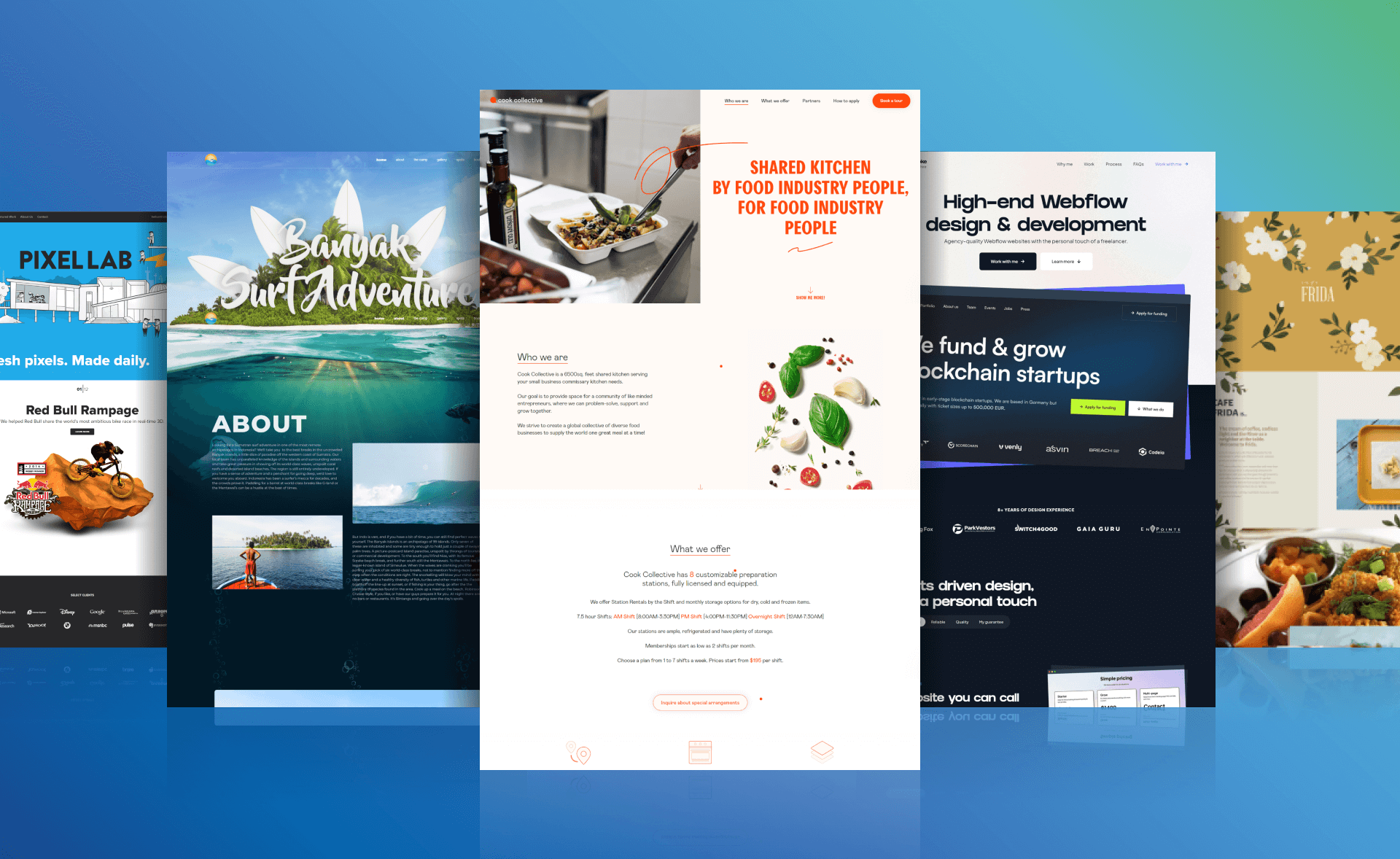
Ready to supercharge your website conversions? What if we told you that simplicity is key and a one-page website can outperform multi-page sites? In fact, one-page websites have shown a surge in conversion rates by a whopping 37.5%. But it’s not just about minimizing pages; it’s about smart design and targeted information.
As an award-winning design agency focused on solving design challenges and driving real results for our clients, Cyphon Digital wants to help you create the most effective single-page design. That’s why we came up with this list of the best one-page website examples and what makes them effective.
Let’s turn your business website into a conversion powerhouse! Check out the importance of a well-structured sites, and get ready to be inspired by these ten one-page website examples.
Quick Guide
- One-Page Websites Vs Multi-Page Websites
- What Makes a One-Page Website Convert?
- Top 10 Stunning One-Page Website Examples of 2024
- Conclusion
- FAQs
One-Page Websites Vs Multi-Page Websites
A one-page website is exactly what it sounds like. Instead of the traditional multipage layout with different pages for services, about us, contact, and more, a single-page website will have all those different sections on a single scrollable page. They can still have a navigation bar, but it won’t take you to a new page. Instead, it will take you to the associated portion of the homepage.
When done correctly, this type of layout can act as a landing page and drive direct actions and conversions. Additionally, it simplifies the user experience, which can promote a positive association with your brand.
There are a few downsides as well, though. For one, there won’t be much of an opportunity for Search Engine Optimization (SEO). Additionally, a single-page website is not necessarily great for businesses that need to provide a lot of content to their audience.
What Makes a One-Page Website Convert?
To ensure your one-page website performs adequately by driving conversions, boosting brand awareness, promoting a pleasant experience, and gathering leads, there are some specific elements you should include.
Clear and Concise Messaging
While clear and concise messaging is also important, it’s indispensable for a single-page website. You have less room to make a lasting impression or convert guests, so make sure you craft copy that highlights benefits and features, describes how to do business with you, and leads to a strong CTA.
Compelling Visuals
Having visuals to break up the typography and text can improve transitions and balance the graphic design. With every visual you add, whether it’s a background image, photo, or icon, try to make sure it supports your brand, offer, and goals.
Strong Call-to-Action (CTA)
Any website needs a strong call-to-action, but single-page websites only have one CTA. All other links will merely transport visitors to other sections of the one-pager. Because of that, make sure your compelling CTA uses action and power words.
If possible, we recommend A/B testing CTAs and other elements to see which performs the best, similar to how you would do so with a conversion landing page.
Scrolling and Navigation
Just because you are using a one-page website design doesn’t mean you can avoid using navigation menus. You can have a scrolling navigation bar and interactive buttons that open up more information or lead to relevant portions of the single-page website.
Social Proof and Testimonials
Social proof, testimonials, and other trust elements are crucial for a beautiful one-page website that converts rapidly. Other trust element options include certifications, awards, and recognizable business partner logos.
Performance and Load Time
Nobody likes waiting for a page to load. The rate increases by 32% when a page load time goes from one to three seconds. Therefore, make sure you have a fast-loading and responsive website. Additionally, make sure you use a website template that is mobile-friendly and loads quickly on both desktop and mobile devices.
Top 10 Stunning One-Page Website Examples of 2024
These are the best one-page website examples with design elements that you can steal for your single-page website to improve the user experience, build credibility, and boost leads and conversions.
Cook Collective
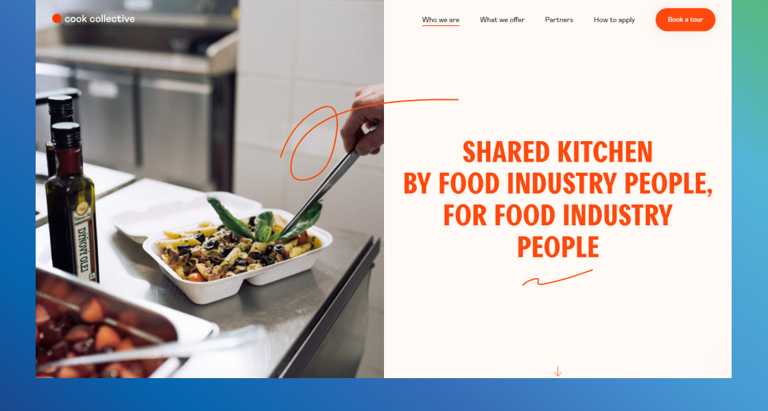
Image source: https://cookcollectivekitchen.com/
This one-page website example is fantastic because it’s so easy on the eyes and pleasant. That’s because Cook Collective uses plenty of whitespace, high-quality images, and contrasting colors. It’s organized so that the messaging is never jumbled, and clearly and concisely covers all the main benefits and features.
What you can steal:
- Organized White Space: By having different sections like “Who we are,” “What we offer,” and “How to apply” and combining them with concise copywriting and plenty of white space, Cook Collective avoids the potential stress and confusion that too many design elements can cause, especially on a one-page site.
- Detailed Contact Form: By including more information in a contact form, you can learn more about your site visitors, where they came from, and how to initiate a working relationship. For example, in addition to name, email, and phone number, Cook Collective learns more about their leads by asking for the type of cuisine, website or social media, and a description of the small business or company.
Ribalta
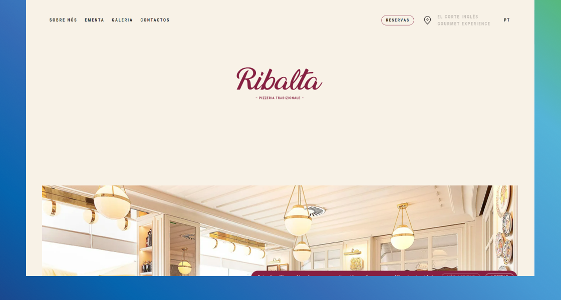
Image source: https://www.ribalta.pt/
Ribalta’s single web page design uses a distinct color scheme that perfectly matches the Italian cuisine and artisanal branding. Plus, the parallax scrolling with high-quality images and copywriting that makes your mouth water, this single page speaks volumes to their target customers.
What you can steal:
- The color scheme that matches your brand: Different colors evoke different feelings, so it’s a good idea to try to unite your color palette with your brand, value proposition, industry, and target customers. Ribalta does this with a combination of passionate maroon and beige color that mimics Italian architecture.
- Informative Footer: For a single-page website, an informative footer can provide your visitors with crucial details that didn’t naturally flow on the homepage like contact information, social media links, hours, privacy details, and more.
Dolox
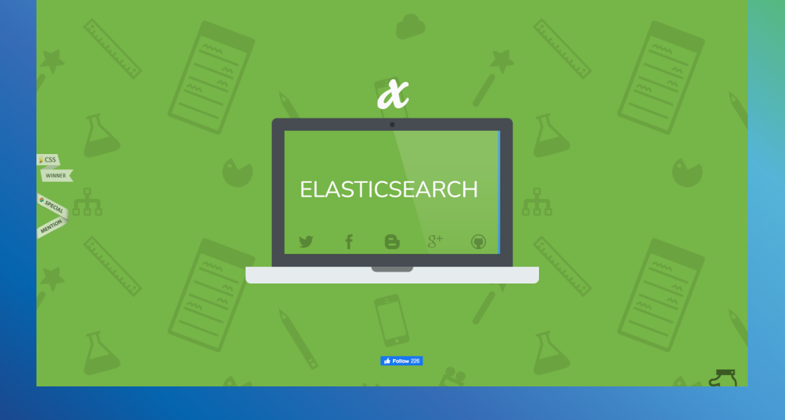
Image source: https://dolox.com/
After an impressive slideshow in the hero section that explains what Dolox does, the page animates as the user scrolls. The use of pain points as quotes on the left side with the Dolox process on the right provides direct benefits associated with target customer problems. Then, they finish with tons of other features, services, and clear CTA.
What you can steal:
- Clear On-Brand CTA: The conversational “Get in Touch” call to action is perfectly on-brand with Dolox while also having “no obligation” nearby to encourage clicks. Try to use your brand voice in your call to action and include trust elements, additional benefits, or guarantees nearby to boost conversions.
- Animations that Explain: Using interactive animations can be a great way to drive engagement but using them like Dolox where the process is walked through from original pain points to a completed product is effective, concise, and creative. You can do something similar by animating your small business process or results.
Plant22
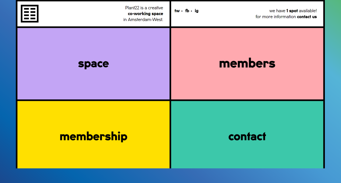
Image source: https://plant22.co/
This is another great resource of one-page website example that doesn’t involve any scrolling, making for an interactive, engaging, and minimalist experience. Plant22 provides co-working spaces, and their website has four colored blocks that, when clicked, open up to display the associated slideshow information.
What you can steal:
- Interactive elements: Having interactive features, clickable information, drop-down bullets, and expandable FAQs is a great way to boost engagement. Use Plant22 as design inspiration to show how you can compact tons of information within interactive features to reduce scrolling while still providing all the necessary information to target customers.
- Add Urgency with Countdowns: Plant22 uses a “we have ___ available!” with the number of spots available in the blank space. This adds urgency and encourages their visitors to take immediate action. Any e-commerce business can do the same by adding countdowns for free shipping, flash sales, or the number of products left.
Andy Hooks Portfolio Website
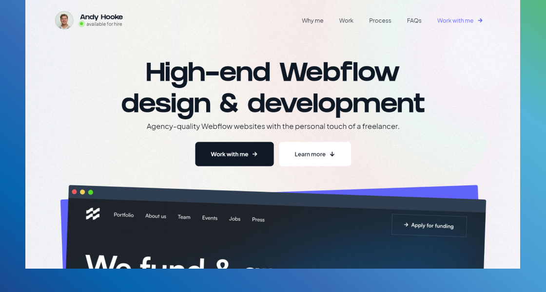
Image source: https://www.andyhooke.co.uk/
Andy Hooks is a web developer and web flow design freelancer, and his website is a great one-page website example with clear CTAs, a great division with FAQs, processes, an online portfolio, and other sections, and plenty of social proof including years of experience, previous client logos, and testimonials.
What you can steal:
- FAQs Section: Sometimes it can be difficult to fit all the pertinent information on a single-page site, but copying Andy Hooks and using FAQs to detail pricing, turnaround time, objections, and other frequently asked questions is a great choice. Plus, you can get to it from his navigation bar at the top of the page!
- Social Proof: Sprinkling social proof throughout a single-page website, particularly a longer one like this example, is a great way to build trust as your visitors are reading more about your services. Additionally, using a combination of different types is also a smart move.
Balsoy
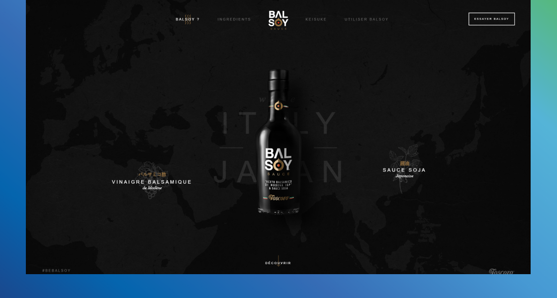
Image source: https://www.balsoysauce.com/
This one-page website example demonstrates how effective one page can be for a single product.
Balsoy is a tangy, vinegary, and salty condiment and the interactive features, product story, recipe ideas, and parallax effects make for an intriguing and mouth-watering experience.
What you can steal:
- Parallax Effects to Divide Sections: To avoid creating a single-page website that seems too much like a single page with the same background and typography, try using a parallax effect like Balsoy. This provides the appeal of completely separate pages while still retaining the one-page simplicity.
- Pop-Up information: Balsoy uses pop-ups to keep you on a single page while also providing more detailed information like recipes. You can try doing this with a contact form, portfolio pieces, or even high-quality videos.
Formation
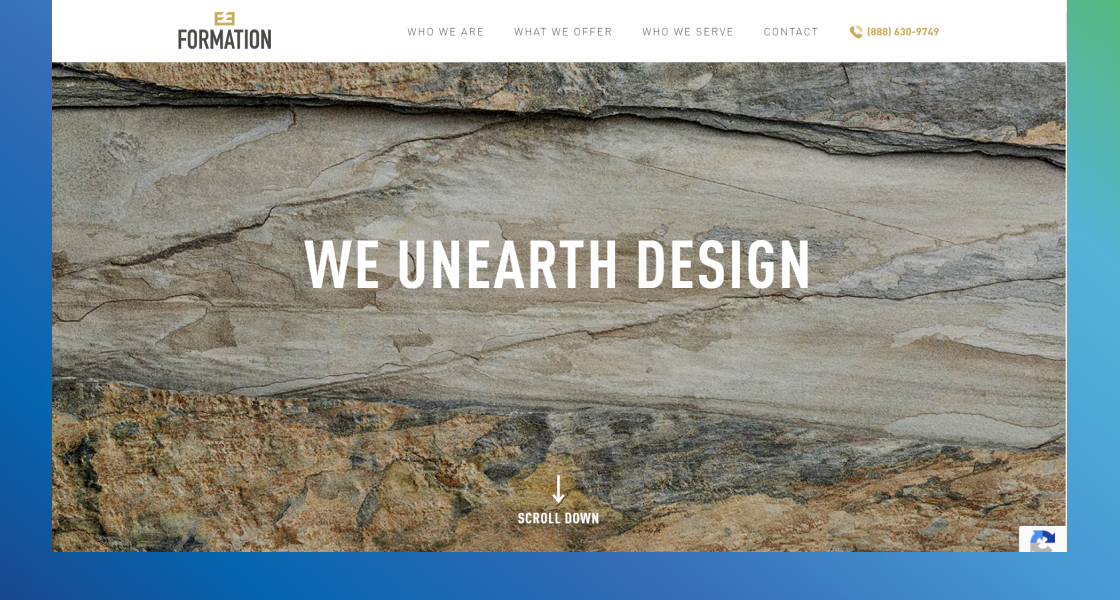
Image source: http://www.formationstone.com/
Formation’s website is a great one-page website example for businesses that want to include lots of information. With nearly a dozen sections, each with a CTA button that ultimately leads to the same, primary call to action and contact form.
What you can steal:
- Multiple CTA Buttons: If you are planning on having a long single-page website, including the CTA multiple times throughout the page can make it easier for visitors to find. You can also use Formation’s approach by also including your phone number in the navigation bar or a map at the bottom of the page to encourage in-person or telephone conversions as well.
- Slideshow of products or services: A completely vertical webpage can get pretty boring for visitors, but you can add a dimension and increase engagement by adding horizontal slideshows. Plus, this allows you to showcase more information that might not be relevant to every visitor.
Banyak Surf Adventure
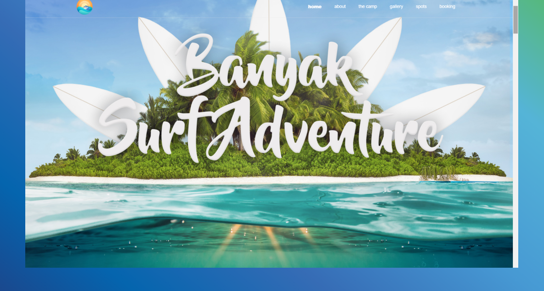
Image source: https://www.banyaksurfadventure.com/
The incredible color scheme, background design, and high-quality images establish a clear brand for Banyak Surf Adventure. They also use a navigation bar that scrolls with you and detailed information that describes the entire experience they offer.
What you can steal:
- High-Quality Images: Banyak uses images directly from their social media accounts to demonstrate the realness of their adventures, but they also use only high-quality photography to cultivate a professional and adventurous brand image.
- Scrollable Navigation Bar: Just because you only have a single page for your website doesn’t mean visitors won’t want to jump around to different sections. By including a navigation bar that scrolls down the page with guests, you can ensure a stress-free experience and make it easier for visitors to find info and ultimately click your CTA.
Pixel Lab
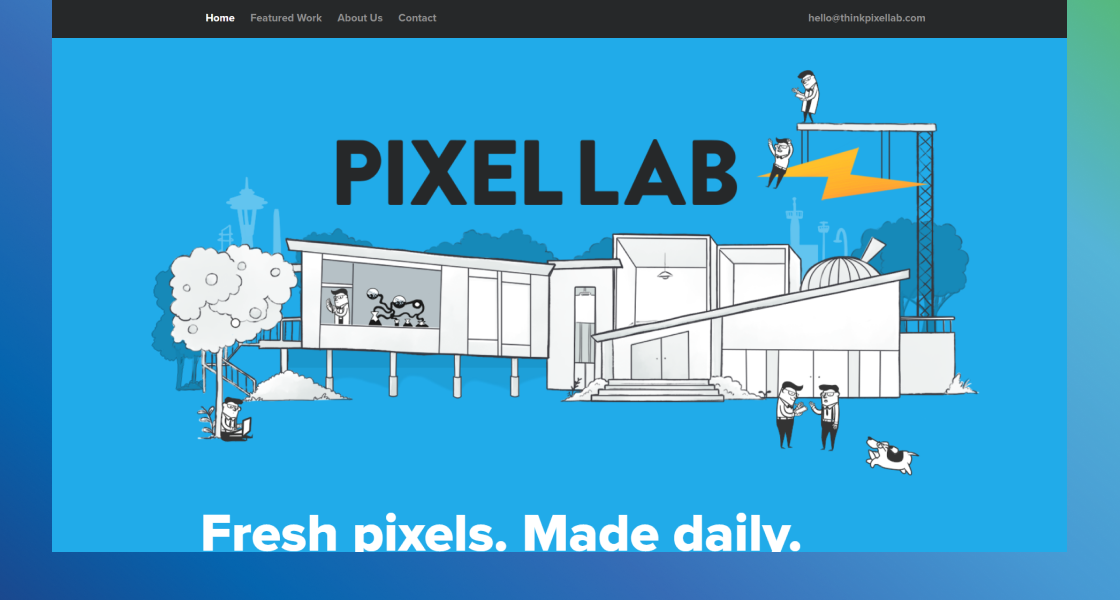
Image source: https://thinkpixellab.com/
Starting with the clean typeface, header, and subheading that directly cover what they do for their customers, Pixel Lab maintains a minimalist aesthetic throughout the page. In fact, they only have a few sections: hero, featured work, about us, and contact.
What you can steal:
- Only the Essentials: By including only the essentials, you can streamline the user experience straight to your call to action. While this might not be a good approach for direct e-commerce sales, it can be effective for a personal website focused on encouraging free consultations, no-obligations sign-ups, and other complimentary call-to-actions.
- Use eye-catching numbers and stats: Stats are a great way to demonstrate your value to your target audience. Like Pixel Lab, you can use numbers and stats as trust elements and to point out your expertise, but you can also use them to support your services, pricing, urgency, and other factors.
Café Frida

Image source: https://cafefrida.ca/
Restaurants like Café Frida serve more than food, they are serving an experience, and so are many other entertainment businesses. This immersive experience starts as soon as you land on this one-page website example.
They use engaging animations, imagery-fueled copywriting, high-quality photos, and detailed menus to get their point across, and they do it well.
What you can steal:
- Copywriting Paints a Picture: If you use copywriting like Café Frida, you can get your visitors to imagine themselves experiencing the benefits of your product or service. That can persuade them to take action based on emotions but don’t forget to support emotional benefits with logical features.
- Immersive Design: By using flowers that travel with you down the screen, animated photos, parallax effects, and a feeling of adventure, Café Frida demands immersive engagement. While you don’t have to take it as far as they do, using immersive elements, interactive features, and scrolling animations can keep your potential customers’ eyes on the page.
Conclusion
A website’s single-page design can be an effective way to boost conversions because of the simplicity and singular landing-page-style call to action. Use our one-page website examples as inspiration to include engaging animations and interactive elements, persuasive copywriting, effective social proof, concise messaging, and strong CTAs.
FAQs
Is a one-page website cheaper to build than a multipage website?
Yes, in general, a single-page website takes less time to build, requires less intensive HTML development, and will cost less money to design. Additionally, it may not take as long to get your website live and convert.
When to use a one-page website versus a multipage website?
Single-page websites are great for selling single products, compiling online portfolios, targeting a very specific audience, raising awareness of your startup, or advertising specific events.
Before deciding if you need a single or multi-page design, think about how many CTAs and how much information you want to include. A single CTA and limited information are perfect for a single page while detailed or complex information might be best divided between multiple pages.
Can I build my own one-page website?
There are tons of one-page website builders that make it easy for you to create your webpage yourself using templates. Some options include Wix, WordPress, and Weebly.
However, there are also benefits to using a professional development, design, and marketing agency like Cyphon Digital. We can ensure your one-page website doesn’t just look great, but that it’s fast, functional, and designed for conversions.
If you’d like to see what we can do for your one-page website, click below to schedule a free consultation!
