The best information websites provide all the information their visitors want in an easy-to-read format while also prompting them to click a CTA, whether that’s signing up for a subscription, requesting more information, or buying a product based on the info presented.
Since 2001, Cyphon Digital’s web, SEO, and marketing experts have been delivering results for our clients.
We put together this guide on the best informational website examples so you can get the same results with superior usability, functionality, navigation, responsiveness, and a well-planned layout for a user-friendly experience that keeps visitors coming back.
Keep reading to evaluate the most important criteria for an impressive informational website, learn from the best informational website examples, and use tips so you can create your own effective and results-driven information web page.
Jump Here:
- Criteria for an Impressive Informational Website
- 8 Impressive Informational Websites for Inspiration
- Tips for Building an Inspiring Informational Website
Criteria for an Impressive Informational Website
Informational websites are simply websites that prioritize information. This includes information-as-a-service websites like news websites and websites for businesses that rely on in-person customers.
Other types of businesses that might have informational websites include non-profits, blogs, and brands that use their website to tell who they are and what they do.
You can use the following criteria to create an impressive website because it’s the criteria we used to choose the best information website examples:
Content Quality: An information website relies primarily on content, so all the best examples have premium quality content that delivers value to their target audience.
Authority and Credibility: Visitors should trust that your information comes from a source of authority or credibility, so using social proof, experience, and credentials goes a long way toward an impressive website design.
User Experience (UX): A user-friendly website design that’s easy to navigate with features that serve visitors is a critical criterion for an impressive informational website.
Accessibility: Making your website accessible to bilingual, visually impaired, mobility-challenges, and other audiences goes a long way toward trust and effectiveness.
Functionality & Responsiveness: The informational design examples we chose are easy to use with essential features that promote functionality, readability, navigation, and responsiveness.
Layout and Visual Hierarchy: It’s good to have a layout that prioritizes the newer or most important information at the top of the page and offers subheaders and headers for scanners and detailed information for readers.
Regular Updates: Informational websites should always have up-to-date information that’s accurate and relevant.
8 Impressive Informational Websites for Inspiration
Use these excellent information examples to inspire you and your own informational website and online presence.
The Information

Image source: https://www.theinformation.com/
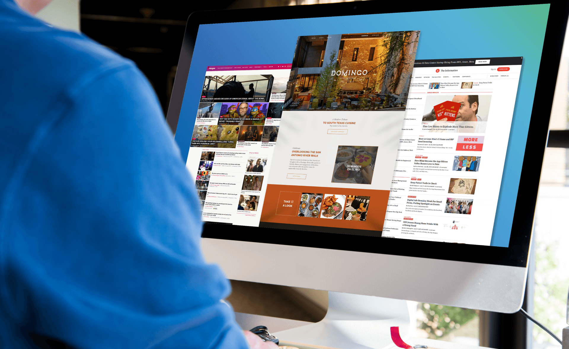
The Information provides a fantastic balance between free and paid content, and their homepage includes the latest articles at the very top. They also make it easy to find specific articles or information with an accurate search engine and navigation menu.
What makes this website impressive:
- Pop-up sign-up form that offers 25% off for subscribers with a clear call-to-action, but that’s also easy to exit out of to browse free content, including a newsletter.
- User-friendly features like a mobile app, bookmarks, preferences, and personalized information.
Invisalign
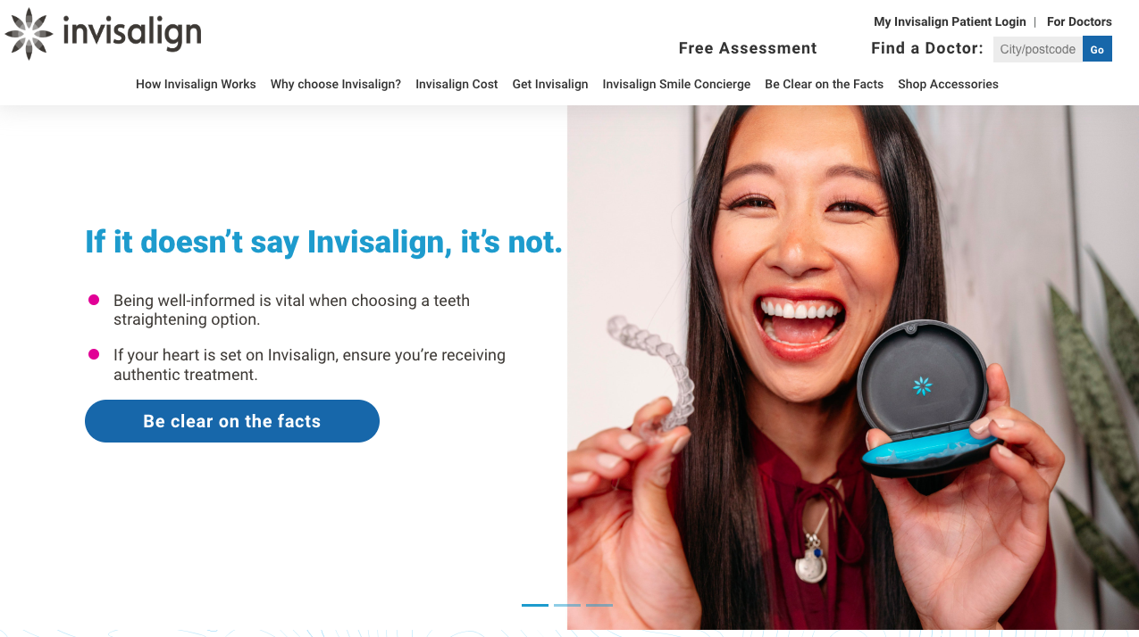
Image source: https://www.invisalign.com.au/
Invisalign mostly relies on dentist connections and recommendations for sales, but they have this informational ecommerce website that provides all sorts of great info to potential customers and doctors.
They use research-based facts, pages on how it works, information on costs, and provide a quiz to see if their product is right for you.
What makes this website impressive:
- The homepage provides the most important information in a factual and concise step-by-step way while other pages offer more detailed information about the product.
- Engages visitors while providing more information by using a quiz. You can also use discussions, podcasts, and webinars to boost engagement on an informational website.
Polygon
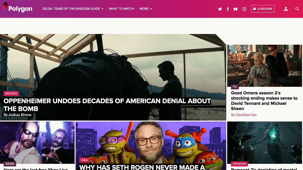
Image source: https://www.polygon.com/
Polygon is a great website for finding information about comics, games, movies, and other popular culture topics that appeal to their target demographic.
Their use of white space alongside large images and clear, easy-to-read fonts makes it easy for guests to keep scrolling and find what they are looking for.
What makes this website impressive:
- Excellent messaging adds value by telling their audience that they narrow down the endless media options to highlight the “best, the funniest, the scariest, and the most exciting” options.
- Informational sites often make money off ads, but Polygon doesn’t overdo it so that the website is fast and prioritizes the user experience.
UCLA
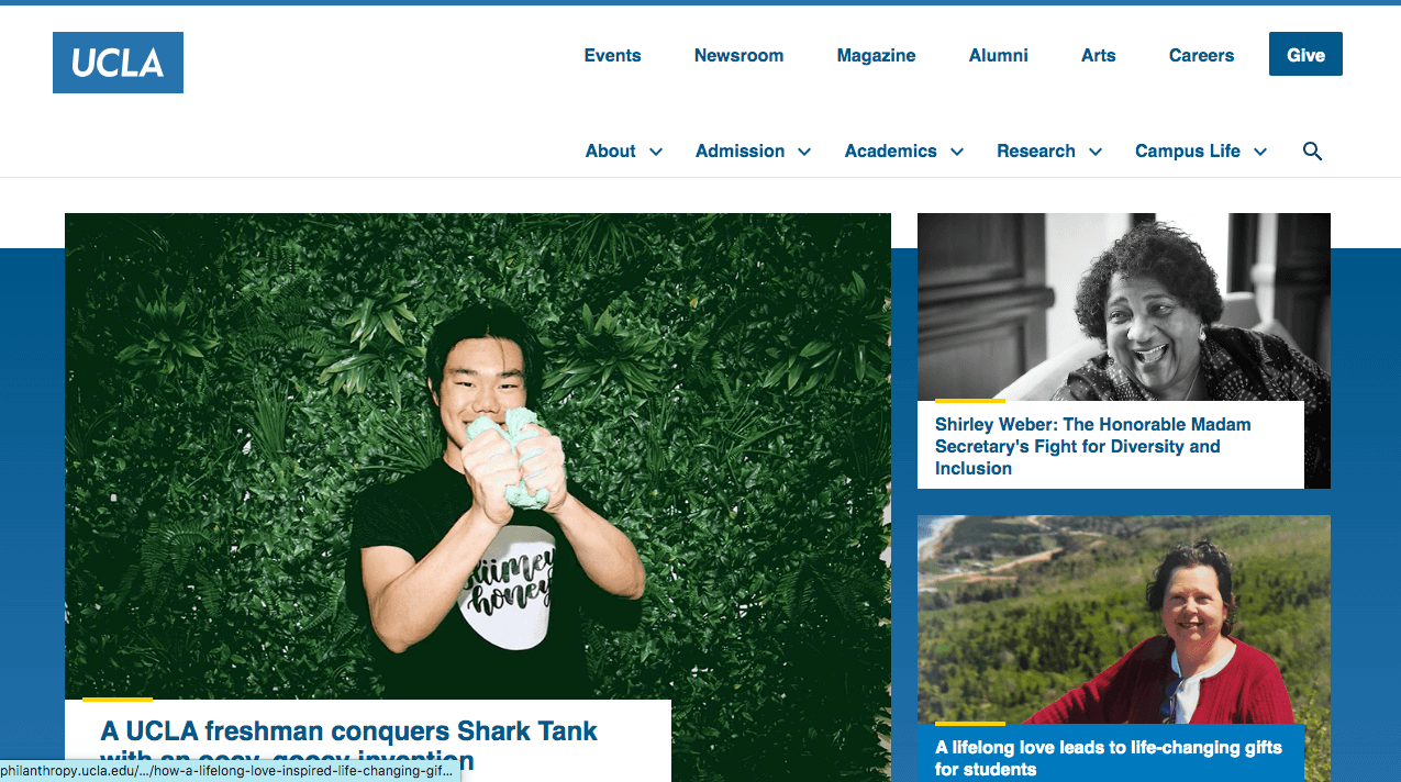
Image source: https://www.ucla.edu/
Universities, colleges, and schools often have informational websites to provide necessary details to students, staff, and parents.
UCLA does it exceptionally well with the most recent updates in the hero section of the homepage, on-brand color scheme, excellent navigation, and a clean design that divides information by topic.
What makes this website impressive:
- UCLA includes social media updates on its homepage to boost engagement, grow a larger following, and raise awareness of all the events they have going on.
- Most pages throughout the website are divided into sections with clear headers, alternating background colors, and high-quality images.
New York Times
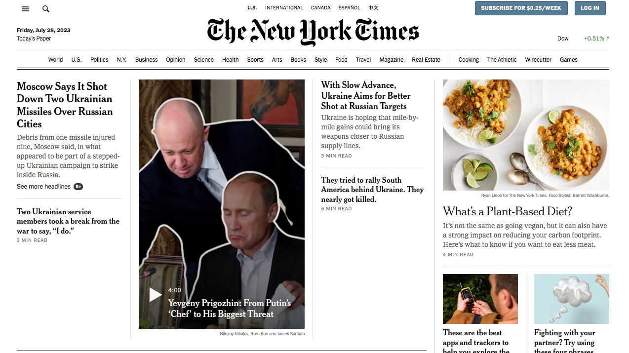
Image source: https://www.nytimes.com/
The New York Times website layout mimics their iconic physical newspaper design including the date and header.
They also allow free access to a certain number of articles while using a paywall with a clear call-to-action button and persuasive pricing to encourage subscriptions.
What makes this website impressive:
- The New York Times app and website both offer great accessibility functionality including closed captioning and transcripts for videos, font size settings, language toggle, and audio transcripts.
- Minimalist web design delivers a fresh take on a familiar experience with an attractive balance of white space, images, text, and ads.
Verywell Mind
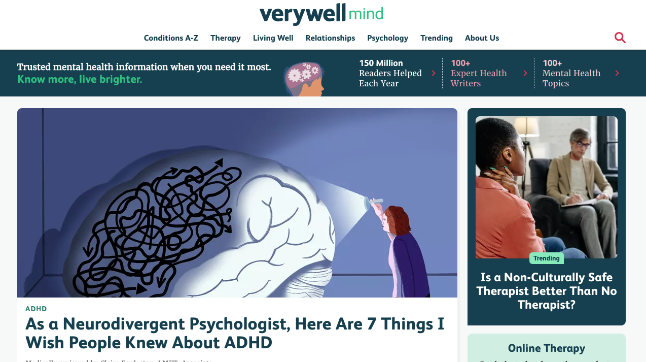
Image source: https://www.verywellmind.com/
Verywell Mind is a blog providing information about mental health, relationships, and other related topics.
They use exceptional SEO content to drive visitors to their ecommerce website as well as a user-friendly design that makes browsing articles and information easy.
Plus, their fantastic value proposition highlights trusted info that’s easily accessible for readers to “live brighter.”
What makes this website impressive:
- They use multiple forms of social proof on their homepage to demonstrate their credibility to readers including the number of annual readers, topics, and writers, their awards, and review board of “board-certified physicians and other mental health professionals.”
- While articles are extremely SEO-friendly, they also provide all the necessary information in a well-organized way that includes specific subheaders, bullets, and sympathetic writing to speak to their target audience.
MADD
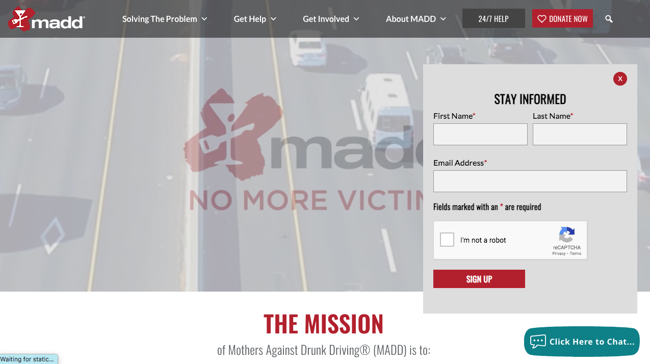
Image source: https://madd.org/
Mothers Against Drunk Driving is a non-profit and their website is mostly used for providing information while also persuading visitors to donate to a good cause.
They have impactful statistics, emotional testimonials and case studies, and tons of information for donors, victims, survivors, and concerned citizens.
What makes this website impressive:
- The pop-up email newsletter form engages with potential donors and anyone interested in information about their organization and contributes to their overall marketing strategy.
- The website’s layout organizes information in a clear, easy-to-navigate way that includes separate sections for their biggest target audiences: victims and volunteers/donors.
MET Museum
Image source: https://www.metmuseum.org/
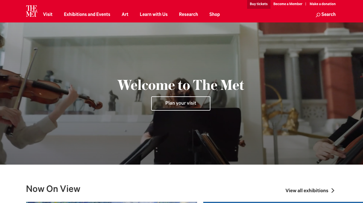
The New York Metropolitan Museum of Art is one of the most famous art museums in the world, and their website provides all the best and most recent information to ensure you have a smooth and fun visit.
They have an entire “Plan Your Visit” section with tickets, locations, and all other information that you need to know as well as tons of great sections on their events, exhibits, research, and art.
What makes this website impressive:
- While this website has a fairly simple design, its high-quality images and videos make art the real hero, just like it is at their physical location in NYC. You can even browse almost their entire collection online!
- Interactive event calendar allows you to click on any events to see detailed information pages, buy tickets, learn more, or contact specific email addresses for more information, concerns, or questions.
Tips for Building an Inspiring Informational Website
These are some expert tips to ensure your informational business website looks like the best website examples above.
Demonstrate Credibility
The best informational website examples show their visitors that their information is credible. People trust their domain names because of a combination between track record, social proof, process, style, and more.
Even as a startup, you can boost credibility by including testimonials, constructing a premium value proposition, adding your background, and highlighting your experience.
Additionally, like the Verywell Mind example above, you can detail your process, regular updates, and team of experts who create or review the content.
Define Target Audience
It’s almost impossible to provide information to everyone, so whether you are making a blog, creating a website for an in-person business, or promoting any other type of information website, it’s critical to have a clear and defined target audience.
That way, you can position the information, messaging, and website design to cater to their needs, concerns, and pain points.
Focus on Compelling and Engaging Content
While it can be easy to focus on designing an attractive website with animations, interactive features, widgets, and everything else, the best informational websites like New York Times or Invisalign require compelling, valuable, up-to-date, and engaging content to thrive.
Content should provide value to your visitors while also being easy to read with clear headers, subheaders, bullets, and concise sentence structure.
The tone and style will depend on your target audience whether it’s formal, conversational, humorous, or a combination of different voices.
Prioritize User Experience (UX)
When it comes to web design for the top informational websites, it’s clear that the main function is to create a user-friendly experience.
This includes simple navigation and helpful features like navigation bars, search menus, chatbots, or even interactive quizzes like you can find on the Discount Tire website.
Make a good first impression while also providing an easy-to-follow visual hierarchy for new visitors.
Conclusion
The internet used to be known as the information superhighway, so it’s no surprise that there are tons of great informational website examples including news websites, blogs, and other sites that prioritize information. The best information websites provide value to their visitors, cultivate a pleasant user experience, make a good first impression, and demonstrate credibility.
Use the 10 informative website designs above to inspire your own efforts so that you can create your own impressive website that attracts more guests and drives more subscriptions, sales, and revenue.
Information Website Examples FAQs
What are the different types of information websites?
There are many different types of information websites including:
- Blogs
- Information product websites
- Non-profit websites
- Forums
- Personal websites
- Family websites
- Educational websites
- News websites
- Portfolios
- Websites for in-person businesses
- Petition websites
- Community websites
- Much more
How does an information website make money?
Information websites can make money in several different ways, even if they don’t sell specific products or services. They can offer paid subscriptions with exclusive content, perks, and other benefits.
Additionally, if you want to provide only free information, then you can drive revenue by including ads or affiliate articles. Finally, some nonprofits and information websites thrive on donations.
How do I build an impressive information website?
You can use website builders like Wix, Squarespace, and WordPress that make it easy to build your own website. They offer website templates and themes to help you get a functional website up and running cheaper and faster, but there are some downsides.
Your website won’t be 100% unique and you might not be able to lay it out in the most impressive way. It might also be difficult to incorporate unique features that promote a user-friendly experience.
The other option is to hire a web design team with a track record of success in design, development, SEO, and marketing, like Cyphon Digital. Our teams will work with you to create your information website to meet your audiences’ precise needs.
Schedule a consultation to tell us all about your business, audience, website, and goals today!
