Your construction company’s website is the public face of your business. In a competitive market, an impeccable website design is not just an option, but a necessity.
To ensure your website captures the essence of professionalism and trustworthiness, it is vital to integrate general best practices with industry-specific website design strategies. Cyphon Digital’s expertise, backed by over 20 years of experience, offers a compilation of 10 exceptional construction website examples for inspiration.
Whether you are planning to create a website for your construction business or trying to improve what you have, dive into this awesome lineup of slick, easy-to-use construction websites and make your site a total game-changer!
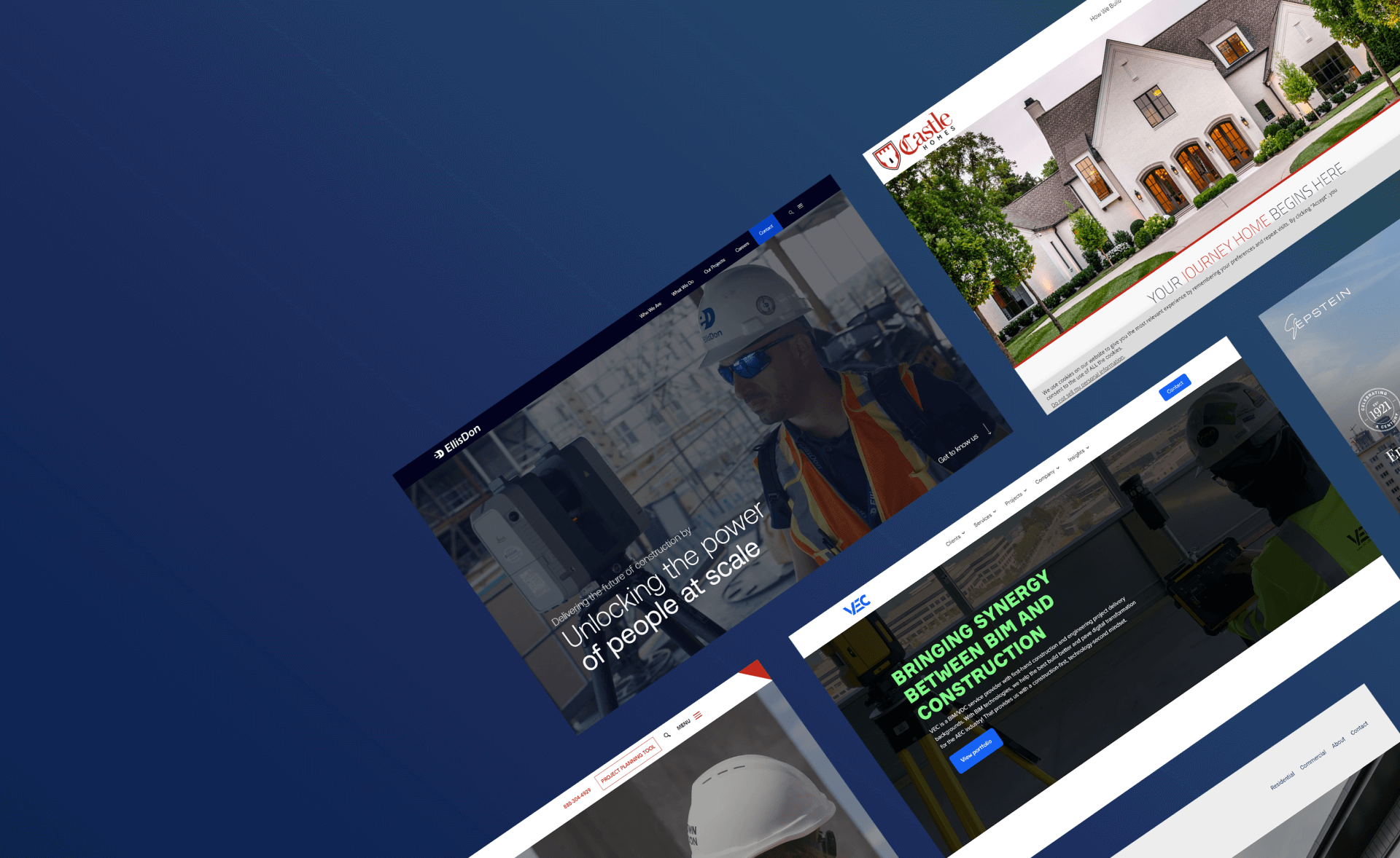
10 Best Construction Website Examples
Here’s 10 construction company websites that are solid in delivering great browsing experiences. They also have their own twists, catering to their brand and customers.
QualMax
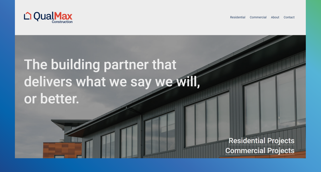
Image source: https://qualmax.co.nz/
QualMax Construction offers a simple website that gets right to the point with a headline that addresses a potential objection or concern when someone is looking for a great construction company. Plus, the website is divided by its two customer bases, residential and commercial. This ensures that their messaging isn’t muddled and can directly address specific benefits, pain points, and questions.
What you can steal:
- Minimalistic design: It can be easy to go overboard when creating your website, but keeping things simple, clear, and direct can be more pleasant for your visitors.
- Divide by customer base: If you have different customer bases, whether it’s residential and commercial like QualMax or something entirely different like general contractor services, real estate, and new builds, separating your web pages accordingly can add clarity to your messaging and help you address more specific clientele needs.
Epstein Global
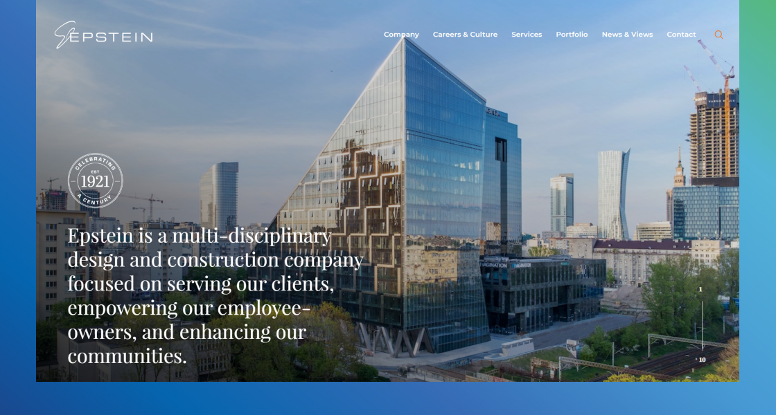
Image source: https://www.epsteinglobal.com/
With a combination of high-quality videos, copywriting, and cohesive branding, Epstein Global tells its story while incorporating the benefits of experience and expertise for its target customers. Their site is also easy to navigate whether you’re looking for their New York offices, portfolio, news, or specific services.
What you can steal:
- Easy Navigation: Having easy navigation from every page of your construction website makes life easier for your prospects. Epstein does this with a navigation bar as well as an additional “In This Section” navigation tool on each page of their website. Plus, they have a footer with even more precise links, so their customers never get lost.
- Storytelling: Having a brand story helps you connect with your customers. You can convey your narrative with videos, written messaging, high-quality images, and even social proof. Epstein is a great example of website design construction that uses videos to tell its story in a customer-focused way.
VEC
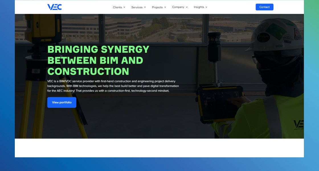
Image source: https://www.vec-us.com/
VEC has a clean and professional website design that uses plenty of white space. This makes it easy on the eyes while also making the blue CTA buttons, awards, services, and social proof stand out. Plus, the color scheme is consistent throughout the entire website.
What you can steal:
- Trust Elements: Like VEC, you can use multiple types of social proof and trust elements including the number of projects, years of experience, certifications, testimonials, and recognizable partner brands like Meta and Tesla.
- Interactive Features: You can use emphasis animations and interactive elements to improve the customer experience. For example, on the homepage, VEC allows visitors to click on the services they are interested in to learn more about them while staying on the page. This also contributes to a clean appearance because all the info isn’t on the page at the same time.
McCown Gordon
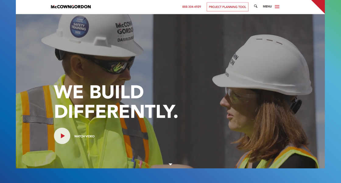
Image source: https://mccowngordon.com/
This is an excellent construction website example that demonstrates how to use scrolling animations that do not interfere with messaging or customer focus. McCown Gordon offers a great Project Planning Tool instead of a generic contact form while providing as much, or more contact information.
What you can steal:
- Non-Intrusive Animations: While it can be easy to go overboard with animations, use MCown Gordon’s construction website as inspiration for how to use animation to boost engagement without creating an unpleasant user experience.
- Portfolio Divided by Project Type: Instead of having a single portfolio page with all your various projects, try having separate pages for different construction project types, industries, and construction services.
Castle Homes 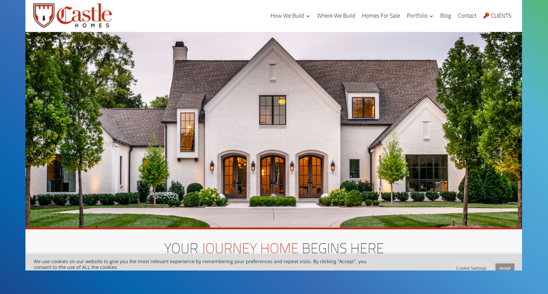
Image source: https://www.castlehomes.com/
This custom home builder uses a slideshow of high-quality images in the hero section to clearly demonstrate their value and the beauty of their work. They also use copywriting that combines emotion with logic to persuade the reader. Plus, it stays on-brand with the castle theme.
What you can steal:
- High-Quality Images: When showing off past projects, it won’t matter how great they are if the images are poor quality. By using high-quality photos, you display your expertise and professionalism to potential customers.
- Detailed Contact Page: Instead of using simple “Contact Us” and “Fill out the Form” on your contact page, try including other contact info like phone number and address in addition to the contact form. Then, like Castle Homes, you can also include customer testimonials and reviews to boost credibility.
EllisDon
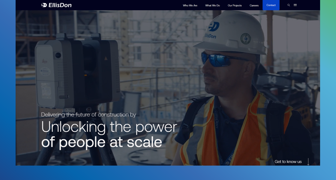
Image source: https://www.ellisdon.com/
The dark blue background color as well as interactive images gives EllisDon’s WordPress website a modern, futuristic feel that aligns with their brand and messaging. They also have a fantastic “Who We Are” page that builds on the themes of progress, modernism, and people-first values.
What you can steal:
- Customer-Focused About Us Page: While it may sound like an “About Us” page should be all about you, try to write it so that it demonstrates what you can do for your target customers. For example, EllisDon uses its values to show how they are “fast, fluid, and flexible” and “innovate continuously.”
- Cohesive Theme: If you can design your construction company website in a way that develops a consistent theme, as EllisDon does with people-first modernism, you’ll attract more leads and promote greater brand awareness.
Statewide Remodeling
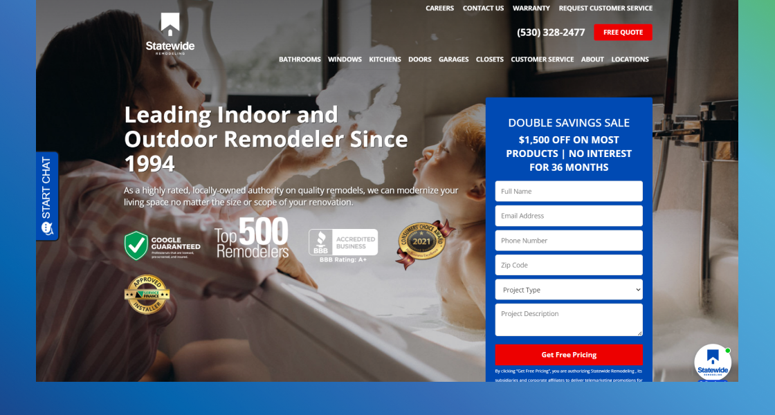
Image source: https://www.statewideremodeling.com/
While not a full construction company, Statewide Remodeling demonstrates some great design elements that you can use for a general contractor, remodeling, new construction, or any other type of construction website. With a fantastic hero section, clear CTAs, and steps of their construction process, this construction website example is exceptional.
What you can steal:
- Complete Hero Section: By using a value proposition tagline, awards, years of experience, and even a contact form in the hero section, you can simplify the experience for website visitors.
- Clear CTAs: Make sure you use actionable language in your calls to action as well as words like “Now” and “Free” to add urgency. Also, like Statewide Remodeling, you can make your CTA buttons attract the eye by using a color that stands out among background images and color schemes.
Samuels Group
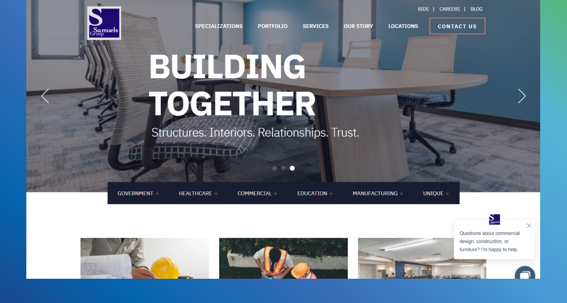
Image source: https://www.samuelsgroup.net/
The Samuels Group website offers clean navigation, a mobile-friendly design, and a helpful Chatbot that promotes a positive user experience. Plus, they make great use of SEO blog articles that address the needs of their customer base.
What you can steal:
- Helpful Chatbot: Not all chatbots are helpful but use the Samuels Group’s bot feature to inspire your own. It gives plenty of choices for the type of information a potential client may be looking for when they visit websites, but it’s also not pushy and doesn’t intrude on the user experience.
Mortenson
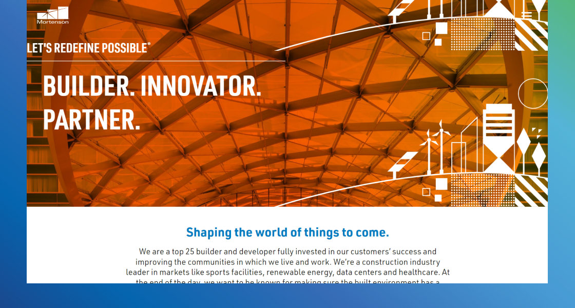
Image source: https://www.mortenson.com/
The design that Mortenson uses for their website makes it easy for both in-depth readers and fast scanners to find the information they want. With a balanced aesthetic, clear headers and sub headers, and buttons that stand out, the website is clean and easy on the eyes.
What you can steal:
- Mobile-Friendly Designs and Templates: There’s a good chance that many of your website visitors will come via mobile phones, so make sure you consider that with your website design. Mortenson’s website looks just as good on a phone screen as it does on a desktop.
- Balanced Aesthetic: Mortenson keeps their web design clean and easy to read because they maintain balance. For example, by switching from white to color backgrounds with each section, alternating between images and text, and maintaining a straight line down the middle of the page, they promote a positive user experience.
Jova
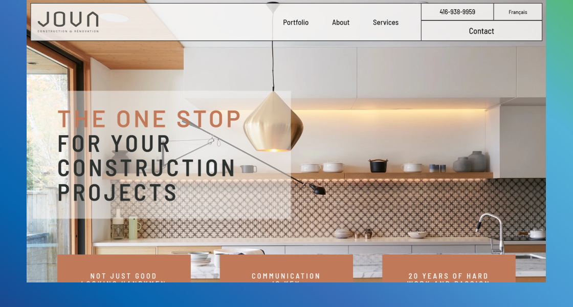
Image source: https://jovaconstruction.com/
This website combines a great color scheme and high-quality background images with superb functionality for a well-rounded user experience. They include their phone number, contact button, and navigation bar that scrolls with the user and it even has the option to switch languages to ensure they make it as easy as possible for customers to find what they need.
What you can steal:
- Scrolling Navigation Bar: By having a navigation bar that scrolls with the user, you prevent the need for scrolling all the way to the top. While that may seem minor, it’s an important element of UX design, which, in turn, generates a positive association with your brand, whether you’re a small business or a corporation.
- Easy-to-Read Font: The font on Jova’s website is clear, large, and easy to read while the color supports the readability and makes the messaging stick out on the lighter background.
Strategies for an Outstanding Construction Website in 2023
The construction industry is highly competitive, but having a dedicated online presence, social media accounts, and a beautiful website can go a long way to attracting leads and converting them into clients. In addition to using the best construction website examples above to inspire your project, there are some construction web design strategies you can also keep in mind.
Clearly State Construction Specialties
Clearly state the type of construction projects your company undertakes, and mention any specialties. This ensures that visitors to your site will instantly know what your construction company offers and whether it aligns with their needs.
Feature High-Quality Product Imageshotos
Use large, high-resolution images of your completed projects with a focus on the Home page. This will serve as a visual portfolio, and will instantly establish your credibility and showcase your achievements.
High-quality photos and images are important for any website, but they are especially important when you’re trying to show off your construction portfolio. Using professional photography can make your projects look even better and allow you to display your specific expertise and attention to detail.
Simplify the Navigation
It’s critical that you make it easy for potential customers to find exactly what they are looking for on your website. There are lots of different navigation strategies that you can use, but it typically starts with having a navigation bar on your homepage. You can also use a scrolling navigation bar to make it even better, similar to what Jova does on their website.
Additionally, you can incorporate breadcrumbs that tell your visitors where they are on your website. These will show the page your visitor came from leading to where they are now. For example, it might state “Home > Services > Residential> Roofing.”
Define Your Unique Value Proposition
Articulate your unique value proposition. Avoid generic statements like “high quality work” or “integrity”, and instead focus on the specific aspects that make your company distinct from other competitors.
Mobile-Friendly Design
Whether your customers found you on a search engine, social media, or through a recommendation, there is a good chance they will be using a phone to enter your website. A mobile friendly design ensures a smooth experience when that happens, which, in turn, can increase conversions.
Customer-First Messaging
It can be tempting to talk about your own experience, portfolio, projects, and more, but you should try to do so in a way that focuses primarily on the customer. For example, instead of saying, “We have 10 years of experience in commercial construction,” you could say, “Our 10 years of experience ensures a reliable, efficient, and budget-friendly commercial construction project.”
Include Extensive Portfolio, Case Studies and Display Industry Trust Signals
As you may have noticed with several of example websites for construction companies, social proof is an important feature. When you start your own construction website make sure to create a separate portfolio page that is easily accessible through the website’s top-level navigation. Populate this page with professional photographs of your completed projects, showcasing a wide range of work.
Consider adding case studies alongside the portfolio. Through case studies, demonstrate how your company has successfully navigated challenges in planning, design, or construction. This showcases your problem-solving capabilities.
Feature industry trust signals like licenses, insurance, certification, and trade organization memberships using official logos. Additionally, include testimonials attributed to real clients, as these serve as powerful trust builders.
Incorporate User-Friendly Contact Form with Clear and Effective CTAs
Ensure that your Contact Page includes a simple and easy-to-use form. This allows potential clients to swiftly ask questions or request bids and quotes. This is a great way to boost conversions by generating more leads.
Make sure that you also have clear and strong CTA. You can make them stick out by using contrasting colors. Then, for the text use action words and power words like “Get,” “Request,” “Contact,” “Free,” and “Today.”
Conclusion
We got your back! If you went through all the lists and think that your site is not making the cut, DON’T WORRY! Cyphon Digital has a 20 years of good reputation in creating epic websites that cater to your needs. Schedule a Free Consultation with us!