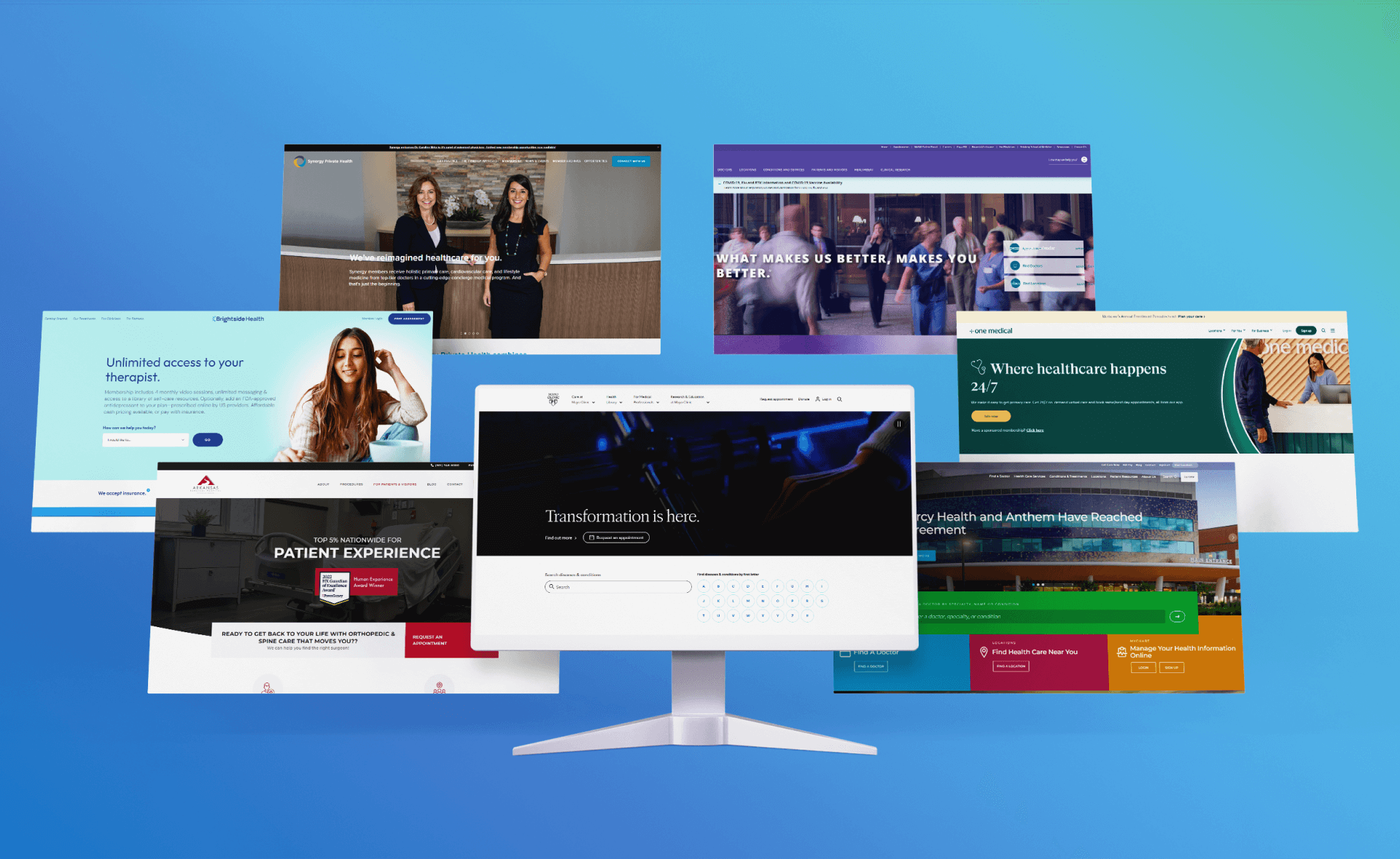
Amidst today’s digital era, an intuitive website design isn’t merely a luxury; it’s an absolute necessity, especially when it comes to the healthcare sector.
Patients who are in search of medical services heavily rely on healthcare website design portals to guide their decisions. A poorly designed website can discourage potential patients, pushing them to seek alternative sources for medical advice or services.
On the flip side, the best healthcare website designs empower patients, ensuring they have effortless access to trustworthy and actionable medical details.
If you’ve been in pursuit of the ultimate inspiration, you’ve landed at the perfect destination. We’ve painstakingly curated a selection of the most compelling health website designs for the healthcare industry in 2023, all for your benefit.
Jump here:
- What Makes the Best Healthcare Website
- 7 Best Healthcare Website Designs
- Example 1-Mayo Clinic
- Example 2-Mercy Health
- Example 3- Arkansas Surgical Hospital
- Example 4- One Medical
- Example 5- Brightside Health
- Example 6- Northwestern Medicine
- Example 7-Synergy Private Health
- Tips for Healthcare Providers
- Conclusion
What Makes the Best Healthcare Website:
- Reliable Medical Information: Top healthcare websites prioritize accuracy and current medical information. False or outdated data can have dire consequences for patients.
- Accessibility/Mobile-Friendly Design: With the influx of mobile site visitors, a site that’s not responsive can alienate a significant portion of its visitors. Patients must access the site effortlessly regardless of their device, ensuring it caters to those with disabilities as well.
- Clear CTA Buttons: Call-to-action (CTA) buttons guide patients to take desired actions, like booking appointments or accessing patient portals.
- Easy Booking and Appointment System: A streamlined process, with an easily visible phone number, to book appointments can significantly improve patient experience, reducing the hassle and time spent.
7 Best Healthcare Website Designs
Example 1-Mayo Clinic
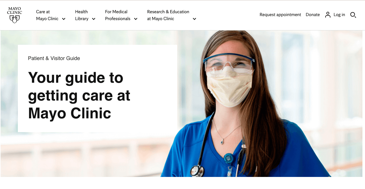
Image source: Screenshot from https://www.mayoclinic.org/
The Mayo Clinic‘s website masterfully integrates its medical prowess with a user-centric online platform. Through clear navigation, detailed resources, and expert-authored content, it serves as a comprehensive resource for anyone seeking reliable health information.
Stand-out Features:
- Comprehensive Navigation Bar: Prominently displayed, this feature ensures users can swiftly navigate through a multitude of health resources.
- Alphabetical List of Conditions: This offers an organized and user-friendly method for visitors to research specific health issues.
- Detailed Symptom Checker: Allows users to delve deeper into understanding potential health concerns based on symptoms they experience.
- High-Quality Content Section: Dedicated areas covering diverse medical topics, all crafted with the expertise of Mayo Clinic‘s physicians and clinicians.
Example 2-Mercy Health
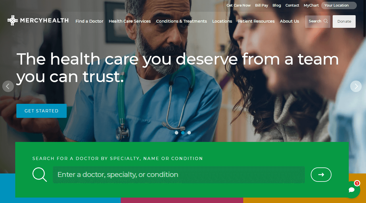
Image source: Screenshot from https://www.mercy.com/
Mercy Health’s website beautifully intertwines the essence of healthcare with dynamic design elements. By opting for a vivid color palette and consistently thematic photography, the site not only informs but also instills hope and enthusiasm in its visitors. The carousel feature, a staple in many healthcare designs, further amplifies its user-friendly interface, making it a standout in medical website designs.
Stand Out Features:
- Dynamic Imagery: Mercy Health’s website utilizes vibrant and lively photography to engage its audience.
- Vivid Color Palette: Unlike traditional medical websites, it boasts a rich and vivid color scheme that distinguishes its design.
- Carousel Feature: Located under the header, this carousel – a frequent attribute in healthcare web designs – ensures seamless navigation and showcases thematic images.
- Consistent Photography Theme: The site maintains a unified theme with its high-quality images, promoting feelings of positivity and optimism for those visiting.
Example 3- Arkansas Surgical Hospital
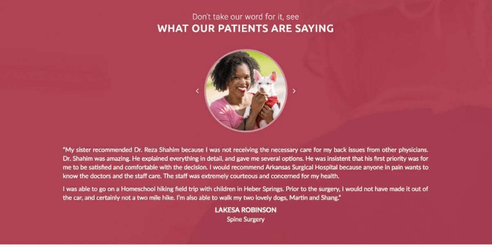
Image source: Screenshot from https://arksurgicalhospital.com/
Arkansas Surgical Hospital utilizes a strategic approach in their website design to prioritize the needs and concerns of prospective patients. By prominently featuring patient testimonials on the homepage, the hospital acknowledges the importance of patient voices in the healthcare decision-making process.
Stand Out Features:
- Testimonial Focus: Emphasizes the value and credibility of real patient experiences.
- User–friendly Carousel: Allows users to easily navigate through multiple testimonials without overwhelming the page.
- Enhanced Credibility: By showcasing genuine patient reviews, the hospital strengthens its reputation and trustworthiness among website visitors.
- Optimized User Experience: The streamlined design ensures visitors can access vital information seamlessly, from patient testimonials to healthcare services
Example 4- One Medical
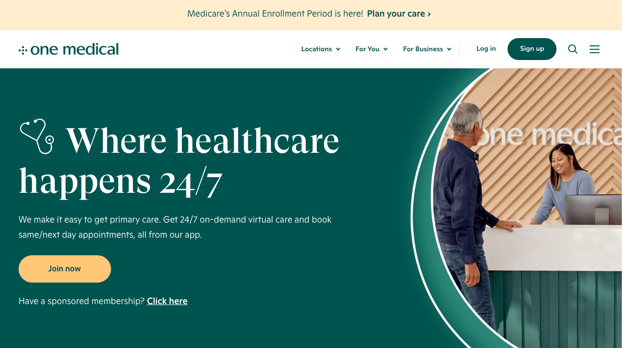
Image source: Screenshot from https://www.onemedical.com/
One Medical’s website is a prime example of a healthcare platform that expertly merges intuitive design with the essentials of patient care. It stands out for its clear emphasis on understanding and catering to its patients, presented in a modern and inviting manner.
Stand Out Features:
- User-Friendly Experience: The clean design combined with a functional navigation bar ensures users find what they’re looking for with ease.
- Strategic Imagery: A hero image on the homepage depicts youthful individuals, suggesting a fresh and contemporary approach to healthcare.
- Cohesive Color Palette: The consistent use of a soft green shade not only brings visual appeal but also evokes a sense of calm and healing.
- Emphasis on Accessibility: The website accentuates its 24/7 access to medical services and guidance, ensuring visitors know help is always available. The inclusion of a patient portal login option further reinforces this notion.
- Tailored Typography: The deliberate choice of fonts and typography styles aligns well with the modern aesthetics, appealing directly to the tech-savvy Millennial demographic.
Example 5- Brightside Health

Image source: Screenshot from https://www.brightside.com/homepage-therapy/
A successful healthcare website marries functionality with user-centric design, drawing inspiration from leading healthcare providers. Emphasizing online booking features and clear calls-to-action can significantly enhance patient experience and conversions.
Stand Out Features:
- Clear CTAs: Drawing inspiration from Brightside Health, incorporate prominent calls-to-action like “Start With A Free Assessment.” Place them strategically in both the header and the hero section to maximize visibility.
- Strategic Color Scheme: Use colors that not only resonate with the brand’s identity but also highlight essential CTAs, much like how Brightside Health accentuates their primary action points.
- Easy Navigation: A search bar and intuitively organized menus ensure users can quickly locate the information or service they’re seeking.
- Showcase Testimonials: Including patient testimonials provides social proof, enhancing trust and credibility with potential patients.
Example 6- Northwestern Medicine
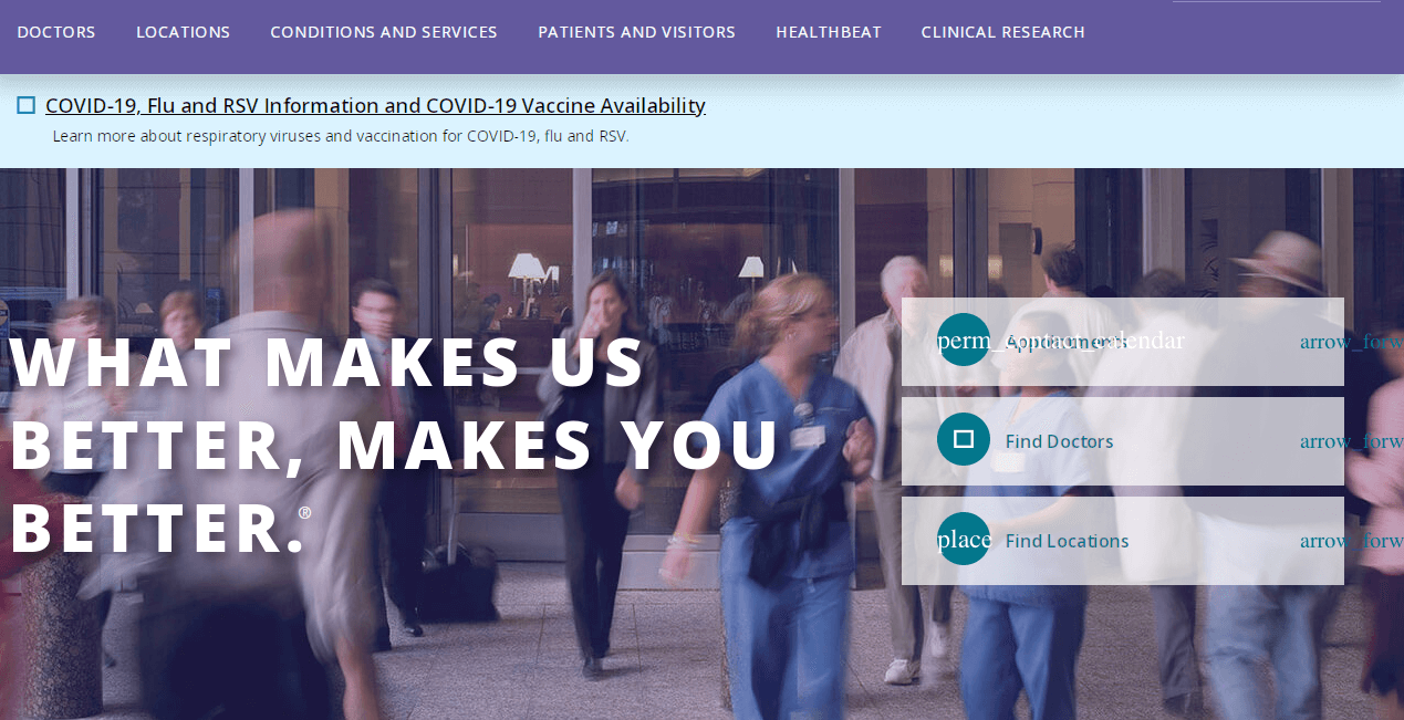
Image source: Screenshot from https://www.nm.org/
Northwestern Medicine showcases a refined healthcare website design that prioritizes user experience. Their homepage immediately offers visitors easy access to essential health information, bolstered by a display of methods, policies, and genuine patient testimonials, ensuring both current and potential patients feel well-informed and valued.
Stand Out Features:
- User-Friendly Tab/Banner: An easily identifiable tab or banner positioned prominently on the homepage, aiding in effortless navigation.
- Transparent Sharing of Methods and Policies: This transparency instills trust, indicating that Northwestern Medicine is forthright about their practices.
- Patient Testimonials: Real testimonials provide prospective patients a genuine insight into the quality of care and experiences offered.
Example 7-Synergy Private Health
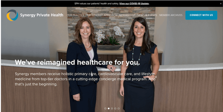
Image source: Screenshot from https://www.synergyprivatehealth.com/
Synergy Private Health’s website epitomizes the best practices in healthcare website design. By utilizing human-centric visuals, they not only captivate visitors but also establish a foundation of trust. The blend of images ranging from modern office spaces to intimate patient moments paints a holistic picture of what potential patients can expect. Coupled with a clean design and apt typography, it’s a masterclass in effective web design for healthcare institutions.
Stand Out Features:
- Human-Centric Visuals: The homepage is adorned with human images, tapping into our natural inclination to be drawn to faces. This enhances user engagement and fosters trust right off the bat.
- Dynamic Gallery: Acting as a testament to their prowess in healthcare website design, the main section is enriched with a diverse range of images: contemporary office spaces, patients immersed in daily activities, tranquil examination rooms, and, notably, portraits of the healthcare providers.
- Clean Design & Optimal Typography: Clean lines, a balanced color palette, and well-selected typography contribute to a seamless user experience, encouraging extended site interaction and potentially improving conversion rates.
- Trust-Building Imagery: Including pictures of healthcare providers takes personalization up a notch. It allows potential patients to familiarize themselves with the faces they might interact with, forging an early connection and enhancing trust.
Tips for Healthcare Providers
- Prioritizing User Experience (UX): The easier a site is to navigate, the more patients will use and trust it. Elements such as intuitive menus, a strategic color palette, and logical site flow can make all the difference.
- Staying Updated with the Latest Design Trends and Technologies: Leveraging the right fonts and design elements can ensure your site stays modern and relevant.
- Regularly Collecting Feedback from Patients: Their feedback is invaluable for site optimization.
- Collaborating with Professional Web Designers: Especially those who have experience in the healthcare sector. Their industry-specific expertise can provide insights others might miss.
Conclusion
A well-designed healthcare website design is not just about aesthetics but also focuses on user experience, ensuring functionality aligns with the needs of potential patients.
It’s about leveraging design elements such as appropriate fonts, white space, and a color scheme that keeps site visitors informed, empowered, and building trust. The best healthcare website designs, like those of Mayo Clinic and Cleveland Clinic, understand the importance of these factors in their web design.
If you’re a healthcare provider or medical center aiming for such high-quality web presence, let us guide you. We have the expertise to help you optimize your homepage, incorporate user-friendly features, and a clear call-to-action (CTA) that truly speaks to your target audience. Contact us today to start crafting a medical website design that serves your patients with the utmost care.
