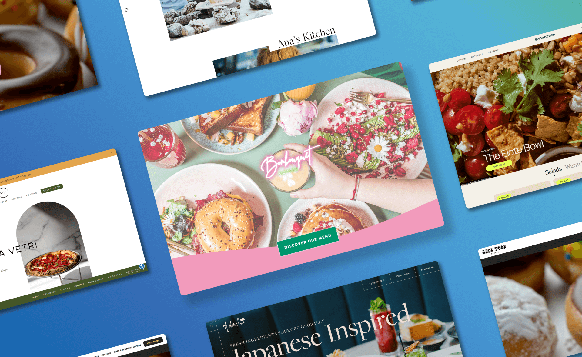
Every time you ponder a mouth-watering dining experience, where does your mind naturally travel? To the online presence of that restaurant.
An impeccably designed restaurant website can evoke the same visceral reactions as the aroma wafting from a sizzling dish. Given that the homepage is often your very first touchpoint with a potential diner, the web design can either captivate them or leave them scrolling for alternatives.
Recognizing this, in 2023, a great restaurant website is not a luxury but a necessity. With the right blend of design elements and functionality, our carefully curated list showcases restaurant website designs that not only offer a visual treat but also ensure a user-friendly experience, converting casual browsers into enthusiastic patrons.
Jump here:
Website Necessity for Restaurants – Why is it a Must?
8 Restaurant Web Designs That Will Leave You Hungry
1. Bon Bouquet Cafe
2. Sweetgreen
3. Hisa Franko
4. Adachi
5. Pizzeria Vetri
6. Back Door Donuts
7. Abnormal Co.
8. Lauri Raphael
Tips for Restaurants Looking to Revamp Their Website
Conclusion
Website Necessity for Restaurants – Why is it a Must?
- Boosted Online Visibility: Elevate your restaurant’s digital footprint to distinguish yourself in a competitive food industry. The impact of an exceptional restaurant website is undeniable.
- Expand Your Reach: Cater to everyone, from tourists to locals. Whether you’re a local sushi spot or a renowned French bistro, ensure you’re the top choice when they search.
- Efficient Online Reservations: Implement a streamlined online booking system to enhance customer convenience, diminish missed reservations, and optimize seating management.
- Food Ordering and Delivery Integration: Capitalize on the booming demand for online food delivery. Prioritize clear display of essential contact details for seamless customer outreach.
- Immediate Access to Operating Details: Never leave a prospective customer wondering about your operating hours or contact methods.
- Showcase Customer Feedback: Amplify your brand with positive testimonials and reviews. A dedicated testimonials page can significantly uplift your brand’s online trustworthiness.
- Web Accessibility for All: Ensure an inclusive digital experience by making your website accessible to individuals with disabilities.
- Ecommerce Capabilities: Explore the potential of selling branded merchandise or gift vouchers directly on your platform.
With these elements, your restaurant not only becomes more searchable but also offers a user-friendly experience, making it easier for customers to choose you over competitors.
8 Restaurant Web Designs That Will Leave You Hungry
1. Bon Bouquet Cafe
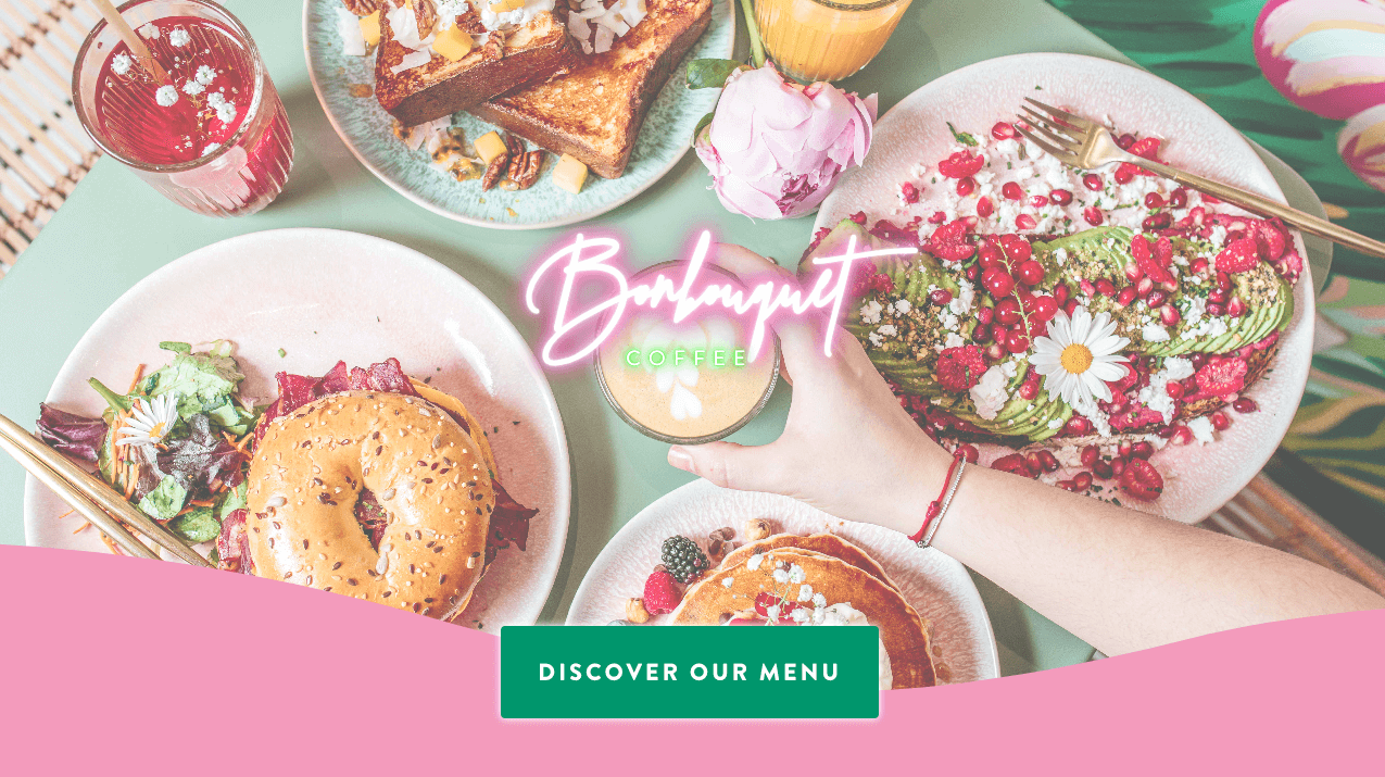
Image source: Screenshot from https://thehungryfamily.com/bon-bouquet-cafe/
The Bon Bouquet Café in Paris takes a delightful twist on brunch, emphasizing its universal appeal beyond the conventional time frames. Their website, a prime example of a user-friendly homepage, exudes an explosion of color, seamlessly merging the vibrancy of tropical themes with the urban charm of Paris, demonstrating the importance of a well-thought-out color palette.
Design Highlights:
- Neon Signage – Instantly captivating, the neon sign gives a modern, upbeat vibe, juxtaposing the historic allure of Paris.
- Vibrant Hero Image – The dominant, bold imagery sets an enthusiastic tone, enticing users from the first glance.
- Tropical Meets Urban – A brilliant blend of tropical aesthetics with Parisian sophistication.
What We Can Learn:
- Bold Choices Stand Out – Daring design decisions, like using vibrant tropical themes in a non-tropical city, can create a memorable brand image.
- Merge Contrasts Seamlessly – Skillfully blending contrasting themes can result in a unique and captivating user experience.
2. Sweetgreen

Image source: Screenshot from https://www.sweetgreen.com/
Sweetgreen’s website stands out from the crowd, leaving an indelible first impression even amidst a sea of pizzeria and doughnut websites. With a focus on fresh, flavorsome salads, the website combines immersive imagery and innovative multimedia content to create a visually delightful experience, making it a great restaurant website.
Design Highlights:
- Vivid Imagery: Detailed photos of fresh produce and dishes jump out against a subtle color palette.
- Short-form Video Content: The homepage seamlessly incorporates videos, giving viewers a behind-the-scenes look into Sweetgreen’s flavor experiments and recipe development.
What We Can Learn:
- The power of contrast in design can amplify visual appeal. By juxtaposing vibrant food images against subdued backgrounds, Sweetgreen captures attention immediately.
- Multimedia integration can elevate a user’s engagement. The inclusion of short videos not only informs but also entertains, fostering a deeper connection with the brand.
3. Hisa Franko
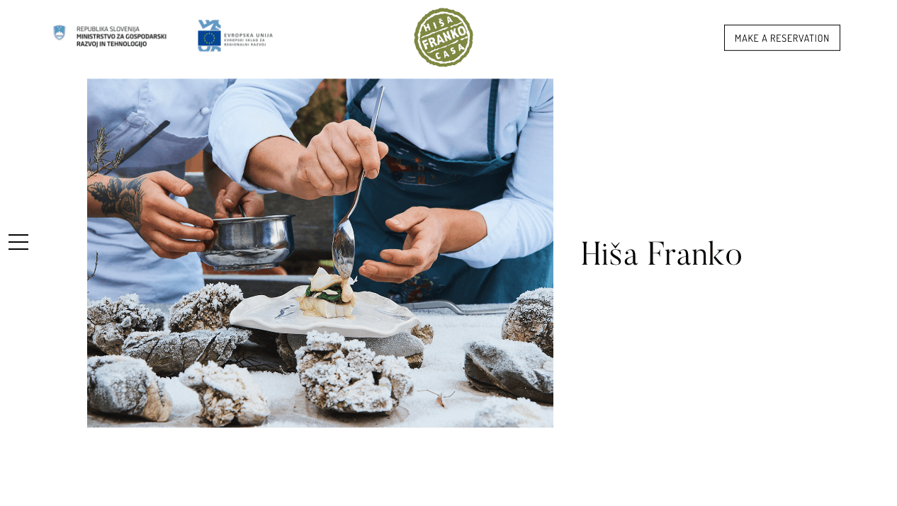
Image source: Screenshot from https://www.hisafranko.com/en/
Hisa Franko’s webpage in the Soča Valley of Slovenia offers not just a dining experience but also a lesson in minimalist and user-friendly web design. It showcases how an authentic restaurant menu can be paired with authentic imagery, ensuring that first-time visitors get the right first impression.
Design Highlights:
- Simplicity with Depth: Just like the dishes served, the website presents a deceptively simple front, but deeper exploration unveils layers of intricacies.
- Storytelling through Imagery: The use of outdoor photography not only conveys the beautiful locale but also tells the story of Hisa Franko’s ethos and connection to nature.
- Inspirational Quotes: Woven throughout the site, quotes add a touch of personal insight, giving visitors a sense of the restaurant’s philosophy and Ana Roš’s vision.
What We Can Learn:
- Less is More: A minimalist design can effectively convey sophistication and depth when paired with rich content.
- Use of Authentic Imagery: Genuine photos can resonate more deeply with the audience than stock images, drawing them into the brand’s story.
- Seamless Integration of Brand Ethos: By subtly interweaving brand values and ethos into the design, one can create a more immersive and meaningful user experience.
4. Adachi

Image source: Screenshot from https://adachirestaurant.com/
Adachi’s online ordering system is enhanced by its restaurant website design, highlighting its Japanese-inspired dishes. The high-quality imagery and the header‘s smooth transition make the user experience top-notch, ensuring visitors, whether on smartphones or desktops, stay engaged.
Design Highlights:
- Artful Representation of Cuisine: High-quality food photography reveals the essence of Japanese-inspired dishes.
- Dynamic Header Transition: The sticky header smoothly transitions from transparency to a solid color, enhancing navigation aesthetics.
- Interactive Visual Elements: Image tiles, when hovered over, bring a 3D effect to the homepage, adding depth and interactivity.
What We Can Learn:
- Value of Details: Focusing on meticulous design details can profoundly enhance the overall user experience.
- Impact of Subtleties: Thoughtfully incorporated design elements can amplify a website’s visual charm without overwhelming the visitor.
- Narrative through Design: The intentional design can narrate a story or brand’s essence, connecting more deeply with its audience.
5. Pizzeria Vetri
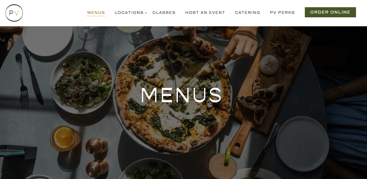
Image source: Screenshot from https://www.pizzeriavetri.com/
Pizzeria Vetri, nestled in the heart of Philadelphia, Pennsylvania, serves as a testament to the notion that simplicity is the ultimate sophistication. With its uncomplicated yet highly effective website design, Pizzeria Vetri makes it easy for pizza aficionados and casual diners alike to navigate and engage, setting a benchmark for pizza restaurant designs everywhere.
Design Highlights:
- User-Friendly Interface: The website boasts a seamless user experience, ensuring easy navigation for visitors.
- Minimalistic Aesthetics: The design embodies a clean, clutter-free visual, highlighting what’s truly essential.
- Visual Engagement: With captivating imagery of their sumptuous pizzas, the website instantly tantalizes the viewer’s taste buds.
What We Can Learn:
- Simplicity Sells: One doesn’t need a complex design filled with bells and whistles. Sometimes, less is more.
- Know Your Audience: Pizzeria Vetri’s design caters to both the tech-savvy and those not as well-versed, making it accessible for all.
- Imagery is Key: High-quality images can convey the essence of a brand, and in the food industry, they can be the deciding factor for a potential diner’s choice.
6. Back Door Donuts

Image source: Screenshot from https://www.backdoordonuts.com/
The website for Martha’s-Vineyard-based doughnut shop, Back Door Donuts, masterfully marries the allure of high-resolution doughnut imagery with a deep-rooted sense of community and history.
It is not just an online storefront for doughnuts but a delightful virtual representation of the shop’s iconic status in the Massachusetts community. Beyond the visual temptation of glistening frosting and impeccable pastries, the website resonates with local charm, evoking a sense of belonging and warmth.
Design Highlights:
- High-Resolution Doughnut Imagery: Captivating photos that nearly pop out of the screen, making users almost taste the sweetness.
- Frosting Drip Effects: Adds an innovative, playful touch that makes browsing an immersive experience.
- Community and History Integration: Seamlessly woven narratives and anecdotes about the shop’s legacy and its significance to the locale.
What We Can Learn:
- Visuals Matter: Quality imagery can engage users and drive desire.
- Go Beyond The Product: Connecting with users on a deeper level, such as community ties and history, can enhance brand loyalty.
- Details Elevate Experience: Small design elements, like the frosting drip effects, can significantly enhance user immersion and enjoyment.
7. Abnormal Co.
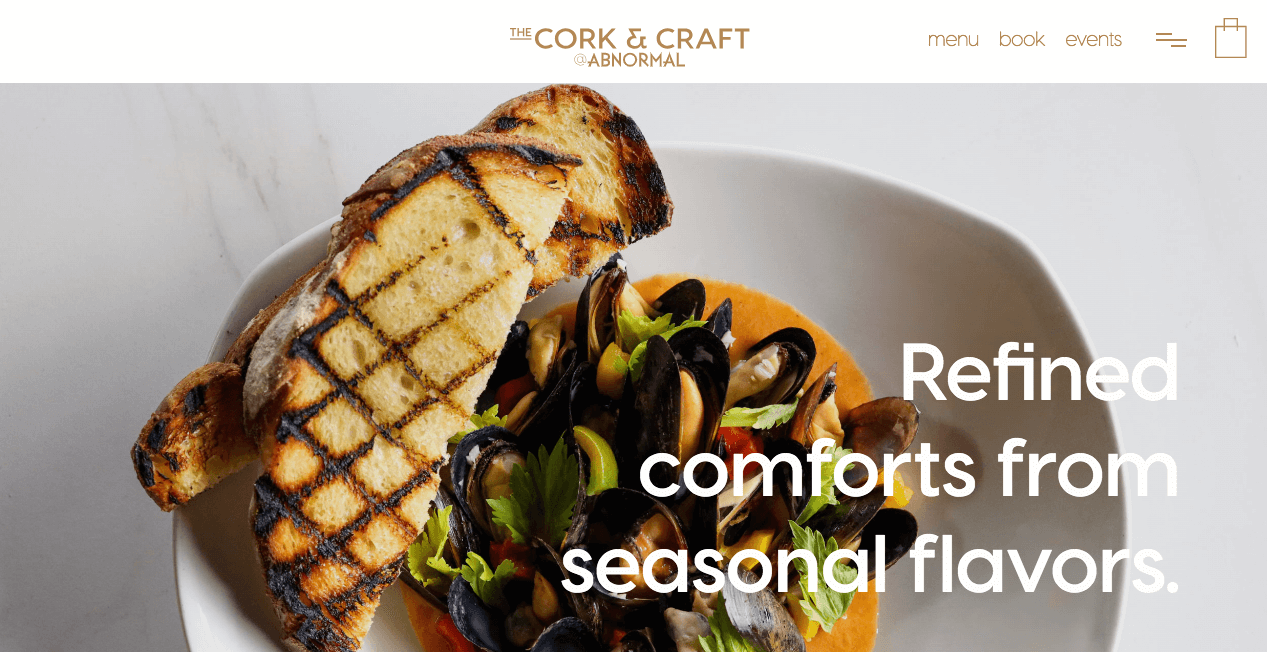
Image source: Screenshot from https://www.abnormal.co/
Abnormal Co. is a San Diego-based microbrewery that revels in its self-professed abnormality. This mantra not only resonates in their brewing style but also cascades onto their digital platform.
Their website boasts an unorthodox design strategy where content subtly slides into view with every scroll. It’s complemented by a warm and shadowy color scheme. At the heart of their online presence is an engrossing video on the homepage and numerous image sliders, revealing the spectrum of beers they have on offer.
The entirety of their website demonstrates that their expertise is not just limited to brewing but also extends to curating a distinctive digital experience.
Design Highlights:
- Dynamic Content Delivery: Page content elegantly slides in as visitors scroll.
- Warm, Dark Aesthetic: The site exudes a cozy and intriguing atmosphere.
- Engaging Multimedia: A captivating video headline and immersive image sliders provide depth and insight into their offerings.
What We Can Learn:
- Brand Consistency: Embracing and embedding your brand’s identity in all aspects, from the product to web design, creates a harmonized brand experience.
- User Engagement: Interactive elements, like sliding content and videos, can elevate the user’s experience and captivate attention.
- Aesthetics Matter: A well-thought-out color palette and design can enhance the perception of a brand and resonate with the target audience.
8. Lauri Raphael
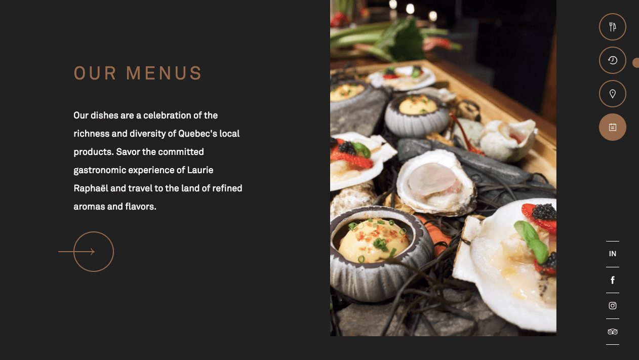
Image source: Screenshot from https://laurieraphael.com/
Laurie Raphaël, a renowned gastronomic restaurant from Quebec, celebrates its 30th anniversary with a refreshed digital presence. The newly commissioned website is a harmonious blend of the establishment’s legacy and modern design cues.
It masterfully integrates both contemporary and vintage design techniques, producing a digital experience that’s both nostalgic and futuristic.
Design Highlights:
- Merged Grids: A seamless fusion of broken and traditional grids provides an eclectic layout, making every scroll a visual delight.
- Parallax Scrolling: This feature adds depth to the web pages, enhancing user engagement and giving the site a dynamic feel.
- Font Fusion: The website artfully combines different font styles, representing the restaurant’s past and present.
- Smooth Image Animations: As users scroll, images subtly come to life with elegant animations, ensuring continuous engagement and visual intrigue.
What We Can Learn:
- Harmony in Dichotomy: It’s possible to merge old and new design styles to create a unique and compelling visual narrative.
- Importance of Engagement: Modern features like parallax scrolling and smooth animations can enhance user experience and keep visitors engaged.
- Storytelling Through Design: By thoughtfully integrating various design elements, brands can tell a rich and immersive story about their journey and evolution.
Tips for Restaurants Looking to Revamp Their Website
- Keep your target audience in mind: A family diner’s design elements differ from a high-end restaurant.
- Stay updated with design trends without losing brand authenticity: Be modern but remain true to your restaurant’s essence.
- Prioritize mobile optimization: More customers search on-the-go; don’t miss out on that traffic.
- Regularly update content, especially the menu: Fresh content signals active management and helps SEO.
Conclusion
A well-designed restaurant website is more than aesthetics; it’s the digital appetizer for the dining experience. Beginning on the homepage, potential customers expect a user-friendly experience, whether navigating through scrolling features or viewing enticing food photography. Using platforms such as WordPress and Squarespace, restaurants can effortlessly integrate online ordering features while highlighting aspects like customer reviews and offering gift cards.
If your restaurant seeks the best website design or online rejuvenation, Cyphon Digital can assist. Embracing minimalist designs optimized for smartphones and ensuring functionality from header designs to SEO elements is vital. Let’s collaborate to elevate your online presence, merging aesthetics with user experience.
