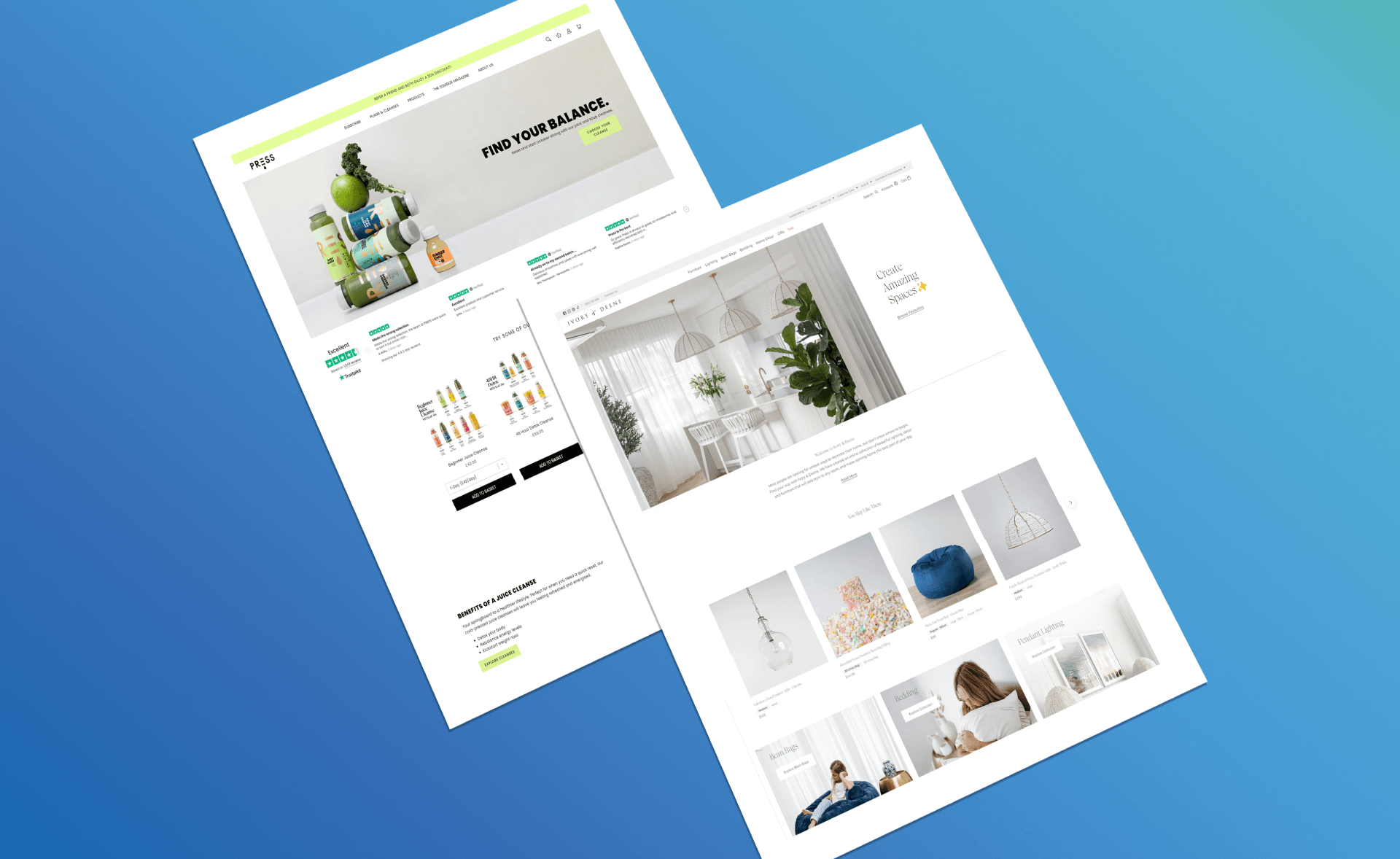
Think of your website as the first impression of your business, much like judging a book by its cover. With tools like WordPress and Wix at your fingertips, it’s straightforward to set up a site that’s not just visually appealing but also optimized for digital marketing and SEO. But here’s the thing—it’s not just about looks.
A well-designed website strengthens your brand’s professional image and builds trust with your audience. And when it comes to conversions? A solid design can turn casual visitors into potential clients.
If you’re thinking about giving your ecommerce site a makeover or just want to make a stronger online impression, I’ve come across some standout small business website designs for 2023. Take a look for some inspiration and always keep your audience’s experience at the forefront.
Jump here:
Top Picks: 10 Small Business Website Design Examples
- Press London
- Ivory & Deene
- Wrightwood Furniture
- LEIF
- MFMG Cosmetics
- Minaal
- Modern Market
- Super Team Deluxe
- La La Land
- Bluboho
Crafting a Small Business Website: A Step-by-Step Guide
In Summary
Top Picks: 10 Small Business Website Design Examples
Remember, while these examples serve as inspiration, it’s essential to ensure your website aligns with your business objectives and brand voice.
Press London
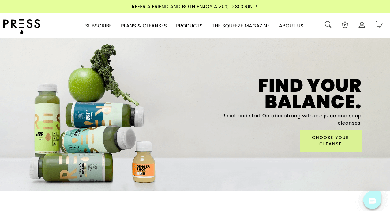
Image source: Screenshot from https://press-london.com/
Press London, an eCommerce site, is a premium online store specializing in cold-pressed juices, wholesome groceries, and detox packages. Their offerings prioritize health and wellness, presented on a website designed for easy navigation and a seamless shopping experience on both desktop and mobile devices.
Why it Stands Out: Its minimalistic design, combined with intuitive top-level categories, streamlines user navigation.
Unique Features: Detailed drop-down menus and essential link icons, such as the shopping cart and search, ensure a clean and efficient interface.
Ivory & Deene
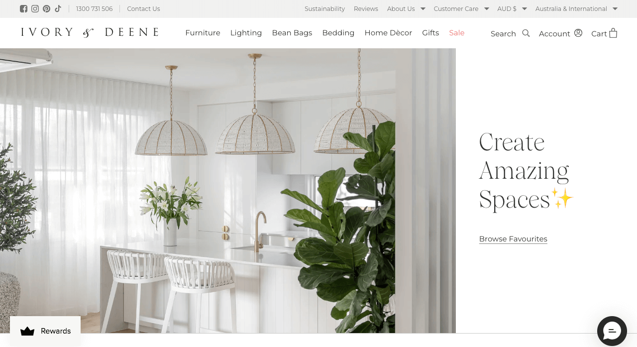
Image source: Screenshot from https://ivoryanddeene.com.au/
Ivory & Deene, an Australian-based luxury home decor store, encapsulates elegance through its sophisticated color palette, hover effects, and subtle animations on the website.
Why It Stands Out: The combination of luxury branding with subtle animations elevates the user experience, making the brand memorable.
Unique Features: Elegant color scheme, smooth animated elements, and user-friendly menu and search filters for easy navigation.
Wrightwood Furniture
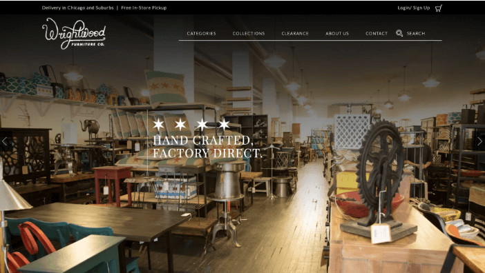
Image source: Screenshot from https://wrightwoodfurniture.com/
Wrightwood Furniture, a prominent Chicago store, now garners over 12% of its earnings from its intuitive Shopify-based eCommerce website, beautifully showcasing its collection with high-quality images.
Why it Stands Out: The home page captures attention with a striking image of their showroom, setting a premium tone.
Unique Features: A user-friendly menu with illustrative icons facilitates easy navigation, complemented by an effective search filter for streamlined product searches.
LEIF
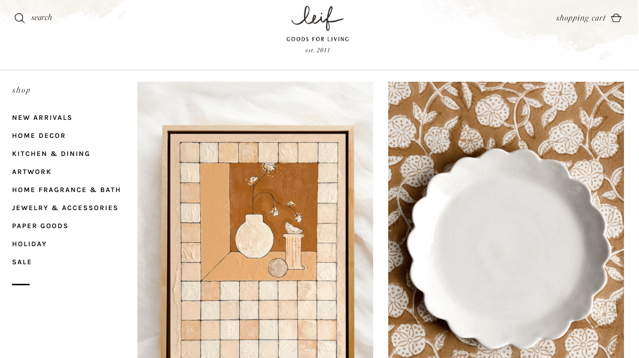
Image source: Screenshot from https://www.leifshop.com/
LEIF, a Brooklyn-based lifestyle startup, offers a curated selection of aesthetic items for daily life. Their user-friendly website builder of choice showcases a blend of muted tones highlighted by vibrant product visuals.
Why it Stands Out: LEIF seamlessly marries simplicity with elegance, making everyday objects feel special.
Unique Features:
- Muted website color palette juxtaposed with vibrant product imagery.
- Comprehensive yet straightforward drop-down-menu for easy online navigation.
- Diverse range of product categories, emphasizing beauty in everyday items.
MFMG Cosmetics
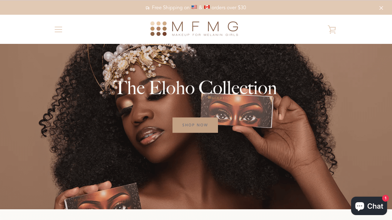
Image source: Screenshot from https://makeupformelaningirls.com/
MFMG Cosmetics, short for “Makeup for Melanin Girls,” champions inclusivity. Their eCommerce website showcases vibrant product colors, making use of a minimalist design approach.
Why it Stands Out: They’re addressing a significant gap in the beauty industry by catering specifically to darker skin tones, a historically underrepresented market.
Unique Features:
- Mobile-optimized website with a sleek, minimalist interface.
- Vibrant product color displays that match the brand’s ethos.
- Enticing call-to-action banner offering 10% off for mailing list sign-ups.
Minaal
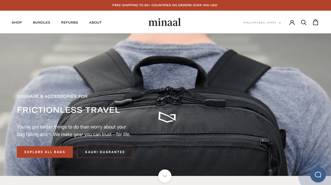
Image source: Screenshot from https://www.minaal.com/en-ph
Minaal offers cutting-edge luggage solutions tailored for modern travelers. With a clear call-to-action (CTA), they entice potential clients and effectively address the desires of contemporary travelers, providing them with durable and stylish options for their journeys.
Why It Stands Out: Minaal’s website reflects its products: sleek, precise, and user-centric.
Unique Features:
- Endorsements from top websites showcasing credibility.
- Multi-currency shopping options.
- Exclusive member community and informative blog.
Modern Market
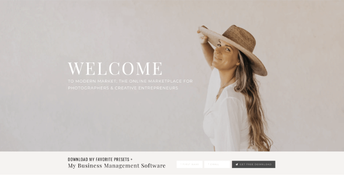
Image source: Screenshot from https://modernmarket.co/
Modern Market, with its online presence, offers digital products and online courses. The site’s design elements, including the navigation menu and color scheme, provide an exceptional user experience.
Why it Stands Out: Its website boasts a stylish and positive ambiance characterized by top-notch photographs and a soothing beige palette.
Unique Features:
- Comprehensive range of digital goods
- Expertly crafted online courses
- High-quality visuals and design
- Refreshing and inviting color scheme
Super Team Deluxe
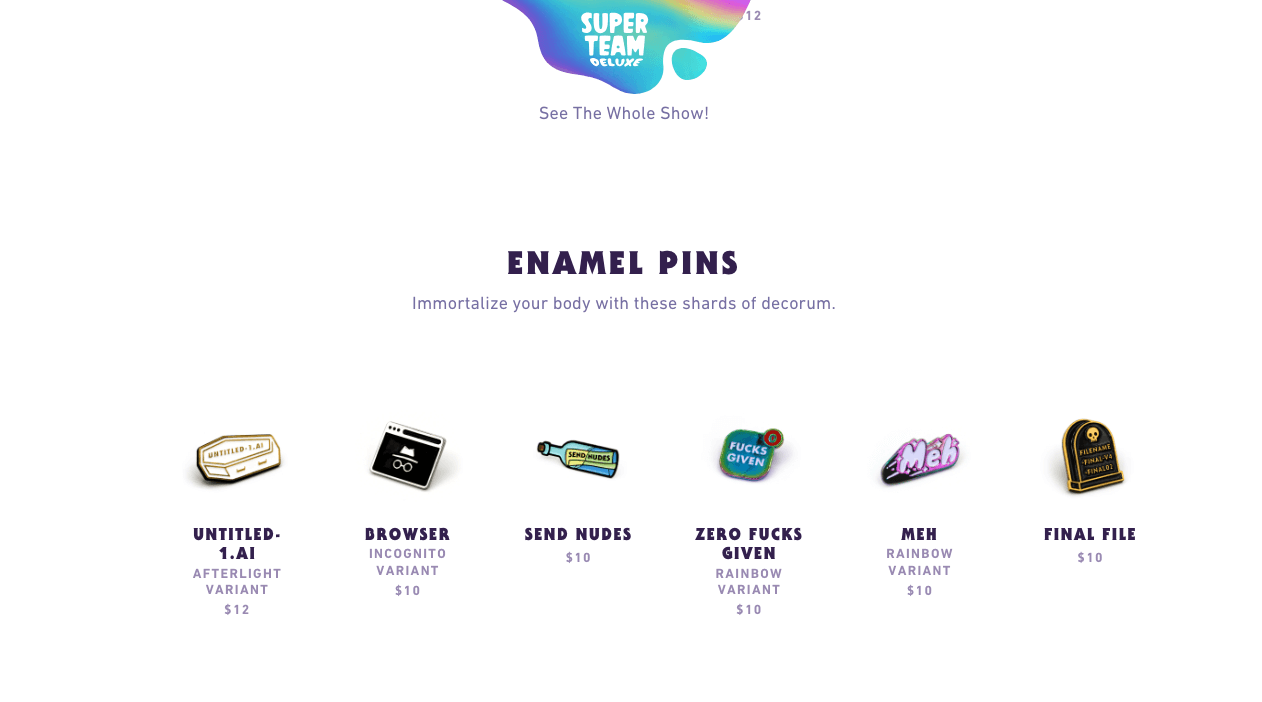
Image source: Screenshot from https://superteamdeluxe.com/
Super Team Deluxe offers a vibrant range of stickers and accessories. With interactive features, including dynamic mouse-triggered animations, the site offers a captivating user experience.
Why It Stands Out: Its use of bold colors, whimsical fonts, and interactive animations creates an engaging browsing experience.
Unique Features: Dynamic mouse-triggered animations and the intriguing “Wall of Humility” showcase the brand’s unique flair on the homepage.
La La Land
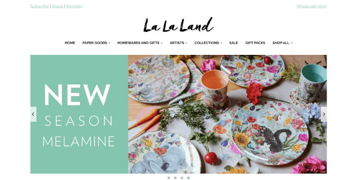
Image source: Screenshot from https://lalalandshop.com.au/
La La Land is a dynamic online store that marries artistic exuberance with intuitive navigation. Their website not only captivates visitors with its unique aesthetic but also ensures a seamless shopping experience, making it a go-to destination for discerning online shoppers.
Why it Stands Out: The brand merges artsy flamboyance with a clean, user-friendly design.
Unique Features: A crisp drop-down menu utilizes capitalized sans-serif text, making navigation effortless and stylish.
Bluboho
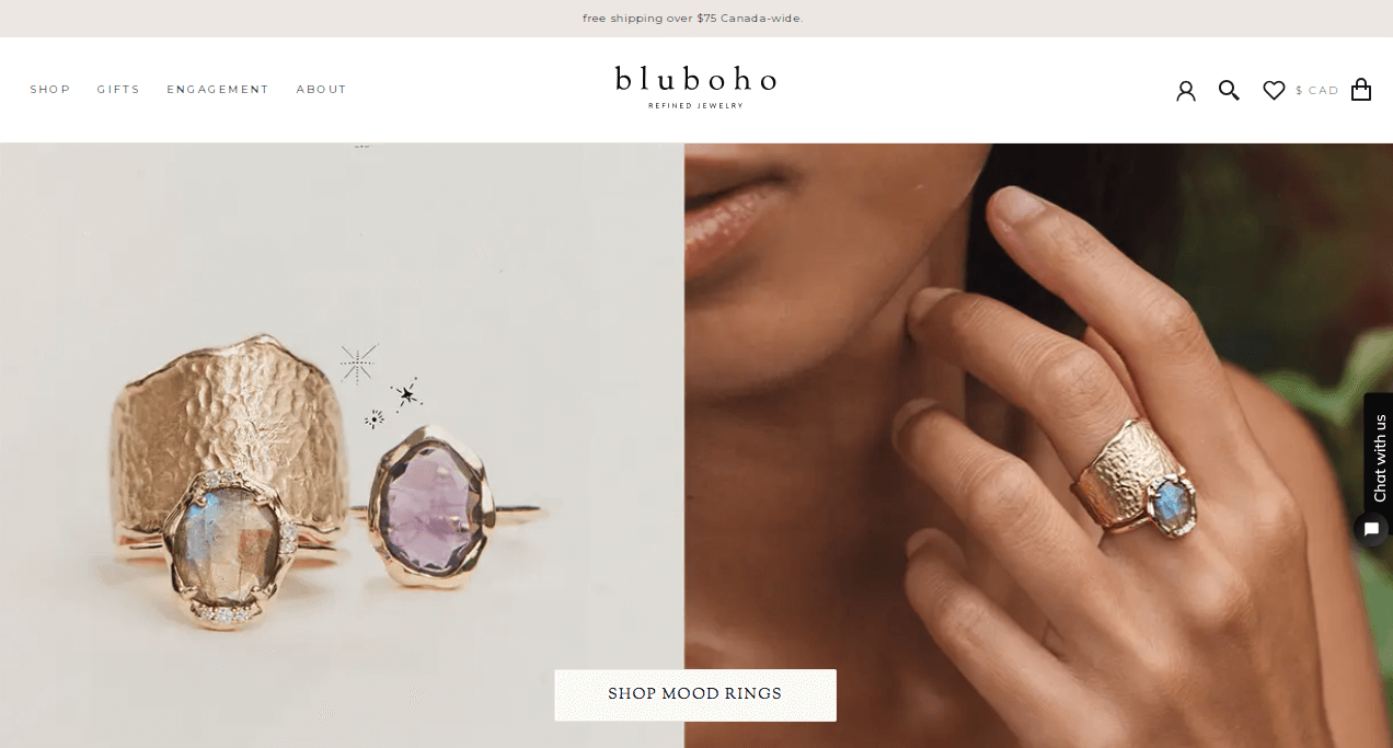
Image source: Screenshot from https://www.bluboho.com/
Bluboho is a digital jewelry boutique, presenting an immersive eCommerce browsing experience on its WordPress platform, emphasizing its brand identity with stunning product photography.
Why It Stands Out: Bluboho masterfully balances striking visuals with functional design. Their site not only entices visitors with captivating product photos but also encourages email sign-ups as they navigate.
Unique Features:
- Stunning high-resolution jewelry photography.
- User-friendly design prompting mailing list sign-ups.
- Comprehensive product pages with extensive imagery and details.
- Seamless optimization for mobile browsing.
Crafting a Small Business Website: A Step-by-Step Guide
Step 1 – Choose Your Approach
Option A: DIY (Do It Yourself) with Website Builders
- Platform Selection: Start by selecting a website builder. Platforms like Wix, Squarespace, and WordPress are popular and provide a plethora of templates suitable for any small business website design.
- Customize Design: Modify your chosen template to fit your brand. This includes deciding on the layout, employing white space strategically, and keeping the homepage captivating.
- Key Elements: Introduce interactive components, such as subtle animations or parallax effects. Ensure your design is responsive for mobile device compatibility.
- Branding: Select a color palette that resonates with your brand’s identity and combine it with reader-friendly typography.
- Populate Content: Fill your website with relevant content, including high-quality images and testimonials. Structure your site with a clear navigation bar and menu.
- Optimize: Incorporate search engine optimization (SEO) techniques to enhance your website’s visibility.
- Testing and Launch: Before making your website live, test it rigorously to ensure it works seamlessly on all devices.
Option B: Opt for Professional Web Design Services
- Hire a Specialist: Explore professional platforms like Shopify or hire a dedicated web design expert who understands your business’s nuances.
- Convey Your Vision: Provide a clear design brief. Sharing examples of websites you admire can help the designer grasp your desired outcome.
- Iterative Process: Engage in a feedback loop with the designer. Review drafts, especially critical sections like headers and landing pages.
- Refinement: Work with the designer to fine-tune details, ensuring features like hover effects and transitions are incorporated seamlessly.
- Testing and Deployment: Before publishing, make sure every aspect of your website, from the intuitive navigation to the contact form, operates flawlessly.
Step 2 – Essential Additions for Small Business Owners
Ecommerce Integration – If selling products, consider setting up an ecommerce website or ecommerce site. Platforms like Shopify are tailor-made for this. Ensure product pages are clear and user-friendly.
Engagement Elements – Add CTAs (call-to-action), build trust with case studies, provide FAQs, and demonstrate social proof.
Interactive Features – Enhance user experience with animations, hover effects, and other interactive elements.
Social Media – Embed your social media feeds or provide easy access links to your profiles to enhance digital marketing efforts.
Step 3 – Post-launch Maintenance
Feedback Loop – Regularly solicit feedback from potential customers or potential clients to refine and improve.
Ongoing SEO – Keep up with search engine optimization techniques and practices, updating as needed.
Monitor Conversions – Track how well your site turns visitors into customers and refine CTAs and other elements as needed.
Step 4 – Considering Further Assistance?
If you’re still uncertain or want a unique blend of DIY and professional touches, explore companies like Cyphon Digital that offer expert assistance, ensuring your website stands out in today’s digital landscape.
In Summary
Your website isn’t just a landing page; it’s an embodiment of your brand’s ethos. As small business owners, ensuring your online store or website is optimized for conversions and has relevant call-to-action elements can turn potential customers into loyal patrons. Remember, every grand skyscraper started with a single brick. If you ever need expert assistance, Cyphon Digital is here to guide you.
